Criminal defense is a different kind of sale than most legal practice areas. Someone landing on your site isn’t comparison-shopping the way they would for an estate plan or a business contract. They’re usually scared, under time pressure, and trying to figure out in the first few seconds whether this firm actually understands what they’re facing. That changes what “good design” means. A criminal defense website doesn’t just need to look polished. Really, it needs to earn trust…fast.
The best sites on this list do that in very different ways. Some lean into a founder’s personal story or a genuinely local identity. Others let a wall of case results and credentials do the talking. A few commit to a single niche, one type of charge, one city, or one kind of client so a visitor never has to wonder if they’re in the right place. What they all share is a clear point of view about who they’re for and what a first-time visitor needs to see before anything else.
We pulled together 15 criminal defense websites that get this right. Some are our own designs, but most aren’t. Take a look at what each one does well, and where it might fall short depending on your firm’s own positioning.
Want a site like one of these built for your firm? We create custom, conversion-focused websites for criminal defense practices.
15 Best Criminal Defense Attorney Websites
| Firm | Standout feature | Palette/mood | Key takeaway |
|---|---|---|---|
| 1. Andrew Flusche, Attorney at Law (Juris Digital design) | Single-charge domain focus, explainer video, funnel-staged CTAs | Clean, focused, simple nav | A specialty within a specialty speeds up the decision |
| 2. Cowboy Country Criminal Defense | Regional cowboy branding, location keywords throughout | Rugged, Western, tough | Local SEO helps clients find you organically |
| 3. SMT Legal | Wordplay headline, full-width “$100 Million Recovered” section | Black & gold, ghosted columns | A quick-to-parse headline plus a hard number covers two kinds of persuasion |
| 4. Moses & Rooth (Juris Digital design) | In-hero contact form, prosecutorial background framed as tactical edge | Navy & gold, Orlando skyline | Remove the extra step between deciding and converting |
| 5. Gounaris Abboud, LPA | Bookended Super Lawyers badges, dual CTA buttons | Red-to-black gradient, Dayton skyline | Bold color needs photography that matches its energy |
| 6. Razumich & Associates | Bulldog mascot, overlapping stat bar, photo-based chat widget | Navy, gold & red | A brand mascot needs to be threaded through the whole design |
| 7. Bryan Brown Law | Warm, smiling hero photo, first-person “Why Clients Trust Me” section | Navy & orange, approachable | Vulnerability works if the photography matches the tone |
| 8. The Rodriguez Law Group | Embedded news-appearance carousel, prosecution-timeline urgency copy | Navy & gold, LA skyline at night | Show credentials in action, not just stated |
| 9. Meltzer & Bell, P.A. | Full five-attorney group photo, “500+ jury trials” overlay | Maroon, black & gold, formal | A group photo signals bench depth over a single personality |
| 10. Combs Waterkotte | Direct competitor callout copy, persistent left-side contact rail | Navy & blue, bold all-caps | Bold claims need credentials sitting right beside them |
| 11. MayesTelles PLLC | 14-attorney group photo, “602-LAWYERS” phone-number logo | Camelback Mountain sunset | A large, staged team photo communicates real scale |
| 12. Konta Georges & Buza, P.C. | Serif “courtroom plaque” headline, staggered attorney portraits | Navy, white & sage, editorial | Restraint can read as more confident than bold color |
| 13. The Law Office of David A. Breston | Video in the hero slot, single red accent color, case-outcome band | Black, white & red | A tightly limited palette makes every color choice matter |
| 14. Knutson + Casey | Triangle-cropped brick-wall hero, pinned vertical live chat tab | Warm brick, gold script | Small deviations from a standard crop make a site memorable |
| 15. Evergreen Attorneys | Video hero cutting between attorneys and the town of Evergreen | Cream & forest green | Video establishes people and place at once |
TL;DR — Top 5 Criminal Defense Website Designs
- Andrew Flusche, Attorney at Law: a single-charge niche site built entirely around Virginia reckless driving cases.
- Cowboy Country Criminal Defense: strong regional branding paired with local SEO built into every page.
- SMT Legal: a wordplay headline backed by a massive standalone “$100 Million Recovered” stat section.
- Moses & Rooth: a lead-gen form built directly into the hero, no separate contact page required.
- Gounaris Abboud, LPA: a red-and-black team photo hero that stacks credibility badges on both sides.
1. Andrew Flusche, Attorney at Law
Company Website | Testimonials | LinkedIn | Contact Info
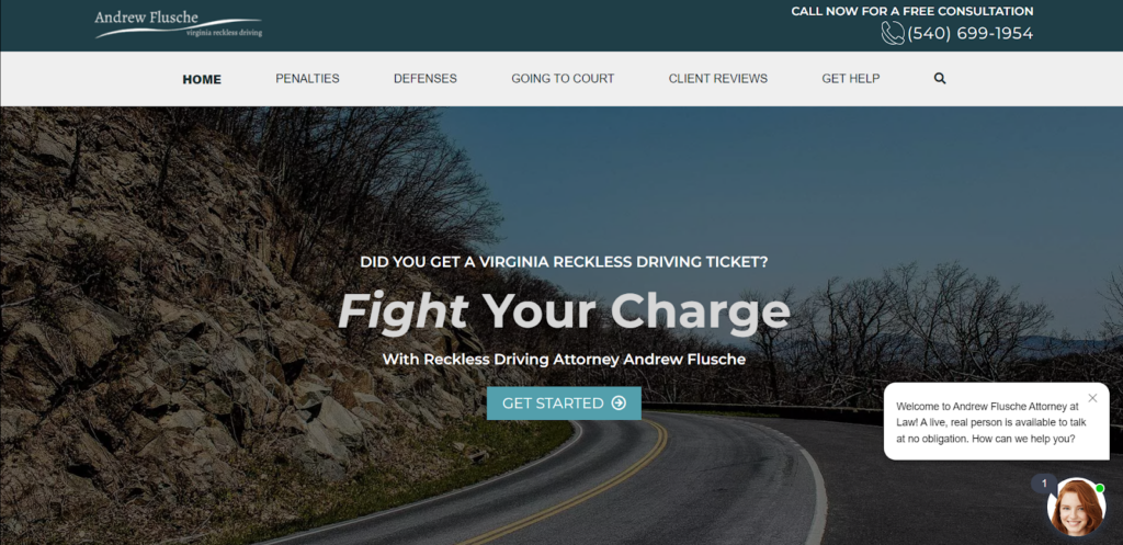
Strengths: Clients don’t have a lot of patience when searching for a criminal defense lawyer, and Andrew Flusche’s website’s main focus—reckless driving cases—is quick and easy to identify for users who come across the page.
Several additional factors make this website stand apart from the rest:
- A simple navigation bar at the top guides potential clients to what they’re looking for, whether it is answers to their questions, a contact form, or helpful blog posts;
- The CTA buttons throughout the site guide users at all stages of the marketing funnel (awareness, consideration, and conversion) to take action; and
- A video gives a short breakdown of ways to beat a reckless driving ticket in Virginia, which both adds value and creates a different approach to accessibility to information.
Key Takeaway: Niching down to a single, specific charge makes the website’s job easier and the visitor’s decision faster. Someone searching for help with a reckless driving ticket in Virginia doesn’t have to wonder whether this firm actually handles cases like theirs; the name of the site answers that before they even click in. If your firm has a genuine specialty within a specialty, building the site (and the domain itself) around that specific charge can outperform a broader “we handle everything” positioning, especially for the exact searches that matter most.
2. Cowboy Country Criminal Defense
Company Website | Testimonials | LinkedIn | Contact Info

Strengths: The Cowboy Country Criminal Defense website touts the Wyoming-based law firm’s deep experience while emphasizing a dedicated approach to the client relationship. The strong cowboy branding, emphasized by visuals and copy, fits the location the firm serves and differentiates itself in a competitive field, which is crucial for getting clients. Here are a few other highlights:
- Strong colors and imagery evoke toughness and a legal team that will fight hard for their clients. By creating memorable visuals that also speak to a brand, a criminal defense lawyer website design can tell a story quicker, which can save time for a potentially overwhelmed client.
- Easy-to-read text simplifies complex legal information and answers common client questions.
- There are location-focused keywords throughout the website and mentioned specifically in the final blurb on what makes Cowboy County Criminal Defense stand out. Focusing on local SEO can put your website in a strong position to rank well in Google.
Key Takeaway: Implement local SEO tactics to help potential clients find your practice through organic search. Google shows local results first when individuals search for criminal defense attorneys. Make sure you use location-based terms in your target key phrases. It also helps your law firm show up in local search results if you sign up for a free Google Business account.
3. SMT Legal
Company Website | Testimonials | LinkedIn | Contact Info

Strengths: Three attorneys stand together against a dark, textured background with ghosted classical columns behind them, echoing courthouse architecture without using an actual photo of one. “YOUR FUTURE” appears in bold gold, directly above “IS OUR PRESENT” in white, a wordplay-driven headline. A thin gold rule sits above and below the headline block, giving the text its own contained space within the busy photo composition. There are some other great design choices as well:
- Below the hero, a huge standalone section reading “OVER $100 MILLION RECOVERED” in gold on black takes up the full width of the page on its own, giving the single biggest number the firm has the most visual real estate on the entire homepage; and
- The firm covers personal injury, accidents, and criminal defense under one roof (visible in the nav: Accidents, Personal Injury, Criminal Defense), and the hero copy names all three practice areas directly instead of defaulting to a single one.
Key Takeaway: A wordplay headline only works if it’s genuinely quick to parse. “Your Future Is Our Present” reads in under a second and still communicates the core promise. It also works well for a firm that has multiple practice areas. Pairing that with a massive standalone stat section immediately after the fold gives visitors two very different kinds of persuasion in quick succession: an emotional hook first, then a hard number to back it up.
4. Moses & Rooth
Company Website | Testimonials | LinkedIn | Contact Info
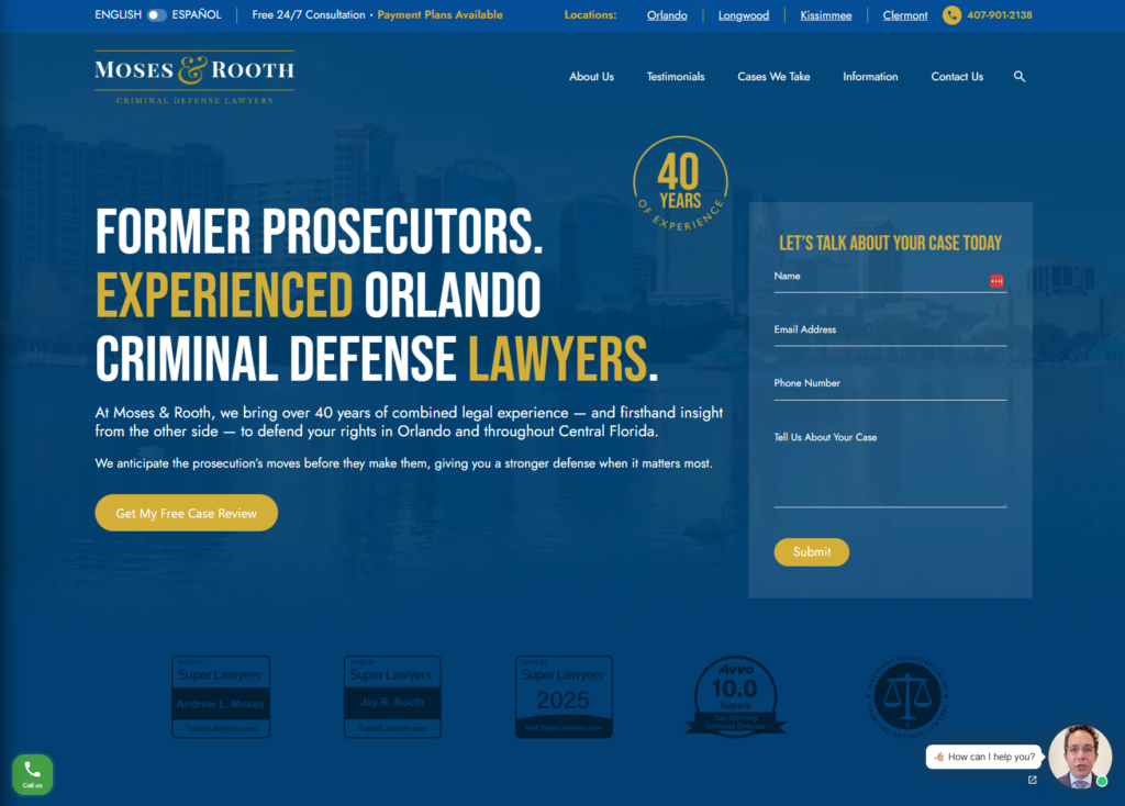
Strengths: The hero uses a deep navy blue over a faded Orlando skyline-and-waterfront photo, with a gold ring badge reading “40 YEARS OF EXPERIENCE” set apart from the main headline. “FORMER PROSECUTORS.” leads in white, followed by “EXPERIENCED ORLANDO CRIMINAL DEFENSE LAWYERS” with “EXPERIENCED” and “LAWYERS” picked out in gold, a simple but effective way to make the two most important words jump out without changing font or size. A few other things do real work on this page:
- The right side of the hero holds a full contact form directly in view, so converting doesn’t require leaving the homepage at all;
- The copy explicitly frames the firm’s prosecutorial background as a tactical edge, turning a credential into a specific promise; and
- A row of five credibility marks sits just below the fold, giving visitors third-party proof before any body copy loads.
Key Takeaway: Putting the lead-generation form directly in the hero, rather than only linking to a separate contact page, removes a full step between a visitor deciding to reach out and actually doing it. Combined with copy that turns a credential (“former prosecutors”) into a concrete tactical claim, the page gives a visitor both a reason to trust the firm and the easiest possible way to act on that trust immediately.
5. Gounaris Abboud, LPA
Company Website | Testimonials | LinkedIn | Contact Info

Strengths: Gounaris Abboud’s full-bleed hero uses a deep red-to-black gradient over a faded Dayton skyline, with the three-attorney team photographed in real color and confidently smiling, standing shoulder to shoulder against that dramatic backdrop. “DAYTON” appears as a small tracked-out label above the bold headline “Criminal Defense Attorney,” followed by “UNYIELDING ADVOCATES. UNWAVERING RESULTS.” in all caps. This layered headline structure establishes location, service, and tone in three quick reads. Some other things we noticed:
- Two Super Lawyers badges anchor the far-left and far-right corners of the hero (Top 100 Ohio, Top 50 Cincinnati), visually bookending the three-stat bar in the center so the hero closes with a wall of credibility signals;
- Two side-by-side CTA buttons, a solid red “GET A FREE CASE EVALUATION” and an outlined “WATCH THE VIDEO,” give visitors both a direct conversion path and a lower-commitment option to learn more first, without competing for attention; and
- Having three attorneys pictured together, rather than a single founder, signals bench strength and team capacity right away, a different trust signal than the solo-founder-focused sites elsewhere on this list.
Key Takeaway: A bold, high-contrast color palette can telegraph confidence and seriousness before a visitor reads a single word, but it only lands if the photography matches that energy. Gounaris Abboud’s team photo has an approachable quality and keeps the dramatic color scheme from tipping into intimidating, which is a real risk for a firm handling cases as serious as this one covers.
6. Razumich & Associates
Company Website | Testimonials | LinkedIn | Contact Info

Strengths: Razumich & Associates commits fully to its “Lawyers Ready to Fight” positioning. In the logo, a bulldog in a red tie sits next to the firm name, with the tagline stamped across a red ribbon banner underneath. The hero itself pairs a dark navy background with gold and red accents, and the headline, “When your freedom is on the line, you don’t want a generalist,” uses a gold italic treatment on the word “generalist” for emphasis, playing off the same color used throughout the credential badges and CTA buttons. It is a clean design, but there are also other elements we like:
- A floating white card overlays the bottom-left corner of founding attorney Jack Razumich’s portrait, naming him directly and pairing it with a short, human quote, “Your problem becomes my problem. Then we solve it.” It is a nice touch that turns a standard headshot into something with actual personality;
- A white stat bar (20 yrs, 75/92 counties, 2,000+ successfully defended, 24/7) is positioned to overlap the boundary between the dark hero and the lighter section below it. This layout choice helps the numbers feel anchored to the hero rather than just another section further down the page; and
- A chat widget in the bottom corner uses an actual photo of the attorney (not a generic icon) inside the frame, paired with prompts reinforcing the “24/7 direct access” promise made elsewhere on the page.
Key Takeaway: A mascot or brand character (the bulldog, in this case) only works if it’s threaded consistently through the rest of the design. Here, it’s reinforced by the “ready to fight” tagline, the gold-and-navy palette, and the direct, no-nonsense headline copy. If your firm has a distinctive visual mark, make sure the supporting color choices and copy tone actually match the personality that mark implies
7. Bryan Brown Law
Company Website | Contact Info

Strengths: Bryan Brown Law’s hero pairs a navy blue and orange palette, a friendly, smiling portrait of Bryan Brown in a navy suit with an orange-striped tie, and a thin orange rectangle frame overlapping the edge of his photo. That frame is a subtle design touch that draws the eye without needing a hard-edged crop. Additionally, the headline, “You Made a Mistake. Let’s Fix It.”, breaks sharply from the aggressive, fight-focused tone most criminal defense sites default to, replacing it with something closer to reassurance. It is a unique choice for this practice area. However, that’s not all we like about the site:
- The photo’s soft-focus street background makes the firm feel local and approachable rather than staged, and the orange frame around him doubles as a subtle callback to the orange “B” logo mark in the header;
- The “Why Clients Trust Me” section is written in first person and explicitly splits between insider knowledge from prosecuting cases and lived experience from being on the other side of the system (“I’ve sat in the back of a police car, seen the inside of a jail cell”), a genuinely rare pairing for a defense attorney to claim; and
- A simple 3-step process (Fill Out the Form, I’ll Call You Back, Meet Face-to-Face) removes ambiguity about what happens immediately after a visitor reaches out, useful for someone in crisis who doesn’t want to guess at next steps.
Key Takeaway: Vulnerability can be a legitimate differentiator in a practice area where most firms compete on toughness. Bryan Brown Law backs up its “I was arrested at 19” story with a hero photo that’s warm and approachable rather than stern. The visual choice and the copy tell the same story. Leading with empathy instead of aggression works if you make sure the photography matches that tone; a hard, unsmiling portrait would undercut this same copy.
8. The Rodriguez Law Group
Company Website | Testimonials | Contact Info

Strengths: The Rodriguez Law Group’s hero pairs a navy palette with a faded, illuminated LA skyline at night behind founder Ambrosio Rodriguez. It’s a serious, big-city look. The headline, “Former Prosecutor With 29 Years of Experience,” leads with credibility instead of a generic tagline. Additionally, two hard numbers back it up immediately: 30 years of combined experience and 175+ five-star Google reviews. Here’s what else stands out:
- A tan/gold accent color breaks up the navy just enough to guide the eye through the hero without competing with the photo;
- An “In the News” carousel sits right below the hero. It embeds real video clips of Rodriguez on Fox 11, KTLA 5, and local news; and
- The copy reframes urgency around the prosecution’s timeline. “The state starts building its case immediately” gives visitors a concrete reason to act now.
Key Takeaway: If a founder’s background as a former prosecutor is the core sales pitch, show it in action. Real news interviews do more work than a paragraph of biography. The Rodriguez Law Group backs up its headline with video proof a visitor can watch in seconds.
9. Meltzer & Bell, P.A.
Company Website | Testimonials | Contact Info

Strengths: Meltzer & Bell’s hero features all five attorneys standing together on the steps of a glass-fronted courthouse-style building, projecting scale and unity right away. It’s a striking, formal group shot. A black-and-red banner overlays the lower third of the photo with the stat “OVER 500 COMBINED JURY TRIALS THROUGH VERDICT” in a serif gold font, and a red play button sits at its center for an intro video. Below that, a solid red CTA bar reads “REQUEST YOUR FREE CASE EVALUATION.” Here’s what stands out beyond the photo itself:
- The maroon, black, and gold palette feels more law-office-formal than the bold primary colors many competitors use, which fits a firm leaning on trial experience rather than personality or slogans;
- “PARTNERS ON CALL 24/7” sits in a solid red block in the top right, next to the phone number, promising direct partner access rather than routing to an associate or intake staff; and
- The navigation bar is unusually complete for a hero: Home, Practice Areas, Results, Testimonials, Our Firm, Legal News, and Contact are all visible without a dropdown, so a visitor can see the full site structure immediately.
Key Takeaway: A group photo of the entire legal team, rather than a single founder, sends a different signal than most defense sites on this list. Meltzer & Bell’s hero says “you’re getting a deep bench of trial attorneys,” backed immediately by the 500+ jury trials stat overlaid right on top of the photo. If your firm’s differentiator is genuinely depth of team rather than one standout personality, a group hero shot paired with a hard trial-experience number can make that case in a single image.
10. Combs Waterkotte
Company Website | Testimonials | Contact Info
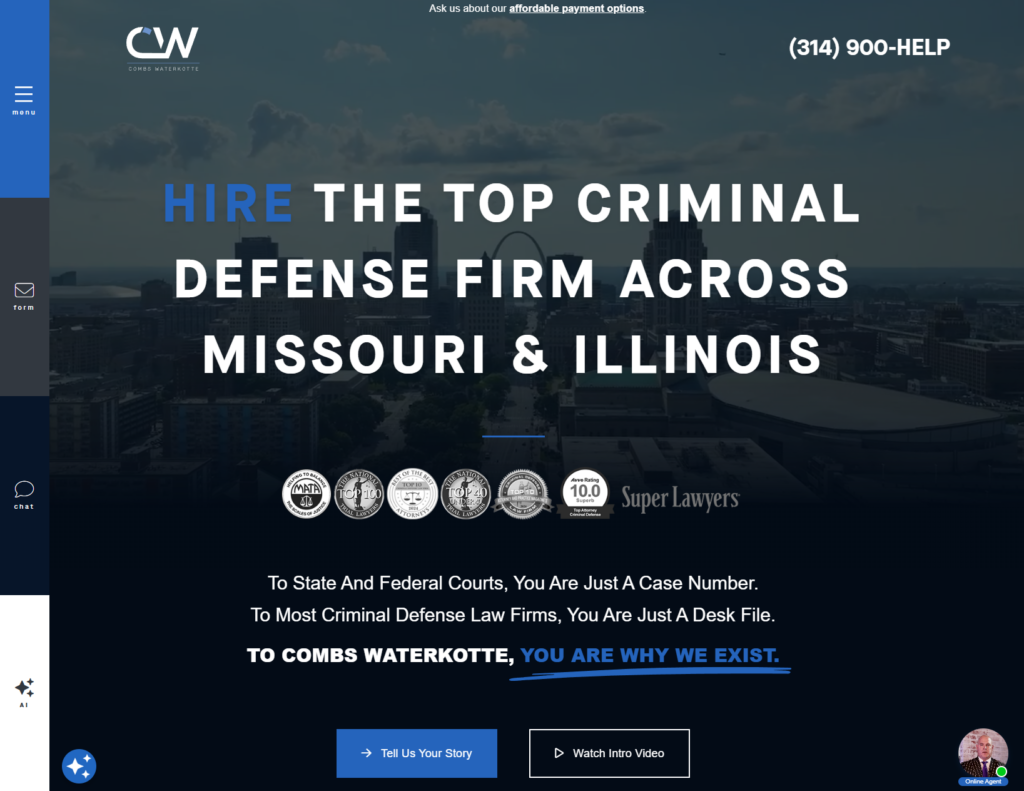
Strengths: Combs Waterkotte’s hero uses a faded, dusk-toned St. Louis skyline photo behind a bold, all-caps headline, “HIRE THE TOP CRIMINAL DEFENSE FIRM ACROSS MISSOURI & ILLINOIS,” with “HIRE” picked out in blue against otherwise white text. It’s direct and unmissable. A row of seven badges sits just below the headline, including Super Lawyers, National Trial Lawyers Top 100, and a 10.0 Avvo rating, stacking third-party validation before a visitor scrolls any further. Here’s what else stands out:
- The copy escalates in three short lines: “To State And Federal Courts, You Are Just A Case Number,” then “To Most Criminal Defense Law Firms, You Are Just A Desk File,” landing on “TO COMBS WATERKOTTE, YOU ARE WHY WE EXIST,” underlined in blue for emphasis. It’s a clear jab at competitors, and it reframes the firm’s value in contrast to a common client fear;
- Two CTA buttons sit side by side, a filled “Tell Us Your Story” and an outlined “Watch Intro Video,” giving visitors a choice between acting now or learning more first; and
- A persistent left-side rail (menu, form, chat, AI, online agent) stays fixed as you scroll, keeping every contact method one click away regardless of where a visitor is on the page.
Key Takeaway: Naming the competition’s shortcomings directly, “most criminal defense law firms treat you like a desk file”, is a bolder move than most firms make. However, it works here because the site backs the claim with a wall of real credentials right above it. If you want to draw a contrast with how competitors treat clients, the claim needs third-party proof sitting close enough that a visitor can verify it in the same glance.
11. MayesTelles PLLC
Company Website | Testimonials | Contact Info
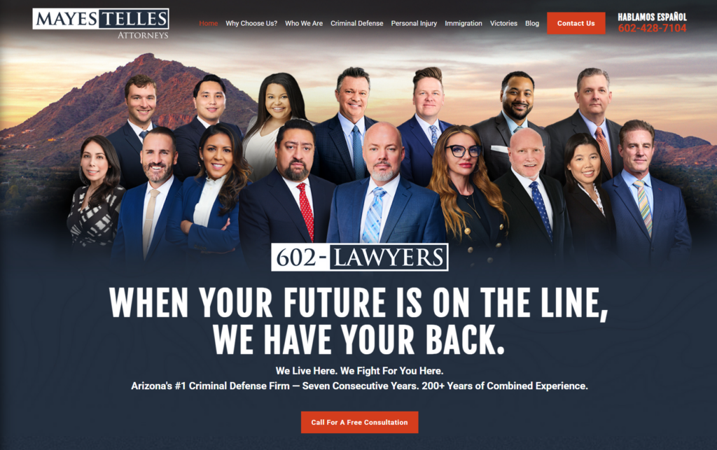
Strengths: MayesTelles’ hero features the firm’s entire roster, fourteen attorneys standing together against a Camelback Mountain sunset backdrop. It’s an unusually large group to feature in one photo, and it reads as genuine scale rather than a stock crowd. A boxed “602-LAWYERS” mark sits at the center of the group like a second logo, doubling as a memorable, dialable phone number. Below the photo, bold white all-caps text reads “WHEN YOUR FUTURE IS ON THE LINE, WE HAVE YOUR BACK,” followed by “We Live Here. We Fight For You Here.” Here’s what else stands out:
- “Arizona’s #1 Criminal Defense Firm — Seven Consecutive Years. 200+ Years of Combined Experience” stacks a ranking claim and an experience stat into one line, giving visitors two different kinds of proof without needing separate sections;
- The Camelback Mountain photo behind the team ties the firm visually to Phoenix specifically, rather than a generic city skyline or plain studio backdrop most competitors use; and
- “Hablamos Español” sits in the top right next to the phone number, in the same size and weight as the English contact info, not tucked into a footer link.
Key Takeaway: A photo with this many people only works if it’s staged with intention. MayesTelles arranges all fourteen attorneys in a natural, layered group rather than a stiff grid, and pairs it with a phone-number-as-logo device (“602-LAWYERS”) that turns a contact detail into a piece of the brand itself. If your firm has genuinely grown to this size, showing the whole team at once can communicate capacity in a way a single founder photo can’t.
12. Konta Georges & Buza, P.C.
Company Website | LinkedIn | Contact Info

Strengths: The hero pairs a faded, ghosted illustration of a Manhattan courthouse facade in the background with three attorneys standing in a staggered lineup, all in matching navy suits. A restrained navy, white, sage, and soft gray palette runs through the whole page. Here’s what stands out:
- The headline, “WE FIGHT & HAVE THE VERDICTS TO PROVE IT,” uses a large serif typeface that reads more like a law journal or a courtroom plaque than a typical sans-serif legal site;
- The three attorneys are staggered front-to-back and slightly offset rather than lined up shoulder-to-shoulder, giving the photo depth and movement; and
- The subtext under the headline, “Exceptional Legal Representation,” followed by a specific paragraph naming both criminal defense and civil rights/wrongful incarceration work, signals a firm that handles serious, high-stakes cases beyond routine defense work.
Key Takeaway: Serif typography and a subdued palette can make a criminal defense site feel more like an established institution than a typical fight-for-you pitch. Konta Georges & Buza leans into a restrained, editorial look rather than bold primary colors or aggressive slogans, and it still reads as confident.
13. The Law Office of David A. Breston
Company Website | Testimonials | Contact Info

Strengths: The hero immediately presents an embedded video labeled “Learn about our firm in 90 seconds” sitting right where a hero image usually goes. The headline, “The Smart Choice for Criminal Defense in Houston,” sits in a large serif font next to it, backed by three quick differentiators above it: “PERSONAL ATTENTION • 24-HOUR RESPONSE • EXPERIENCED TRIAL ATTORNEY.” A single bold red CTA, “request free consultation,” is the only splash of saturated color in an otherwise black-and-white page. A few other choices worth calling out:
- Below the hero, a black band displays four case outcomes side by side, letting results speak before any biography or credentials section;
- Putting a video directly in the hero’s visual slot rather than a static photo is a genuinely different choice from nearly every other site in this list; and
- The red accent color is used sparingly and consistently so it reads as a deliberate brand choice.
Key Takeaway: Restraint can be its own kind of boldness. Where most competitors reach for a big group photo or a stack of badges, this site commits to black, white, and a single red accent, then uses that discipline to make the video button and the CTA the only things that visually pop. If your firm wants a higher-end feel, limiting the palette this tightly forces every remaining color choice to actually mean something.
14. Knutson + Casey
Company Website | LinkedIn | Contact Info
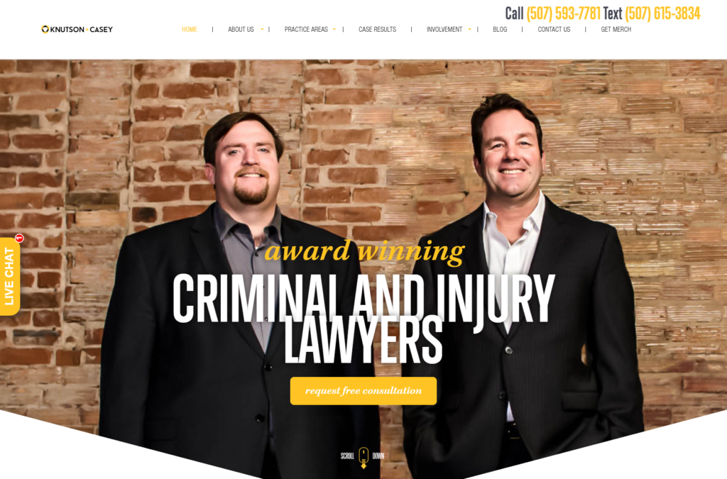
Strengths: The hero commits to a real exposed brick wall as the backdrop for the two founding attorneys, standing casually rather than in a stiff studio pose, with “award winning” in a loose gold script layered over “CRIMINAL AND INJURY LAWYERS” in a massive bold sans-serif. The whole image sits inside a triangle-cut frame with angled edges instead of a standard rectangle, giving the entire hero a distinctive shape before a visitor even reads the headline. A few other things worth noting:
- A gold “request free consultation” button in the same script font as “award winning” ties the CTA visually to the headline treatment rather than looking like a bolted-on element;
- The brick texture and casual stance make the firm feel more like a local, established fixture than a polished corporate practice; and
- A vertical “LIVE CHAT” tab pinned to the far left edge of the screen stays visible no matter how far a visitor scrolls, an unusual placement compared to the typical bottom-right chat widget.
Key Takeaway: A triangular crop and a textured, unconventional backdrop can make a hero feel custom-built rather than templated, even when the core elements (two attorneys, a bold headline, a CTA button) are standard. Small deviations from the expected rectangle and studio backdrop go a long way toward making a site memorable.
15. Evergreen Attorneys
Company Website | Testimonials | LinkedIn | Contact Info

Strengths: The homepage opens with a video hero cutting between shots of the attorneys at work and Evergreen, Colorado. Over the footage, the headline “U.S. Supreme Court-Winning Federal Criminal Defense Team” sits in a warm cream serif type against the courtroom setting, and a cream card reading “Speak confidentially with a federal defense attorney” anchors the bottom of the hero as the CTA. All of this sits comfortably under a cream and forest green navbar. However, a couple of things stand out beyond the video itself:
- Naming the town in the firm’s name and cutting to shots of Evergreen ties the firm directly to its home base, even though the practice itself is federal and handles cases nationwide;
- The firm’s own copy is explicit about its narrow focus in federal criminal defense work and partner-level attorneys only, positioning boutique specialization as the primary differentiator.
Key Takeaway: A video hero works especially well when a firm wants to establish both people and place in the same few seconds, something a single photo can’t easily do. Pairing that with copy that spells out exactly who the firm doesn’t serve (no family law, no fresh associates) helps a niche, high-stakes practice signal focus rather than trying to appeal to everyone.
How to Get a Great Criminal Defense Law Firm Website
Since competition for clients among criminal defense law firms is so stiff, every step you take to make your website design work better for potential clients can help you outperform other websites. Here are four ways you can get a well-designed website that draws in new business for your criminal defense law firm.
1. Create a Compelling Website Design
Don’t settle for a busy website with long blocks of text and under-exposed snapshots of your legal team. Your potential clients are in immediate need of legal help. Your website should make it clear from the second they land on your homepage what you can do for them and how they can reach you.
Some easy elements to incorporate into your website design:
- Powerful graphics coupled with simple text;
- Bold, high-contrast colors; and
- Easy-to-find CTAs.
Put the most important information front-and-center, and make your website easy to navigate.
2. Post Valuable Content
Individuals coming to your website are in a state of crisis. The criminal justice system is confusing and complex. Posting blogs, videos, and graphics that break down that complexity into bite-sized, understandable information builds trust with potential clients. It can also boost your search engine rank since Google prioritizes websites that offer a valuable user experience.
The fastest way to make your case to potential clients is through the use of testimonials and Google reviews. Studies show that 93% of consumers make purchase decisions based on online reviews. Give your client testimonials prominent placement on your website—we recommend posting at least one testimonial or Google reviews widget on each page of your website.
4. Hire a Professional Website Design Team
To stand out from the crowded field of criminal defense attorneys, you need a website that offers a top-tier user experience. Give potential clients the confidence to hire your firm through impactful graphics, informative content, and a clear demonstration of the value your law firm offers.
A good design firm also has deep legal marketing SEO knowledge and digital marketing expertise to help your site rank above its competitors. Juris Digital is the leading law firm website design agency with more than a decade of experience creating cutting-edge websites for leading criminal defense law firms across the U.S. Our content writers and editors all have legal backgrounds and are experienced in producing SEO-optimized blogs, case studies, and web site content that ranks on Google search. Check out our full range of law-firm focused digital marketing services, and reach out for a free consultation.
Ready to Elevate Your Law Firm’s Marketing?
Let’s TalkLast updated: