Note from the author: My name is Matt Green. I am the Chief Strategy Officer here at Juris Digital. Before you dive into the list of best law firm websites, I want you to know that this post is a labor of love. Creating and optimizing websites for law firms has been the focus of my professional life for over a decade. This work has afforded me a life for which I am profoundly grateful, and drawing inspiration and ideas from others is an essential key to my success. I genuinely hope you find inspiration in the websites included here, and that you are able to return to this post again and again for ideas to help you keep moving forward.
This post has three parts:
Part one: Over 140 of the best law firm websites, curated
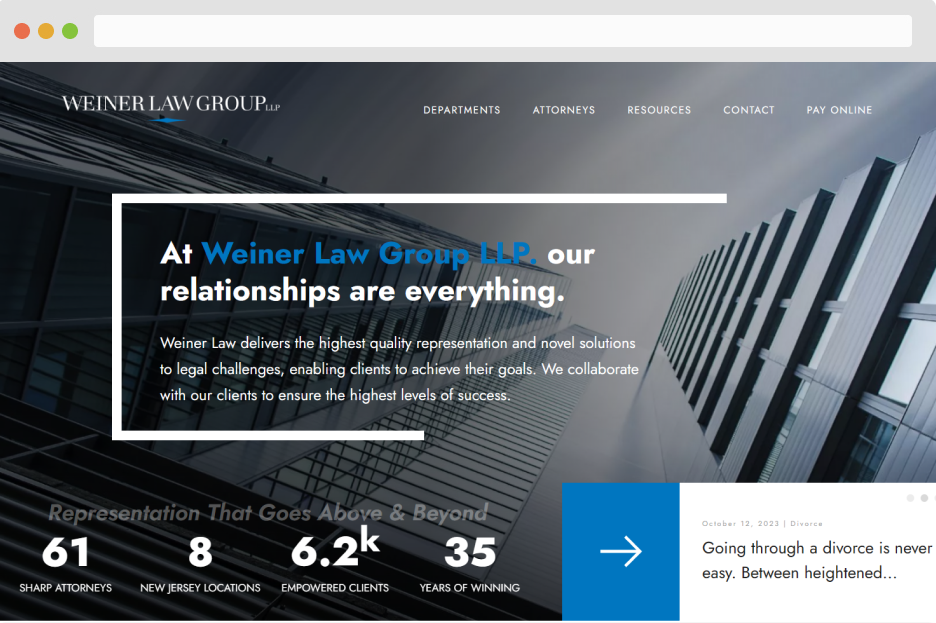
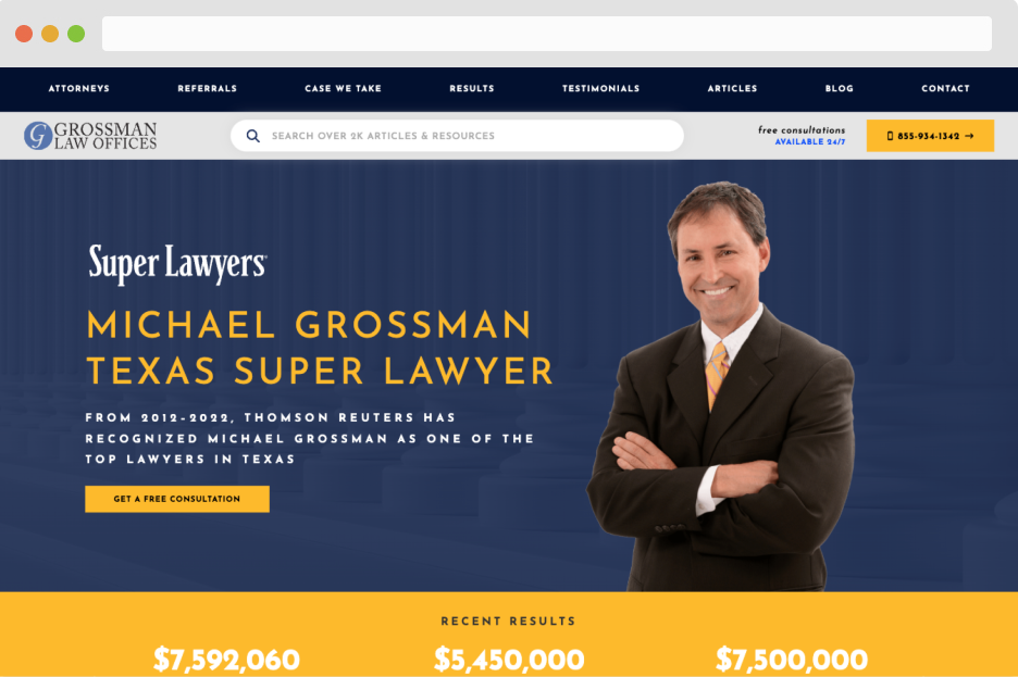
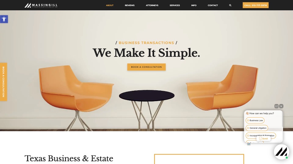
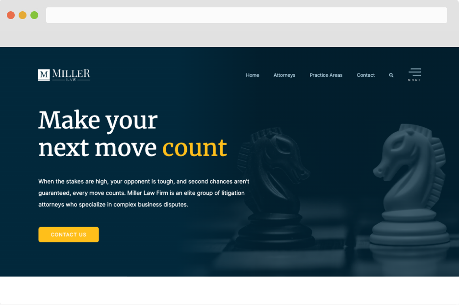
Part one of it is a curation of 140 law firm websites that are listed by the top various legal marketing websites. So, rather than having to click through to all 10 of those articles, you can review our list and see all the websites they mention. This section includes bare-bones information: The name of the law firm, a link to their website, and a screenshot of the website’s homepage. Go to part one.
Part two: My personal top-10 list of law firm websites
Part two is a list of my current favorite law firm websites. In this section, you’ll find a more detailed and nuanced breakdown of what I believe – as a seasoned digital marketer – makes these sites so exceptional. Go to part two.
Part three: 5 of the best websites from Juris Digital
Part three is the most self-serving of the three sections. Here you’ll find my pick of the best law firm websites that were designed and developed by Juris Digital. We are a digital marketing agency for law firms, and we are proud of our work. If you’re in the market for a new website for your law firm, we hope you’ll reach out to discuss your project with us. Go to part three.
A Curated List of 140+ of the Best Law Firm Websites
The websites below represent a curation of all of the websites listed within articles that rank on page one of Google for the keyword “best law firm websites”. So, rather than clicking on all of those articles and adding to your open-browser-tab problem, you can get the same dose of inspiration from this post alone. How great is that?!
Note: In some cases, the website screenshots below don’t fully generate due to how those web pages are being rendered. In those cases, go ahead and click the tile to view the live site.
Want to learn more about how this list was developed? Click here.
My Personal Top-10 List of Legal Websites
The list below represents websites that fit my criteria for what makes a law firm website exceptional:
The best law firm websites increase the firm’s overall value by 1) enhancing the perception of its brand and 2) reaching more of the capturable market.
Put another way, an exceptional law firm website should make you look good, and it should make you money. For me, there are three common elements required to achieve this result:
- Differentiation
- Subject Matter Authority
- Usability
Each of the sites listed below exceeds in achieving distinction in these three areas. Let’s get into it.
1. Kelley | Uustal
Visit website / Designed by: People Design
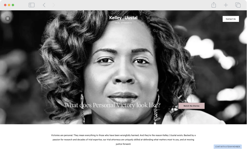
What I love about KelleyUustal.com:
- The imagery. Close-up shots of the people that the firm helps is a really effective way to trigger emotion and interest.
- The messaging. The firm drills home the idea of “personal victory”, placing their client squarely in the role of the hero of the story, as opposed to so many firms that paint themselves as the star of the show.
- The videos. The firm has invested in Oscar-Award quality videos to tell the stories of their clients. They are powerful and compelling, and they differentiate this firm in a truly impressive way.
2. Atticus
Visit website / Designed by: Unknown

What I love about Atticus.com:
- Client-Centric Approach: Atticus.com focuses on the needs and concerns of their clients right from the start. Their commitment to providing free initial advice and ensuring clients don’t pay unless they win is prominently highlighted, making the site immediately welcoming and reassuring to potential clients.
- Clear and Direct Communication: The website excels in explaining its services and processes in a straightforward and easy-to-understand manner. This clarity in communication helps demystify legal processes for visitors, making legal assistance feel more accessible.
- Innovative Service Model: Atticus.com presents itself as a new kind of law firm, emphasizing its mission to reinvent how people seek legal help. This innovative approach, combined with their promise of connecting clients with the right lawyers, sets them apart in the legal landscape.
3. Marble
Visit website / Designed by: Unknown
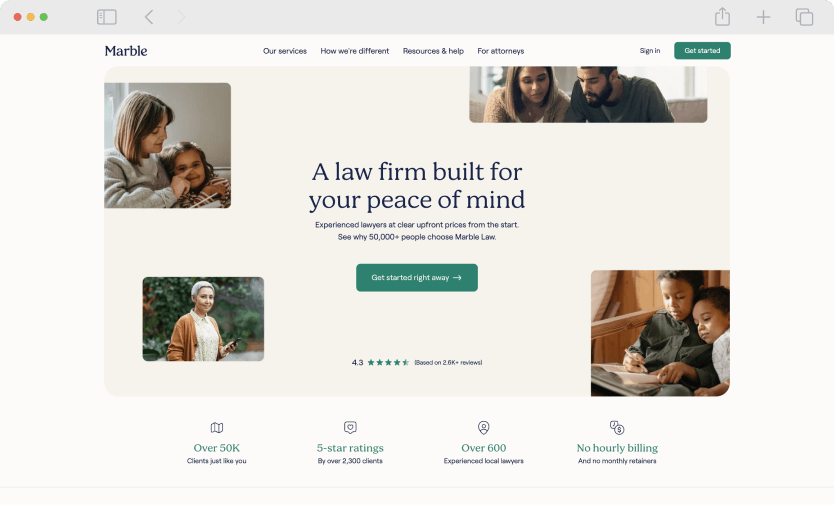
What I love about Marble.co:
- User-Friendly Interface: The website features a clean, modern design that’s easy to navigate. Its intuitive layout makes it simple for visitors to find information about the firm’s services and pricing.
- Engaging Visuals: Marble.co uses compelling imagery and graphics that effectively communicate their message and services. The visuals are not only eye-catching but also help in breaking down complex legal information into more digestible content.
- Client Testimonials and Reviews: The site smartly incorporates client testimonials and reviews, providing social proof and building trust with potential clients. These real-life success stories and ratings add a personal touch and credibility to the firm’s online presence.
4. Work Lawyers
Visit website / Designed by: Unknown

What I love about WorkLawyers.com
- Extensive Resource Library: The website hosts a large library of informative articles about employment law, providing valuable insights and information to visitors. This extensive resource not only establishes the firm’s expertise in employment law but also serves as a helpful tool for individuals seeking to understand their rights and legal options.
- Clear and Empowering Messaging: WorkLawyers.com effectively communicates the message that employees have rights that need to be protected. This empowering approach is evident throughout the site, encouraging visitors to take action if they face unlawful treatment at work.
- Visual and Functional Clarity: The website combines clean visuals with a functional layout, making it easy for users to navigate and find the information they need. The use of icons and images helps to break down complex legal concepts into more understandable terms, enhancing the overall user experience.
5. Rosen
Visit website / Designed by: Unknown
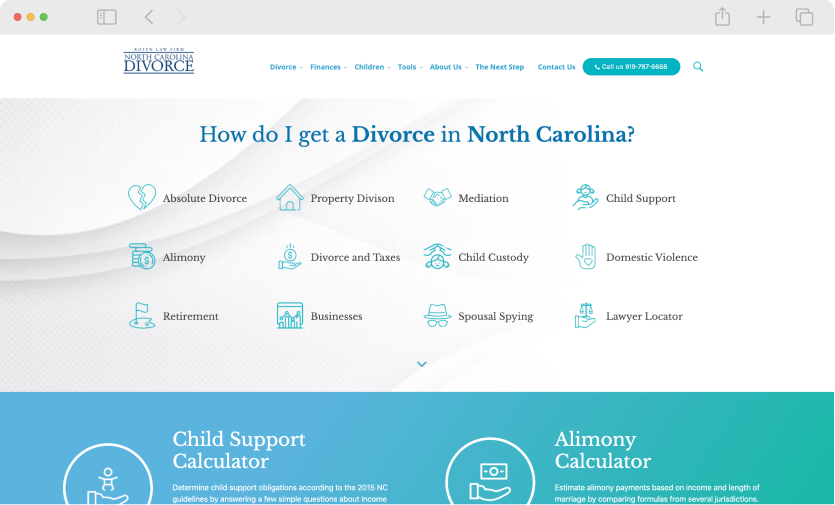
What I love about Rosen.com:
- Focus on Client Education: Rosen.com prioritizes educating their clients over self-promotion. The firm shares valuable legal information and insights, demystifying the divorce process and empowering clients with knowledge. This approach reflects a commitment to transparency and client support.
- Informative Content: The website provides a wealth of information on North Carolina divorce law, offering clear, legal advice and resources. This content is not only informative but also accessible, helping visitors understand complex legal matters.
- Client-Centric Approach: The site’s narrative emphasizes the firm’s history of sharing legal ‘secrets’ to simplify the divorce process for their clients. This client-centric approach, focusing on clarity and guidance, sets them apart from firms that might prioritize showcasing their achievements.
6. Justin Ziegler
Visit website / Designed by: The attorney’s nephew probably

What I love about JustinZiegler.com
- It’s ugly. Ok, so here’s the thing. There is nothing pretty about this website. But you know what? It’s effective! We love that Mr. Ziegler is saying to his prospective client, “look, I don’t spend a bunch of money on my website design. I do that shit myself. But, on my website, you will learn exactly how I get results for my clients, and you’ll know that I am a far better lawyer than web designer”.
- SEO strategy. What we really love about this site is the SEO strategy. This site ranks well and brings in traffic for all sort of creative, long-tail -settlement related keywords, eg: If you browse the site you’ll see that Mr. Zeigler has created these massively informative pages using all original content – including photos, police reports, videos etc. – from his actual clients, which is why the content ranks so well, and why we’re sure it’s effective at generating new cases.
Could this site use a facelift? Big time. But it’s clearly effective, and it’s unique, and we are big fans of the hustle.
7. Injury.com
Visit website / Designed by: Morgan & Morgan

What I love about Injury.com:
- Client-Focused Approach: The website prioritizes helping visitors through their injury journey, emphasizing support and compensation. This client-focused approach is evident in their messaging, which is dedicated to assisting clients rather than highlighting the firm’s achievements.
- Ease of Use and Accessibility: Injury.com is designed for ease of use, offering fast approval, simple case management, and transparent pricing. The site’s functionality allows clients to easily check their case status and communicate with their legal team, enhancing the user experience.
- Comprehensive Legal Information: The site provides detailed information on various types of injury cases, from auto accidents to workers’ compensation. This comprehensive coverage helps educate visitors about their legal options and the firm’s areas of expertise.
8. JHPII
Visit website / Designed by: Reduced Design
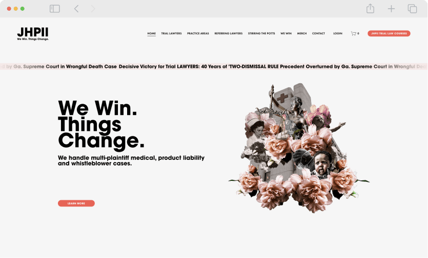
What I love about jhpii.com:
- The messaging: The slogan is A+. It conveys a complex idea – the concept of a lawsuit not just being a tool for the enrichment of the plaintiff but rather for societal change for the better – and distills it in just four words.
- The imagery: The banner imagery is wildly unique and creative and not something you’ll see on any other law firm website. It’s like a contemporary art-fueled collage. It’s bold and memorable.
I could go on and on because, frankly I love everything about this site. Big props to Antonio Lewis at Reduced Designs for creating this beauty.
9. Verrill Law
Visit website / Designed by: Great Jakes
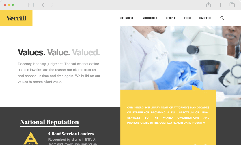
What I love about Verrill-Law.com:
- Impactful Tagline: The tagline “Values. Value. Valued.” on the homepage effectively captures the essence of the firm’s approach. It succinctly conveys their commitment to core values, delivering value to clients, and valuing client relationships, achieving differentiation in a crowded market.
- Professional and Trustworthy Design: The website’s design exudes professionalism and trustworthiness, aligning with the firm’s emphasis on decency and honesty. This design approach reinforces their commitment to upholding high ethical standards in their practice.
- Focus on Client Trust and Long-Term Relationships: The emphasis on values and the reasons clients choose and trust them repeatedly highlights their focus on building long-term client relationships. This approach differentiates them from firms that might focus more on showcasing their successes or accolades.
10. Protass Law
Visit website / Designed by: Postali
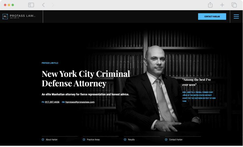
What I love about protasslaw.com:
- The color scheme: Not that there is anything ground-breaking about blue and black, but combined with the black and white photo and the white text, this color scheme just screams “I’m a bad ass lawyer”.
- The testimonial on the main banner: The fact that this attorney has a judge calling him “the best she’s ever seen” right on his homepage is such a powerful piece of social proof and imagine has landed him some big clients.
5 of the Best Juris Digital Websites
Now it’s time to show off our chops. Here are my five favorite Juris Digital websites (at the moment). To see more of our work, check out our portfolio.
Let’s Build an Amazing Website Together
In the market for a website for your law firm? We’d love to work with you. Reach out anytime to discuss your project with us. You can also check out our website service page for more information and FAQ about what it looks like to partner with us.
How we made the big list of law firm websites
Here’s what I did to create the big list of the top lawyer websites:
- I asked ChatGPT to analyze the top-ranking articles on Google for the term “best law firm websites”.
- The AI then returned to me a list of all of the law firms listed in those articles and their corresponding website URLs.
- Then, I cleaned up the data, removed duplicates, updated bad links, sorted alphabetically, etc.
- From that list, I asked Paul (our head of development) to find a way to display up-to-date image tiles of each website’s homepage, to make the tiles look nice, and link out to the live site.
And bam! A list of 150 of the best law firm websites curated in one place rather than spread across ten different articles. I’m really quite clever, aren’t I? (I also require lots of adulation, so please agree that I am clever.)

