Estate planning firms have more challenges than other law practices in attracting clients. Not only are you working within a saturated market of other estate planning and probate lawyers, but you also have to compete against do-it-yourself websites that tout estate planning services by simply filling out an online form.
To be competitive in this market, you need a estate planning lawyer website design that conveys your firm’s talent and demonstrates to potential clients that hiring you is their best option. In this article, we’ll share 15 of the best website designs for estate planning lawyers and what makes them stand out from the competition.
Want a site like one of these built for your firm? We build custom, conversion-focused websites for estate planning practices.
15 of the Best Estate Planning Attorney Websites
| Firm | Standout feature | Palette/mood | Key takeaway |
|---|---|---|---|
| 1. Massingill Attorneys and Counselors at Law (Juris Digital design) | Hover-activated icon service blocks, multiple CTAs throughout | Bright, high-contrast, modern | Make key info scannable on desktop and mobile |
| 2. Robbins Estate Law | Two-path CTA card split by life situation | Warm, candid family photo, dark overlay | Split the path early for visitors at different starting points |
| 3. Wolf Solovy Zivin, LLP (Juris Digital design) | Chess-piece header image, attorney/CPA dual credential | Strategic, symbolic imagery | A symbolic image can beat a standard group photo |
| 4. Klenk Law | Veteran discount banner, awards, nationwide local SEO blog | Trust-driven, credential-heavy | Reviews and testimonials belong front and center |
| 5. Modern Legacy Law Group | Candid founder photo, understated single CTA | Dusty pink, cream & forest green | Let a warmer tone match a genuinely relationship-based practice |
| 6. Davidow, Davidow, Siegel & Stern | Repeated “100 Years” credibility marker, self-select photo icons | Green & gold, generational | Give a rare milestone real visual weight |
| 7. Aspen Estate Planning | Full-bleed namesake forest photo, no text-box overlay | Dark evergreen & gold | Build the palette around a natural visual reference to the name |
| 8. Farrauto Berman Slater & Michaeli | Boxing glove illustration paired with settlement-focused copy | Deep indigo & orange | Let copy reframe what a bold image means |
| 9. Theresa Clancy Law | Headline naming client procrastination directly | Sage green, candid portrait | Name the exact hesitation instead of a generic pitch |
| 10. Jonathan C. Turner Law Office | Full caterpillar-to-butterfly life cycle sequence | Muted gray, vivid orange accents | Carry a metaphor through in sequence, not as a single image |
| 11. Nodelman Law | Floating testimonial card overlapping the hero photo | Navy & white, candid beach photo | Pair an emotional photo directly with a specific testimonial |
| 12. Salines-Mondello Law Firm | Stacked “Plan. Prepare. Protect.” headline, logo mark in the text | Full-bleed beach photo, blue accents | Commit visually to a three-part message structure |
| 13. Sandahl & Damhof | Dated “Minnesota’s Best” badge embedded in the hero photo | Gold & white, polished | A specific, current award beats a vague “award-winning” claim |
| 14. Burner Prudenti Law | “Women-Owned” identity stated directly in the headline | Blue & green, interlocking logo | State a core identity plainly instead of relying on imagery alone |
| 15. Skipton Law, LLC | Compass watermark, signed handwritten pull-quote | Candid hiking photo, warm tones | Carry a brand symbol through the copy, not just the logo |
TL;DR — Top 5 Estate Planning Website Designs
- Massingill Attorneys and Counselors at Law: clean, high-contrast design built around scannable, icon-driven service blocks.
- Robbins Estate Law: a hero that splits visitors by life situation instead of by practice area.
- Wolf Solovy Zivin, LLP: a chess-piece header image that reinforces the firm’s strategic, CPA-backed positioning.
- Klenk Law: a Veteran-owned firm that leads with reviews, awards, and a nationwide local SEO strategy.
- Modern Legacy Law Group: a soft, boutique palette that signals a relationship-first approach to planning.
1. Massingill Attorneys and Counselors at Law
Company Website | Testimonials | LinkedIn | Contact Info
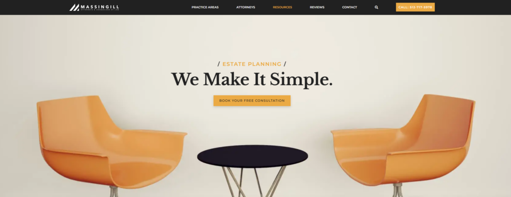
Strengths: The Massingill website is clean and modern. Its high contrast, bright colors, and use of negative space convey the message of their slogan—that they make estate planning simple. Other ways the site design sets this law firm apart:
- Their use of icons pairs perfectly with features of their law firm, meaning a client in need can easily distinguish between their practice and the competition. Keeping information easy to scan and digest is a part of best practices for any estate planning website.
- Multiple calls to action (CTAs) help potential clients easily reach the firm, which is crucial for an estate planning lawyer website design. This website uses buttons, a navigation bar, and phone numbers in various parts of the website to help clients reach out.
- The firm’s website design clearly states its services in bold squares with an easy background image to further illustrate each service. Hovering over each square brings up more information about each practice area, keeping the design simple at a glance.
Key Takeaway: Your estate planning website should be easy for clients to navigate on desktop and mobile. Make sure the important information is front and center and that all contact information is easy to find in multiple places throughout your website.
2. Robbins Estate Law
Company Website | Testimonials | LinkedIn | Contact Info
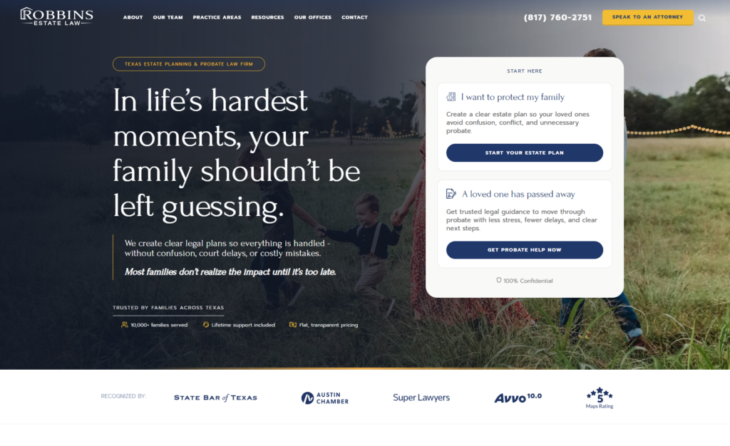
Strengths: The hero pairs a warm, candid photo of a family walking through a field with a dark overlay, giving an emotionally heavy topic a softer, more human entry point than the typical formal office photo. A floating card on the right splits visitors into two clear paths right away: planning ahead versus handling a loss that’s already happened. This page adapts to two very different emotional states instead of forcing everyone through the same message, which is a unique strategy. A few other choices stand out:
- Three quick trust markers (families served, ongoing support, transparent pricing) sit just below the headline, addressing common estate planning hesitations before a visitor has to go looking for that information;
- A row of recognizable third-party badges appears directly beneath the hero, giving visitors an easy way to validate credibility at a glance; and
- Splitting the CTA cards by life situation instead of by practice area speaks to what the visitor is actually going through, not just the legal service they need.
Key Takeaway: Estate planning sites often default to either overly clinical service lists or generic warmth without direction. This homepage appeals to both specificity and compassion at the same time. It acknowledges the emotional weight of the topic while still routing visitors efficiently based on their actual situation. If your firm serves people at very different starting points, splitting the path early can make the site feel like it understands the visitor.
3. Wolf Solovy Zivin, LLP
Company Website | LinkedIn | Contact Info
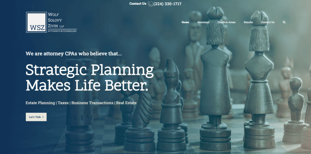
Strengths: Imagery is a great way for estate planning websites to stand out. The chess pieces as the header image are not only unique but serve as a symbol of Wolf Solovy Zivin’s strategic brand. Along with the memorable design, this website stands out in the following ways:
- The home page highlights the unique fact that the attorneys are also CPAs, a key differentiator from other estate planning law firms. Focusing on the unique characteristics of your firm can make it stand out and win a client’s attention.
- A single-click phone number at the top center of each page makes it convenient for potential clients to contact the firm over the web or by phone in one easy step.
- This website design clearly states what services the firm offers in one of its web blocks. When designing estate planning websites, you want clear information on your services or areas of practice that your client can process quickly.
Key Takeaway: Header images that represent the kind of services you provide have a stronger impact than using a group photo of your legal team as your main image, and you need to stand out in a field as competitive as estate planning. A strong brand with memorable images, slogans, and talking points will stand out to potential clients. Think of how your firm’s values or message can be depicted with visuals to convey more meaning faster.
4. Klenk Law
Company Website | Testimonials | LinkedIn | Contact Info
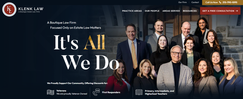
Strengths: Klenk Law’s website has strong copy to reassure clients the firm is a reputable and trusted choice for all their estate planning needs. The message is reinforced through a free consultation button and testimonials. A few other highlights of this well-designed estate law website include:
- Klenk Law is a Veteran-owned small business, and they highlight this in a section geared toward Veterans. They also offer a 20% discount for veterans and include this information in a red banner at the top of all pages, which speaks to their values and can, hopefully, drive more sales.
- Their awards and recognitions are displayed on the homepage, which establishes trust and expertise. Throughout the site, there are testimonials and case studies that drive the point even further that potential clients can trust Klenk Law.
- An SEO-optimized blog both addresses common client concerns and deftly tackles local SEO for a practice that has locations nationwide.
Key Takeaway: Featuring client reviews and testimonials of your estate planning services is a must if you want to turn prospects into business for your firm. Since 93% of consumers say online reviews influence their buying decisions, you’ll want to put reviews in a prominent position on your homepage and include them on each page of your website.
5. Modern Legacy Law Group
Company Website | LinkedIn | Contact Info

Strengths: A dusty pink announcement bar sits above a cream and forest green color scheme, giving the whole page a soft, boutique feel rather than the navy-and-gray formality most law firm sites default to. The hero splits the page in half: a serif headline and short intro on a plain cream background to the left and a candid, sunlit street photo of the two founders on the right. But that’s not all:
- The headline commits fully to the firm’s core promise, keeping families out of court and out of conflict, instead of opening with a generic estate planning tagline;
- A single outlined “Learn More” button in the same muted pink as the top banner keeps the CTA understated; and
- Photographing the two attorneys walking together outside their office reinforces the firm’s relationship-first positioning before a visitor reads a word of copy.
Key Takeaway: Estate planning doesn’t have to look like a bank or a courthouse. Modern Legacy Law Group uses a warmer, more boutique palette and casual photography to signal a relationship-based practice. This works well if you have a firm with an approach that is genuinely warmer and more personal than a typical estate planning firm. Let the visual tone match that instead of defaulting to a serious, corporate look.
6. Davidow, Davidow, Siegel & Stern
Company Website | Testimonials | LinkedIn | Contact Info

Strengths: Green and gold anchor the whole page, from the boxed “DDSS” logo mark to the italic gold script overlaying “Protection & Planning For Generations” in the hero. The photo behind it, an elderly couple from behind, a young family in the distance, spans three generations in one frame, giving weight to a firm that’s been practicing since 1913. However, there’s more worth noting beyond the hero itself:
- Six circular photo icons sit right along the bottom edge of the hero image, splitting the firm’s broad practice into distinct entry points (Elder Law & Medicaid, Special Needs Planning, Estate Planning, Trusts, Probate & Estate Admin, Business) so a visitor can self-select instead of reading a long paragraph first;
- “100 Years” appears twice on the page in underlined gold, once in the hero subhead and again in a headline further down, repeating the firm’s single strongest credibility point; and
- “Listen To Lawrence” sits in its own utility bar above the main navigation, pointing to founder Lawrence Davidow’s media presence.
Key Takeaway: A century-plus of continuous practice is a genuinely rare claim, and this homepage treats it that way. It repeats the “100 years” figure in two separate spots and builds the entire hero image around generational continuity. For firms that have a specific, verifiable milestone like this, this is a great approach.
7. Aspen Estate Planning
Company Website | Testimonials | LinkedIn | Contact Info

Strengths: A full-bleed forest photo, dark evergreens with a stand of gold aspen trees lit up against them, fills the entire hero with no overlay box or contained text panel. The gold in the trees echoes the gold accents in the logo mark and the “Schedule a Consultation” button below. Additionally, the hero also has a heading that stands out from other estate planning firms: “Estate plans that work in real life — not just on paper.” The rest of the page backs up that opening line:
- The subhead names a specific client and follows it with a pointed line: “Because when your situation isn’t simple, a standard estate plan isn’t enough”;
- The photography ties directly to the firm’s name; and
- A single gold button is the only high-contrast element on an otherwise dark, moody page, so there’s no question where the eye should land.
Key Takeaway: A photo doesn’t need a text overlay or a card to work as a hero background if the color palette and typography are planned around it from the start. Aspen Estate Planning lets the aspen trees themselves double as the brand’s namesake and its primary accent color, so the image and the identity reinforce each other instead of competing for attention.
8. Farrauto Berman Slater & Michaeli
Company Website | Testimonials | Contact Info
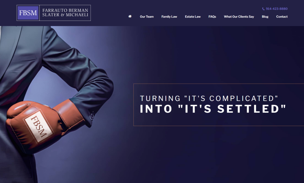
Strengths: A deep indigo background sets off a stylized, illustrated close-up of a suited arm wearing a boxing glove branded with the firm’s “FBSM” initials. It’s an unusual image for a family and estate law site for sure, but it catches your attention immediately because of that. An orange-bordered text box sits to the right with the line “Turning ‘it’s complicated’ into ‘it’s settled,'” the second half in bold to land the payoff. A couple of things build on that opening image:
- Pairing a boxing glove with calm, settlement-focused language creates a deliberate tension: the firm signals it will fight when needed, but the actual promise is resolution rather than prolonged conflict;
- The firm’s initials branded directly onto the glove tie the illustration back to the logo; and
- The navigation splits Family Law and Estate Law into separate top-level items, making clear upfront that this is a combined practice.
Key Takeaway: A single striking image can carry a lot of positioning weight if the copy next to it reframes what that image means. A boxing glove alone would suggest an aggressive, combative firm, but paired with “it’s settled” as the payoff, it tells visitors the firm is prepared to fight without making that their whole personality.
9. Theresa Clancy Law
Company Website | LinkedIn | Contact Info
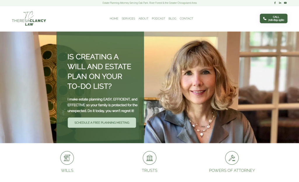
Strengths: A sage green color block splits the hero in half, overlapping a warm, candid photo of Theresa Clancy herself on the right. The text sits directly on the green panel: “Is Creating a Will and Estate Plan on Your To-Do List?” in bold white caps, a relatable, low-pressure framing for a topic most people avoid thinking about. A couple of details make this hero work beyond the headline:
- The photo is a real, unposed portrait, giving the page a personal, approachable feel;
- A cream-colored “Schedule a Free Planning Meeting” button sits against the green panel, offering enough contrast to stand out without breaking the palette; and
- Three simple icon badges for Wills, Trusts, and Powers of Attorney sit just below the fold, using the same green as the hero to tie the page together.
Key Takeaway: Naming the exact hesitation clients feel, “it’s on your to-do list, but you keep putting it off”, is more effective than a generic services pitch. Theresa Clancy Law’s hero speaks directly to procrastination around estate planning instead of assuming visitors are already motivated to act.
10. Jonathan C. Turner Law Office
Company Website | Testimonials | LinkedIn | Contact Info

Strengths: A muted gray sky serves as the backdrop for a full butterfly life cycle stretched across the hero, arranged along a single branch. Bold black text reads “Estate Planning for All Ages,” with a thin red underline beneath “All Ages” tying back to the firm’s red logo mark. A couple of choices make the metaphor land:
- The caterpillar-to-butterfly sequence pairs naturally with an “all ages” message, suggesting a plan that grows and changes at each life stage. For many, estate planning is not a static document throughout their entire life;
- A soft, desaturated background keeps the vivid orange and black butterflies as the only strong color in the hero, so the metaphor itself carries the visual weight instead of competing with a busy palette; and
- Placing the transformation sequence left to right, in the same reading direction as the page’s text, reinforces the idea of progression.
Key Takeaway: A metaphor works best in a hero when it’s carried through in sequence. Showing the full life cycle ties directly to the idea of a plan that evolves over a lifetime instead of a one-time transaction. Metaphors can be a strong attention-getter if used tastefully, like it’s done so here.
11. Nodelman Law
Company Website | Testimonials | LinkedIn | Contact Info
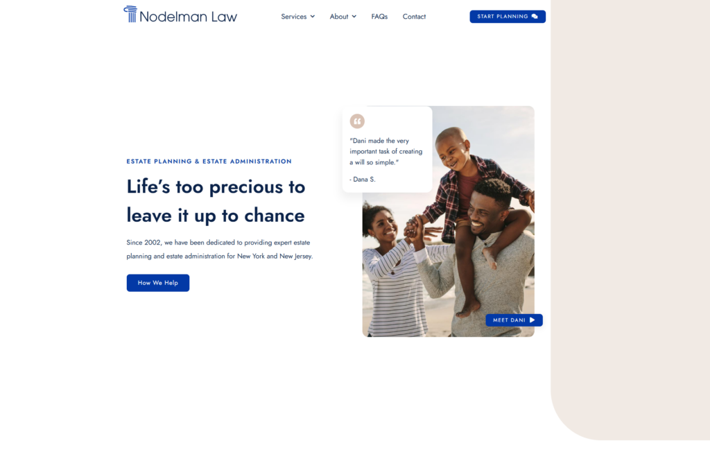
Strengths: A warm, candid beach photo of a family anchors the right side of the hero. Navy blue text on white keeps the left side clean and simple: “Life’s too precious to leave it up to chance.” A soft alabaster shape curves along the far right edge of the page, a small but distinctive break from the standard rectangle layout. Here are some reasons we like this minimalistic design:
- A floating white testimonial card overlaps the top-left corner of the hero image, pulling a specific client quote forward instead of tucking reviews further down the page;
- A “Meet Dani” button sits directly on the photo itself, tying the warm family image back to the actual attorney behind the firm; and
- The subhead states the firm’s founding year and the two states it serves in a single, factual sentence, giving visitors a quick credibility check.
Key Takeaway: Pairing a genuine emotional photo with a specific, attributed testimonial does more persuasive work than either element alone. A stranger’s face and a stranger’s words back each other up: the photo makes the message about family feel real, and the quote confirms the promise holds up with actual clients. If your firm has a strong client testimonial, placing it directly against your hero image rather than on a separate reviews page lets the two reinforce each other immediately.
12. Salines-Mondello Law Firm
Company Website | Testimonials | Contact Info

Strengths: A full-bleed beach photo of a multigenerational family walking together fills the entire hero: no side panel, no text box. Just white text laid directly over the image. “Plan. Prepare. Protect.” runs in massive letters down the left side, each word its own line, echoing the three-step structure a lot of estate planning firms describe. A few details reinforce that structure:
- The “o” in “Protect” is replaced with the firm’s circular wave logo mark, a small touch that ties the huge headline text back to the brand itself;
- Two CTA buttons, a solid “Request a Consultation” and an outlined “Watch Video,” sit side by side giving visitors a direct next step or a lower-commitment option; and
- A scrolling blue ticker beneath the hero lists specific service areas (Special Needs Planning, Medicaid Crisis Planning, Guardianship, VA Planning), letting visitors self-identify their situation.
Key Takeaway: A three-word structure like “Plan. Prepare. Protect.” works best when the design actually commits to it visually. Stacking the words is just one way of doing so. Giving each word its own visual space can make the framework easier to remember than a single flowing sentence would.
13. Sandahl & Damhof
Company Website | Testimonials | LinkedIn | Contact Info
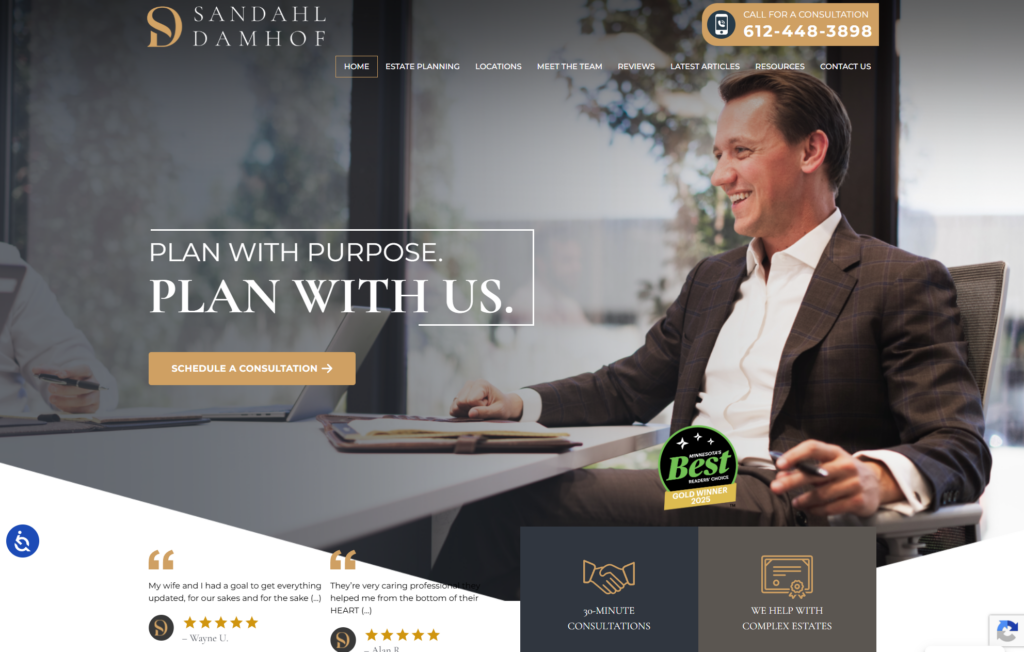
Strengths: A warm office photo with an attorney mid-conversation across a conference table fills the hero. The site has a gold-and-white color scheme that reads polished without feeling cold. “PLAN WITH PURPOSE.” sits in a thin outlined box, followed by the larger, bolder payoff line “PLAN WITH US.” underneath it. At first glance, it seems simple (really, it is), but there are other aspects of the page that make it even better:
- A round “Minnesota’s Best” Gold Winner badge sits low in the photo;
- Two real client testimonials with star ratings and the firm’s own circular logo mark sit directly below the fold, rather than being pushed to a separate reviews page; and
- Two dark info tiles (“30-Minute Consultations,” “We Help With Complex Estates”) sit at the very bottom of the hero section, setting expectations for both the process and the client fit before a visitor scrolls further.
Key Takeaway: A specific, current award (in this case, a “Minnesota’s Best” award) carries more weight than a vague “award-winning” claim, and placing it inside the hero photo keeps it from feeling like a bolted-on trust signal. Moreover, the award helps provide local credibility that may differentiate the firm.
14. Burner Prudenti Law
Company Website | LinkedIn | Contact Info
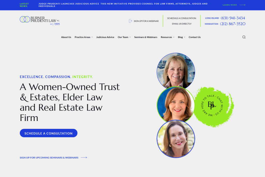
Strengths: A blue and green color scheme runs through the whole page, from the interlocking circle logo mark to the headline “EXCELLENCE. COMPASSION. INTEGRITY.” in matching blue-and-green text. Three round attorney headshots stack vertically on the right, each with a different colored ring border, next to a hand-painted green splash reading “WE ARE HERE TO TALK. CHAT WITH US.” circling the firm’s monogram. A couple of other features give the page real substance beyond the visuals:
- The headline states “A Women-Owned Trust & Estates, Elder Law and Real Estate Law Firm” directly, rather than leaving that identity to be inferred from the photos alone;
- A scrolling news bar above the header announces a specific, current initiative (Judge Prudenti’s “Judicious Advice”), giving the firm a sense of active momentum; and
- Two separate phone numbers for Long Island and Manhattan sit in the header, letting visitors immediately confirm the firm serves their specific location.
Key Takeaway: Stating an identity like “women-owned” directly in the headline removes any ambiguity about what the firm wants to be known for. If a specific identity or ownership structure is core to how your firm wants to be perceived, say it plainly instead of relying on imagery alone to communicate it.
15. Skipton Law, LLC
Company Website | Testimonials | LinkedIn | Contact Info
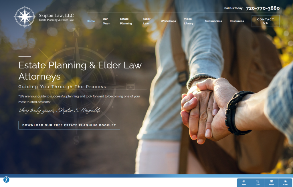
Strengths: A close, candid photo of two people holding hands on a hike fills the entire hero with a compass emblem watermarked faintly into the image itself. “Estate Planning & Elder Law Attorneys” leads the headline, followed by “Guiding You Through The Process,” directly picking up the compass and journey imagery already established. A few smaller choices reinforce that same idea:
- A pull-quote signed “Very truly yours, Skipton S. Reynolds” in a handwritten-style script sits below the headline and helps break up the standard font choice;
- “Download Our Free Estate Planning Booklet” gives visitors a low-commitment resource to take before ever booking a consultation; and
- A fixed bottom-right bar offers four distinct contact methods including Text, Call, Email, and Chat.
Key Takeaway: A compass as a brand mark only pays off if the language around it commits to the metaphor too. Pairing “guiding you through the process” with an actual compass watermark and a signed, letter-style quote makes the firm feel like a personal advisor.
How to Get a Great Estate Planning Law Firm Website
Estate planning and probate lawyers need a website that will help them build connections with potential clients and provide them with the information they need to make informed decisions. With a user-friendly estate planning lawyer website design, you can establish yourself as a leader in your field and build trust with your clients. Here are four tips on how to get a great estate planning website for your practice.
1. Help Potential Clients See Themselves in Your Website
Attracting clients to your estate planning firm is a proactive process. Potential clients have time to shop around since, unlike with other areas of law, deciding to hire an estate attorney is a decision of opportunity instead of imminent need.
Use images, colors, and headings that speak to your audience’s desires as well as their needs. If your client can connect with your firm on a personal level, they will feel more confident to hire you to manage their wishes for their estate.
2. Answer Your Client’s Biggest Needs
Your website is a wealth of information for potential clients. Make it easy for them to understand the often complex process of estate planning by creating blog posts, videos, and web pages that break this complexity down into simple concepts. As a bonus, Google rewards websites that offer high-quality content and are easy for visitors to navigate through. By providing value to potential clients, you can improve your chances of ranking higher than your competitors in organic search.
3. Highlight Client Reviews
Testimonials from satisfied clients are powerful tools for attracting clients. The word-of-mouth effect builds trust and helps validate your capabilities with estate planning.
Post client testimonials and Google or Yelp reviews prominently throughout your website. Google reviews also help boost your website’s local SEO, so be sure to ask every client to leave a review on Google in addition to offering a testimonial for your website.

4. Hire a Professional Website Developer
A successful estate planning law firm website is one that delivers a unique experience and gives value to potential clients. Your site should present a professional and caring image for your firm, and it should be optimized to rank well on Google Search. It’s smart to consult professionals with deep experience in the legal industry to create your custom estate planning website. Juris Digital has more than a decade of experience creating stand-out law firm websites that drive new client leads and rank well on search engines. Our digital marketing services also include SEO-optimized content creation from a team of writers with strong legal experience. Check out the full range of website design and digital marketing services Juris Digital provides, and schedule your free consultation today.
Ready to Elevate Your Law Firm’s Marketing?
Let’s TalkLast updated: