Personal injury law is both a lucrative and saturated field. With more than 62,000 law practices nationwide and $51 billion in earnings in 2022, the personal injury legal industry is expected to grow 5% in 2023.
Without question, earning clients can be difficult. That’s where your law firm website comes in.
Your website is the most critical piece of your law firm’s marketing strategy. A well-designed website will turn visitors into clients organically. Since 49% of people research their legal situation online first, you need a website that will both educate potential clients and convey your law firm’s capabilities.
5 Best Personal Injury Websites
Below, we list five of the best website designs for personal injury law firms and what makes them work well for consistently generating new client leads. Generally, these sites share a few key features that put them above the competition, like thorough client testimonials, overall usability, and attention-getting design.
1. Wells Call Injury Lawyers
Company Website | Testimonials | LinkedIn | Contact Info

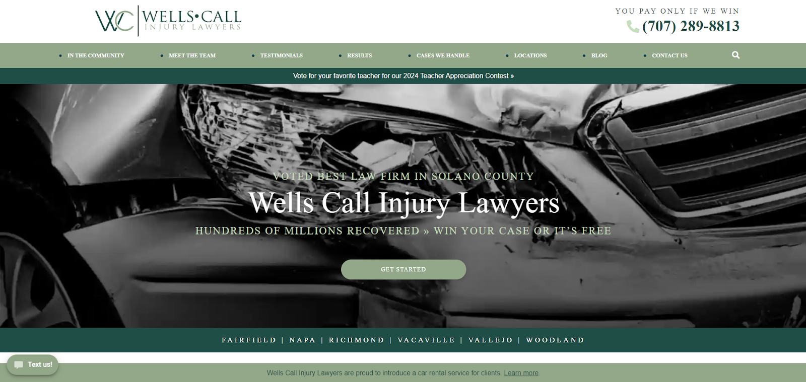
Strengths: The black-and-white closeup of a wrecked vehicle tells visitors at a glance what this law firm is all about. Fast, clear communication of your capabilities and your contact information are critical for netting new clients. Other key takeaways:
- The header shares stats that show off the firm’s reputation and capabilities;
- The green color scheme and use of serif font is reminiscent of money—not a bad subtext for people looking to take on insurance companies; and
- Client reviews on the homepage and a page dedicated to testimonials are a huge selling point to people researching law firms after being injured in a car or truck accident.
Key Takeaway: Put the most important information front and center on your website’s homepage. Whether visitors are looking at your website through a computer screen or their phones, they should be able to know who you are, what you can do, and how to reach you without even having to scroll.
2. Law Office of Chuck Geerhart
Company Website | Testimonials | LinkedIn | Contact Info

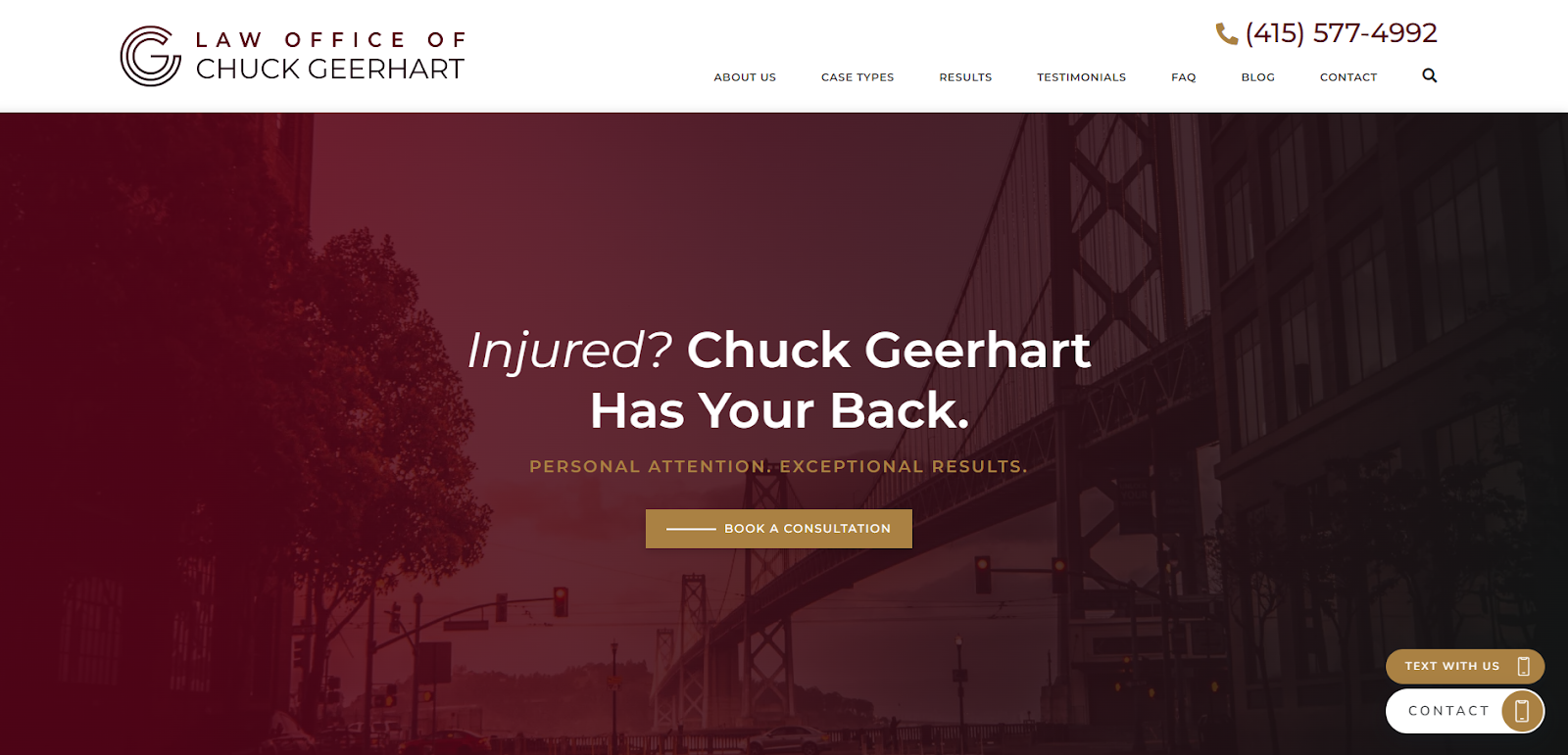
Strengths: This website stands out for its use of local SEO. From the wording to the imagery to the metadata, this site effectively targets people searching for personal injury lawyers in San Francisco. Other highlights:
- The cleverly worded headline is memorable, and it evokes the kind of compassion clients are looking for when dealing with an injury case;
- Multiple contact methods throughout the website make it easy for people to take action no matter which page they’re on; and
- An updated blog answers common client questions while serving as an SEO boost for the website.
Key Takeaway: Local SEO could save your firm loads of money in the long run. When done right, your firm can rank higher on search engines, making it more likely that potential clients will find you on their own. This is a great alternative to forking out tens of thousands of dollars a month on PPC advertising.
3. Gerling Law Injury Attorneys
Company Website | Testimonials | LinkedIn | Contact Info

Strengths: Client testimonials are the closest thing your law firm has to word-of-mouth recommendations. They are powerful tools for quickly building trust among potential clients. This site nails it on client testimonials, as well as highlighting the experience of the attorneys. Other standout points:
- The site is client-centric, using words, imagery, and CTAs that offer reassurance to people facing an often overwhelming decision;
- An AI-supported chat box lets potential clients contact the firm 24/7; and
- The testimonials page features both written reviews and videos from actual clients.
Key Takeaway: Testimonials should be present on each page of your law firm’s website. Why? More than 90% of people say online reviews influence their buying decisions. Google reviews and testimonials are critical tools for attracting new business to your personal injury law firm.
4. Friedman Injury Law
Company Website | Testimonials | Instagram | Contact Info

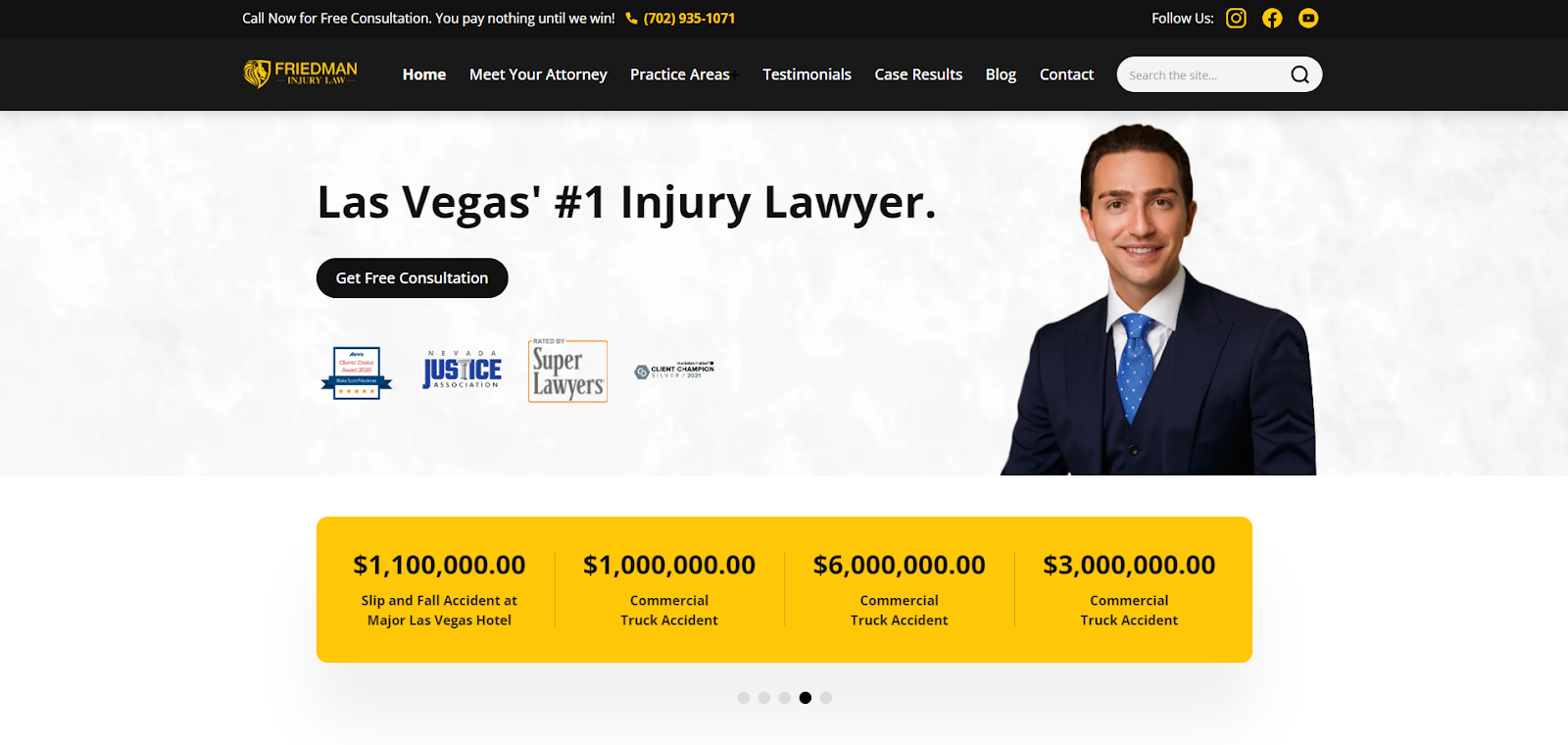
Strengths: People dealing with a serious injury want to know more than your bona fides. They want to see that you’ve helped other people like them win their cases. That’s why this client- and results-focused website is a cut above the rest. Here are some ways this site stands out:
- The use of testimonials on the front page helps accentuate the case results;
- A rotating section featuring case wins and dollar amounts serves as a testament to the firm’s capabilities; and
- The fast-loading and responsive website helps people find the information they need easily, whether they’re behind a computer screen or on their phones.
Key Takeaway: Fight the urge to turn your website into just a brag sheet. Your site should build an affinity between your firm and the people looking to hire you. That means helping them see themselves as your client through the messaging, videos, and images you share. Testimonials, reviews, and other client-focused messaging go a long way in gaining the trust of a potential client. Bonus: Google rewards user-focused websites with higher search rankings than websites that simply keyword stuff their content and provide no real value.
5. Riley Ersoff, LLP
Company Website | Testimonials | LinkedIn | Contact Info

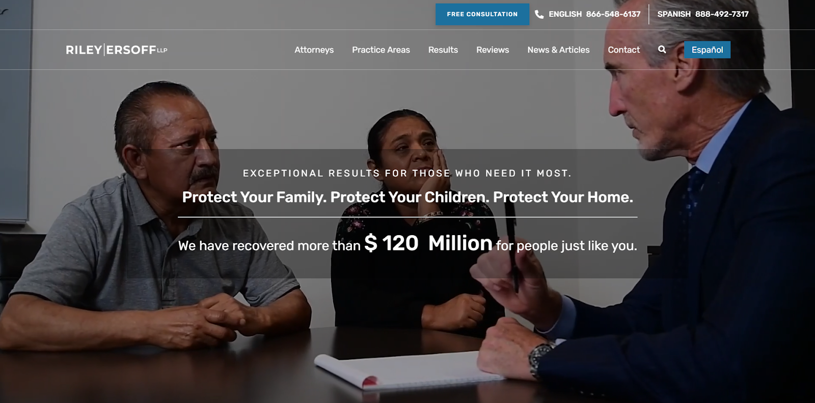
Strengths: The site design for this personal injury practice is both elegant and engaging. A video header catches your attention from the get-go. Additional stand-out design points:
- The line drawing above the extensive list of successful cases is eye-catching;
- Bilingual contact information means the firm can reach an additional market segment of primarily Spanish speakers; and
- An up-to-date blog with informational keywords leads potential clients to the site when they search for topics related to the firm’s practice areas.
Key Takeaway: Your law firm’s brand should convey your capabilities and build a connection with potential clients. When your website design effectively displays your experience, compassion, and professionalism, your client leads feel more confident hiring your firm.
How to Get a Great Personal Injury Law Firm Website
Personal injury trial lawyers need a website that speaks to potential clients with clarity and comfort during a time of great personal crisis. A well-designed website meets clients at their point of greatest need, provides answers, and gives multiple ways to contact your firm. Here are four things to consider when building a well-designed website for your personal injury law firm.
1. Make Your Website Design Work for Clients
Use images, colors, and headings that build a connection with your clients. An elegant website that makes good use of negative space, is skimmable, and puts the most important information front and center helps potential clients make an informed decision quickly.
2. Make Your Website Content Add Value
People dealing with injuries from accidents and negligence are often overwhelmed by the torrent of doctor’s visits, hospital and insurance paperwork, and mental anguish. Your website should make it easy for potential clients to understand their rights and how you will help them through the complex legal system. You can do this by creating blog posts, videos, and other content that is educational and easily shareable.
3. Highlight Client Reviews
Since potential clients are shopping around for the best personal injury firm in their area, they will rely heavily on client testimonials and Google or Yelp reviews. Post reviews prominently throughout your website. Google reviews also help boost your website’s local SEO, which helps clients find you when they search, for example, “car accident lawyer near me.”
4. Hire a Website Developer with Law Firm Expertise
Your personal injury website should not just present a professional and caring image for your firm; it should also have excellent SEO. Good search engine optimization is not just choosing the right keywords, though that’s a critical step. SEO also involves implementing the right code, metadata, and taxonomies behind the scenes, so to speak. Your site should communicate well with both humans and bots.
This isn’t something you want to leave to your internal marketing team. Talk with professionals who have deep experience building high-performance websites for personal injury law firms. Juris Digital has more than a decade of experience creating personal injury websites that drive ongoing client leads and rank well on Google for firms across the United States. Our digital marketing services also include SEO-optimized content creation composed by a team of writers with strong legal backgrounds. Check out the full range of website design and digital marketing services Juris Digital provides, and schedule your free consultation today.
