Personal injury remains one of the most lucrative and most crowded practice areas in law. The U.S. personal injury legal industry was worth $61.7 billion in 2025, spread across more than 50,000 firms nationwide, and it’s grown at a steady clip for five straight years.
That kind of competition means earning a client’s trust before they ever pick up the phone. Nearly 87% of consumers still use Google to research an attorney before hiring one, and in our own survey research, 49% of people research their legal situation online before contacting a lawyer at all. Your website is often the first, and sometimes the only, chance you get to make that case.
We pulled together 15 personal injury firm websites that get this right, from firms built on hyperlocal identity to sites centered on a single founder’s personal brand to one built entirely around a niche as specific as cycling injuries. Some are ours. Most aren’t. What they share is a clear sense of who they’re for and what they want a visitor to do next.
Want a site like one of these built for your firm? We create custom, conversion-focused websites for personal injury practices.
The 15 Best Personal Injury Websites of 2026
Below, we list fifteen of the best website designs for personal injury law firms and what makes them work well for consistently generating new client leads. Generally, these sites share a few key features that put them above the competition, like thorough client testimonials, overall usability, and attention-getting design. However, there are a couple that do things outside of normal law firm website conventions.
| Firm | Standout feature | Palette/mood | Key takeaway |
|---|---|---|---|
| 1. Wells Call Injury Lawyers (Juris Digital design) | Real B-roll video, StoryBrand structure, named-attorney testimonials | Maroon, white, grey & black | Local awards & real photography build trust fast |
| 2. Law Office of Chuck Geerhart (Juris Digital design) | Deep local SEO, multiple contact points, active blog | Compassionate, memorable headline | Local SEO can replace costly PPC spend |
| 3. Romanow Law Group | Wrecked car visual, severity-tagged settlements, free shuttle service | Red, white, grey & black, rugged/industrial | Genuine regional identity is a real design strategy |
| 4. Friedman Injury Law | Founder’s personal story, media badge ticker, live Instagram feed | Black, gold & white, personal-brand | A founder-brand site should commit fully to the founder |
| 5. Hendler Flores Law | Dedicated Client Stories section, community/activism content | Pine green, navy & white, literary/editorial | A narrative hook needs structural follow-through |
| 6. Pitta & Baione LLP | Particulate-animation hero, contaminant breakdown, self-qualifying screener copy | Black & white NY skyline, rustic blue accents | Shared historical context can build trust fast |
| 7. Dan Caplis Law | Top-bar Case of the Year callout, national media ticker | Blue & light grey, conventional | Rare proof points can substitute for visual flash |
| 8. Parker + McConkie | Casket-inclusive hero video, hesitant-visitor copy, “by the numbers” reframe | Red-orange, grey, black, teal accents | Compassion and results reinforce each other |
| 9. Brian D. Guralnick Injury Lawyers | Registered “call me personally” trademark, firm-size comparison table | White, blue & orange, personality-forward | Personal claims need equally personal proof |
| 10. Rudin Law | Trademarked slogan, branded merch line, R-U-D-E method | Black, white & gold, rugged | A bold brand needs to be structurally load-bearing |
| 11. Erdmann & Stumbo, PLLC | Multi-party litigation focus, attorney referral/co-counsel section | Black, yellow, white & teal, kinetic | A striking hero image should tie to something real about the market |
| 12. Porter Simon Sierra Injury Lawyers | Animated compass CTA, 6-step “trail marker” process, hyperlocal practice areas | Forest green & white, orienteering theme | A visual metaphor works best rooted in local life |
| 13. Greenspan & Greenspan Injury Lawyers (Juris Digital design) | 67th-anniversary emblem, all-office directory in header/footer | Navy blue, white & electric green, bold | Rare longevity deserves its own visual moment |
| 14. Yellowstone Law | Quantified stats above the fold, national + local media ticker | Blue-grey, navy, orange & white, grounded | Combine hyperlocal identity with national credibility |
| 15. Paceline Law | Paceline metaphor copy, cycling-specific practice areas & reviews | Generic blue & light grey, minimalist | An authentic niche doesn’t need visual flash to prove itself |
TL;DR — Top 5 Personal Injury Law Firm Website Designs
- Wells Call Injury Lawyers: a StoryBrand homepage built on real B-roll video and hyperlocal awards.
- Law Office of Chuck Geerhart: a masterclass in local SEO for San Francisco personal injury searches.
- Romanow Law Group: borrows Pittsburgh’s own industrial visual language to feel like it belongs to the community.
- Friedman Injury Law: a founder-centered brand backed by real settlement figures and national recognition.
- Hendler Flores Law: restructures the entire site around client narrative instead of firm credentials.
1. Wells Call Injury Lawyers
Company Website | Testimonials | LinkedIn | Contact Info

Strengths: Wells Call Injury Lawyers is a Juris Digital design built around the StoryBrand framework, and the maroon, white, grey, and black palette gives it a serious, no-nonsense feel appropriate for an experienced firm. The hero uses real B-roll video of the attorneys and firm building rather than stock photography, immediately signaling that this is a real, established local firm rather than a generic template. There are some other notable features as well:
- A row of local credibility signals sits just below the hero alongside professional membership badges like the Million Dollar Advocates Forum and Consumer Attorneys of California, stacking hyperlocal trust with statewide recognition;
- The homepage follows a clear StoryBrand plan: naming the client’s problem (a serious injury and the chaos that follows), positioning the firm as the guide with a simple 3-step process (listen and explain, handle treatment and insurance, negotiate or litigate), and reinforcing it with a “you pay nothing unless we win” promise; and
- A dense, specific testimonials section names individual attorneys rather than referring to “the team” generically, letting potential clients see which attorney they might actually work with.
Key Takeaway: Local awards and real photography do more credibility work than most firms realize. A “Voted Best in [County]” badge feels more trustworthy to a nearby prospective client than a generic national ranking, and real footage of the actual team and office reinforces that a firm is exactly as local and established as it claims to be. Don’t bury hyperlocal proof points on an about page when they belong right below the fold.
2. Law Office of Chuck Geerhart
Company Website | Testimonials | LinkedIn | Contact Info
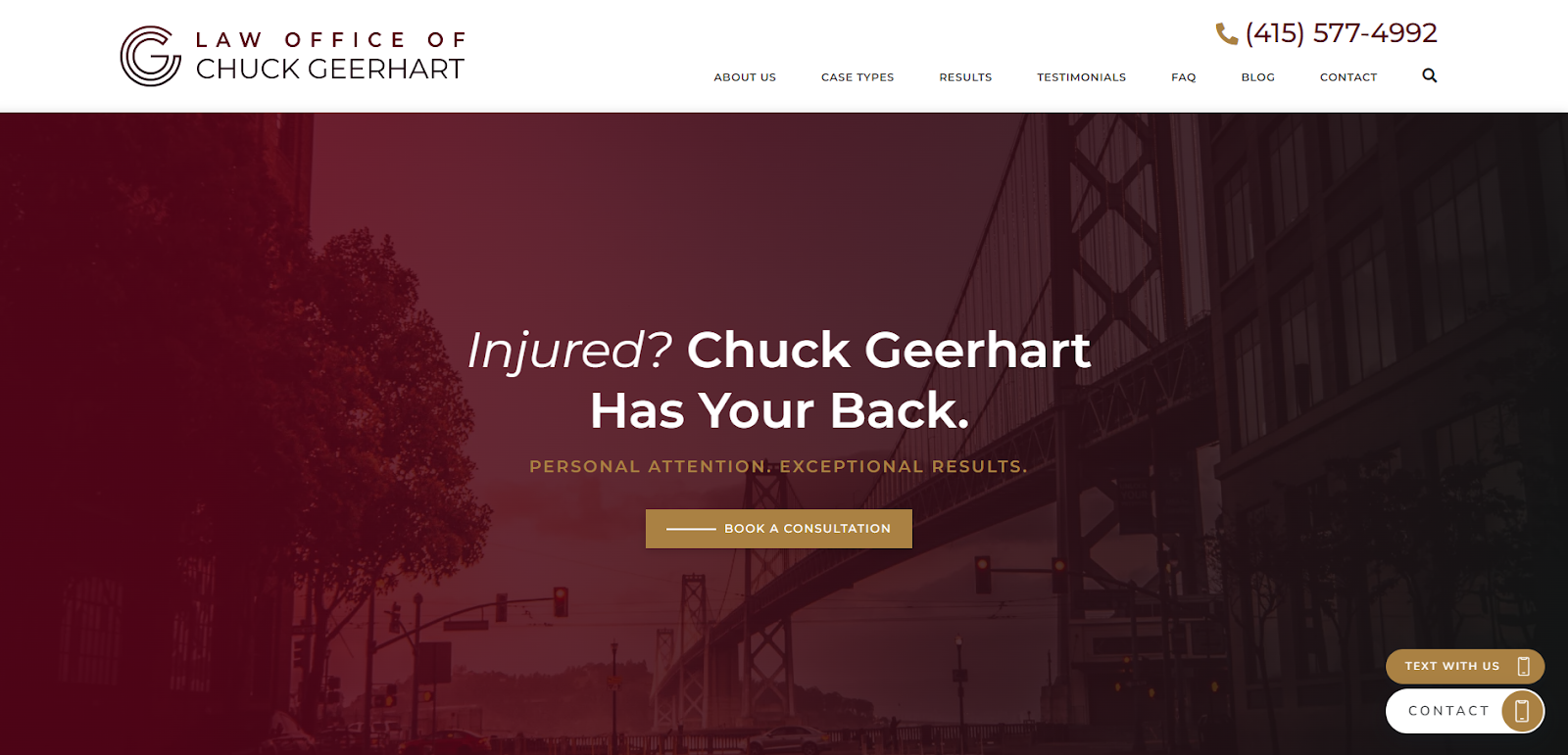
Strengths: This website (also done by Juris Digital) stands out for its use of local SEO. From the wording to the imagery to the metadata, this site effectively targets people searching for personal injury lawyers in San Francisco. Other highlights:
- The cleverly worded headline is memorable, and it evokes the kind of compassion clients are looking for when dealing with an injury case;
- Multiple contact methods throughout the website make it easy for people to take action no matter which page they’re on; and
- An updated blog answers common client questions while serving as an SEO boost for the website.
Key Takeaway: Local SEO could save your firm loads of money in the long run. When done right, your firm can rank higher on search engines, making it more likely that potential clients will find you on their own. This is a great alternative to forking out tens of thousands of dollars a month on PPC advertising.
3. Romanow Law Group
Company Website | LinkedIn | Contact Info

Strengths: Romanow Law Group leans hard into Pittsburgh identity (minus the black and gold). “Pittsburgh Tough” sits right in the hero, styled like an industrial stamp, a nod to the city’s steel-mill roots that immediately signals this firm understands its market. The attorney stands in front of a graffiti-style silhouette of the Pittsburgh skyline on a white brick wall, with a red, white, grey, and black palette that reads rugged and blue-collar rather than polished and corporate, the only break in that scheme being the attorney’s navy blazer. Other than the unique stylization, here are some other notable features:
- A wrecked red car sits just below the hero, a blunt visual reminder of exactly what brought most visitors to the site, reinforcing the firm’s stated focus on car accident cases specifically rather than personal injury broadly;
- Specific settlement figures are listed with the injury type attached, giving visitors concrete proof tied to case severity rather than a single vague headline number; and
- A free shuttle service is offered to get injured clients to medical appointments or meetings with the firm. This is a practical, unique accommodation that reinforces the “we’ll come to you” message repeated throughout the site.
Key Takeaway: Regional identity is a legitimate design strategy when it’s genuine. Romanow Law Group borrows Pittsburgh’s own visual vocabulary (industrial stamps, graffiti-style skyline art, a “tough” attitude tied to steel-industry heritage) to make the firm feel like it belongs to the community rather than being a generic firm that happens to be located there. If your firm has a real, specific connection to its market, let the design reflect that instead of defaulting to generic legal-industry blue and grey.
4. Friedman Injury Law
Company Website | Testimonials | Contact Info
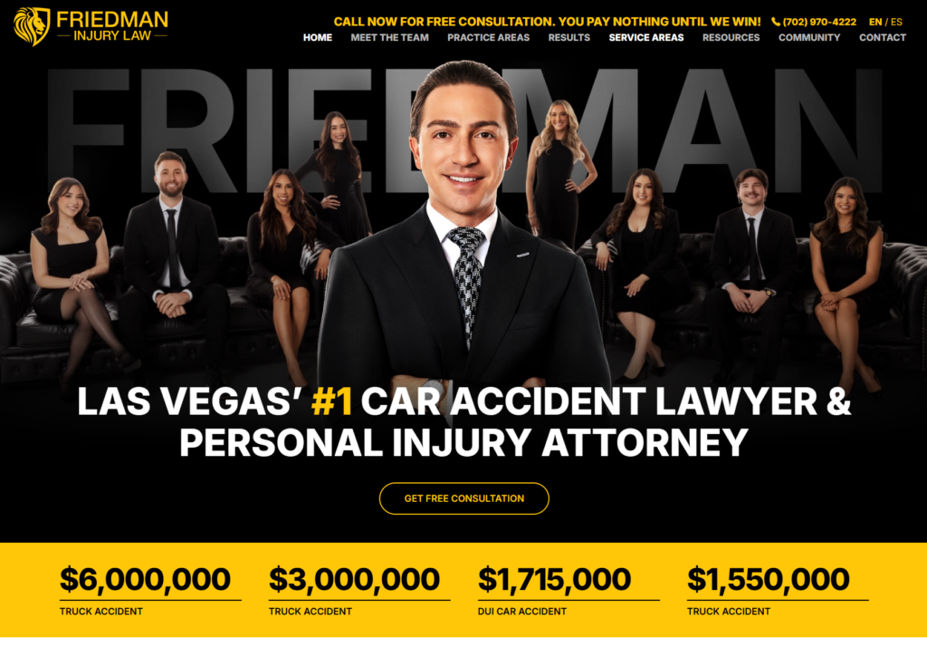
Strengths: Friedman Injury Law’s Las Vegas homepage leads with the founder front and center against a bold black, gold, and white palette that feels more personal-brand than generic law firm. The H1, “Las Vegas’ #1 Car Accident Lawyer & Personal Injury Attorney,” is backed immediately by real settlement figures ($6,000,000 truck accident, $3,000,000 truck accident, $1,715,000 DUI accident), establishing credibility before a visitor scrolls past the fold. More standout features include:
- Below the fold, the focus shifts almost entirely to Blake’s personal story, a second-generation Las Vegas lawyer who grew up shadowing his father in the courtroom, with over $100 million recovered and CALI awards from his time at UNLV’s Boyd School of Law, alongside personal touches like his signature that reinforce he’s a real person staking his name on the firm;
- A ticker-style badge row runs through Multi-Million Dollar Advocates Forum, Nevada Justice Association, National Trial Lawyers Top 40 Under 40, and Super Lawyers recognition, stacking third-party validation rather than relying on the firm’s own claims alone; and
- A live Instagram feed is embedded directly on the homepage, giving visitors a real-time, informal window into the firm beyond the polished case results and testimonials.
Key Takeaway: When a firm is built around a founder’s personal brand, the website should commit to that fully rather than splitting attention between “the firm” and “the founder.” Friedman Injury Law puts the founder’s face, story, credentials, and even his social presence, at the center of the page, which builds a different kind of trust than an anonymous “our team” approach. Visitors feel like they’re hiring a specific, proven person.
5. Hendler Flores Law
Company Website | Client Stories | LinkedIn | Contact Info
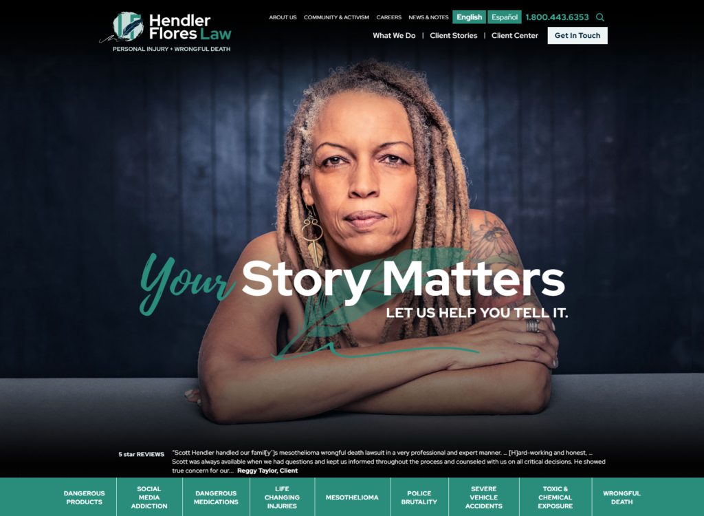
Strengths: Hendler Flores Law, an Austin firm that takes cases nationwide, breaks from typical personal injury design conventions with a hero built around narrative rather than authority. “Your Story Matters. Let us help you tell it.” sits over an image of a quill and a headshot of a regular person rather than an attorney, immediately signaling that the client’s experience, not the firm’s credentials, is the focus. The pine green, navy blue, and white palette, paired with cursive script used as accent styling on key words in headings gives the site a literary, almost editorial feel unusual for the practice area. Here are some of our favorite things about it:
- A scrolling ticker of client and peer reviews sits directly below the hero and above a horizontal list of practice areas ranging from dangerous medications and mesothelioma to police brutality and social media addiction, showing a firm handling complex mass tort and catastrophic injury work rather than routine claims;
- “Client Stories” gets its own top-level navigation section (separate from a standard “Case Results” page), featuring detailed narratives like a $13.8 million mesothelioma verdict for a Navy veteran’s widow and a $30 million recovery for a family in a drunk-driving death, each framed as a story with real people at the center rather than just a settlement figure; and
- The site folds in the firm’s community and activism work directly into the homepage, including local Austin murals honoring social justice figures, reinforcing the “we fight for people, not just cases” positioning with tangible, local proof.
Key Takeaway: A strong narrative hook only works if the rest of the site delivers on it. Hendler Flores Law restructures the whole site around the client rather than the firm. If you want to differentiate on empathy or client-centricity, make sure that idea shows up structurally rather than as an afterthought.
6. Pitta & Baione LLP
Company Website | Testimonials | LinkedIn | Contact Info

Strengths: Pitta & Baione LLP occupies a genuinely narrow niche: 9/11 toxic dust exposure claims under the VCF and WTC Health Program. However, the design commits fully to that specificity rather than reading as a generic personal injury site. The hero uses a black-and-white NY skyline with the missing Twin Towers rendered in a rustic blue, while tan and blue dots drift across the image with mouse movement, evoking airborne particulates. It’s a subtle, but effective visual metaphor for the toxic dust at the center of every case the firm handles. Here are some other things that standout:
- The hero text, “EXPOSURE ZONE: SOUTH OF HOUSTON ST” and “Were You There?”, functions almost like a self-qualifying screener, speaking directly to the specific geography and timeframe that determines eligibility before a visitor even reaches a form;
- A “What Was in the 9/11 Dust?” section breaks down specific contaminants (asbestos, lead, PCBs, glass, gypsum) and their health effects, giving visitors a factual, almost documentary-style education alongside the legal pitch; and
- A running list of settlement amounts tied to specific cancer diagnoses (breast, brain, pancreatic, lung, and more) and the victim’s occupation or circumstance (an NYPD officer, a sanitation worker, a Lower Manhattan resident) makes the firm’s stated $700M+ more relatable.
Key Takeaway: When a firm’s entire practice is built around one specific, shared historical event, the design can lean into the collective memory of that event. Pitta & Baione’s skyline imagery, particulate animation, and street-level exposure map all assume the visitor already understands the emotional weight of 9/11, and use that shared context to build trust faster than credentials alone could.
7. Dan Caplis Law
Company Website | Testimonials | LinkedIn | Contact Info
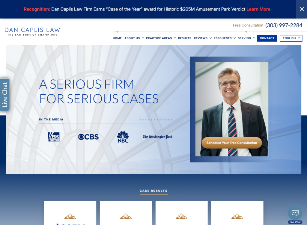
Strengths: Dan Caplis Law sticks to a standard blue and light grey palette, letting media credibility and case results carry the visual weight instead of a distinctive aesthetic. The hero pairs a photo of Dan Caplis with the headline “A Serious Firm for Serious Cases,” directly over a scrolling ticker of national media logos, positioning Caplis as a recognized legal commentator rather than just a practicing attorney. Some other interesting aspects of this homepage:
- A top bar announcement calls out the firm’s “Case of the Year” recognition from the Colorado Trial Lawyers Association for a $205 million settlement against Glenwood Caverns Adventure Park, a widely covered story in Colorado, putting the firm’s single biggest result front and center before a visitor even reaches the hero;
- A results ticker below the hero runs through specific settlement figures by case type ($6 million pedestrian accident, $4.5 million car accident, $3 million truck accident), mixing disclosed numbers with “confidential sum” entries that still signal case volume across practice areas; and
- The site leans on Dan Caplis’s 34 years of trial experience and his radio program on Denver’s 710-KNUS as a second layer of authority beyond the legal work itself, reinforcing that he’s a known, trusted local voice independent of any single case result.
Key Takeaway: A firm doesn’t need a distinctive visual identity if it has genuinely rare proof points to lean on instead. Dan Caplis Law uses a conventional legal color palette but compensates with an unusually strong media presence and a headline-grabbing case result announced right at the top of the page. If your firm has a standout achievement or public profile, put it where every visitor sees it first, the way Dan Caplis Law does with its top-bar Case of the Year callout.
8. Parker + McConkie
Company Website | Testimonials | LinkedIn | Contact Info
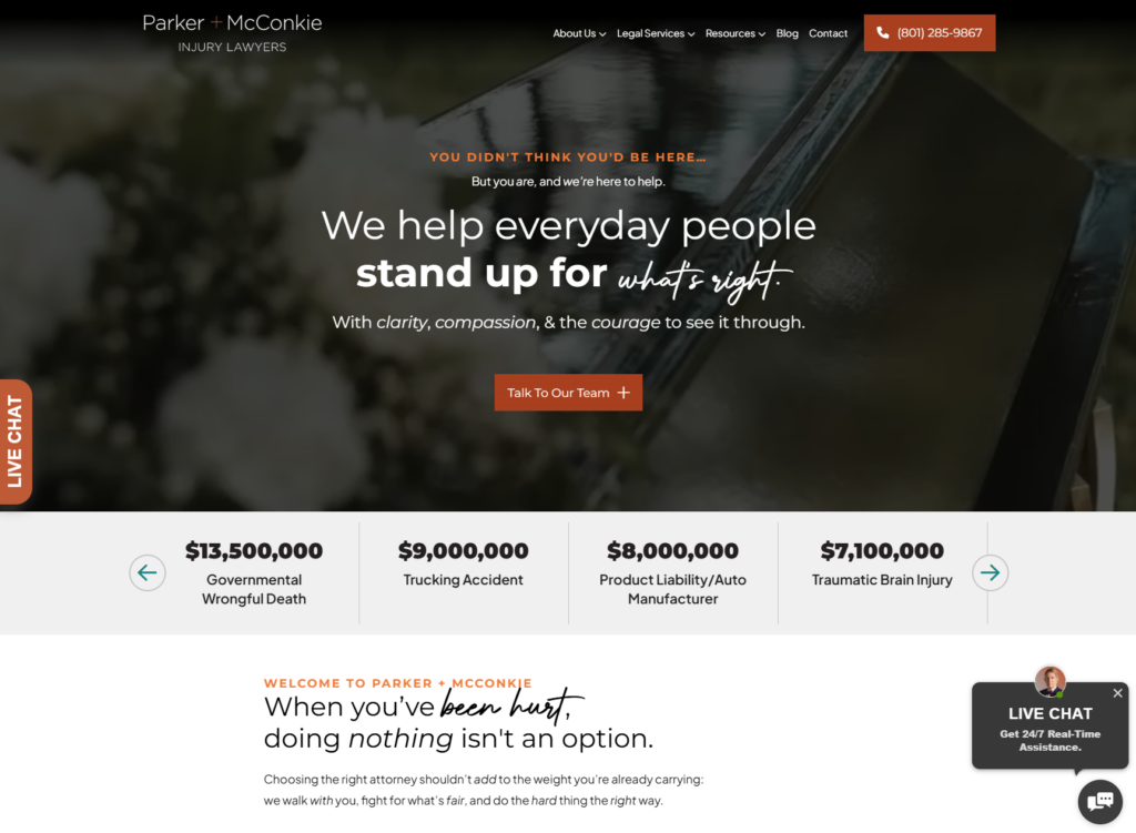
Strengths: Parker + McConkie’s homepage balances hard results with genuine emotional restraint, an unusual combination for personal injury. The hero runs a video slideshow of everyday moments (the kind of ordinary life an injury or loss interrupts) that closes on a shot of the top of a casket. It is a somber but earned choice given that the firm handles wrongful death cases among its largest results, layered under the text “You Didn’t Think You’d Be Here…But you are, and we’re here to help.” The red-orange, grey, white, and black palette, with small teal accents and cursive script for emphasis, keeps the tone serious without tipping into the aggressive, dollar-sign-forward style common in the practice area. Here are some other great features:
- Copy throughout directly addresses a common hesitation: “I’m not the type of person who sues.” Rather than ignoring it, the page meets a reluctant visitor where they actually are instead of assuming everyone arrives ready to hire a lawyer;
- A results ticker runs well beyond a highlight reel, over two dozen figures from $13.5 million governmental wrongful death down to $190,000 dog bite cases, giving visitors a realistic range rather than just the firm’s biggest headline numbers; and
- A “Parker + McConkie by the Numbers” section deliberately reframes its stats as “not the billboard-dollar-signs kind”: 3,000+ clients, 500K+ hours of support, and over a thousand five-star reviews, emphasizing care alongside the case results.
Key Takeaway: Compassion and results aren’t mutually exclusive design choices. They can actually reinforce each other if you’re smart about copy and imagery. Parker + McConkie backs its softer, more human copy (“we’ll remember the names of your family,” “we check in after surgeries”) with genuinely substantial case results and client volume, so the empathy doesn’t read as a substitute for competence. If your firm wants to lead with warmth, make sure the proof points are still there to back it up.
9. Brian D. Guralnick Injury Lawyers
Company Website | Testimonials | Contact Info

Strengths: Brian D. Guralnick Injury Lawyers makes a deliberately personality-forward, unconventional choice for the practice area. The hero shows Brian mid-phone-call backed by a collage of photos of him with clients holding settlement and judgment checks, all over his registered trademark saying that you can call him directly. A white, blue, and orange palette with sparse red accents keeps the page feeling clean rather than cluttered, despite how much is packed into the hero. This unusual site also has some other effective design choices:
- The right side of the hero stacks a phone number, a “Free Case Evaluation” link, a 4.9 review aggregate, and professional membership logos (including Super Lawyers) in quick succession, front-loading every trust signal a visitor might need before they scroll at all;
- A direct “Solo Firm vs. Oversized Firm vs. Our Firm” comparison table addresses a real client hesitation head-on: whether to hire a small, personal-attention practice or a large, resourced one, and positions the firm as offering both; and
- Brian’s personal story, his mother’s death from a misdiagnosed melanoma, is featured prominently as the origin of his career, giving the trademark real emotional weight rather than reading as just a marketing slogan.
Key Takeaway: A hero built entirely around one person’s face and voice is a genuinely divisive design choice. Some visitors will find it too personality-driven for a legal service. However, it works here. If your firm wants to center a single attorney’s brand this heavily, the personal claim needs to be backed by equally personal, verifiable proof, not just a slogan.
10. Rudin Law
Company Website | Testimonials | LinkedIn | Contact Info

Strengths: Rudin Law has built its entire brand around a single registered trademark and every design choice on the New Orleans homepage reinforces it. The black, white, and gold palette gives the site a rugged, no-nonsense feel, while Lee Rudin’s photo sits opposite the tagline in the hero, immediately pairing a face with the brand’s attitude. Here are some unique aspects of this homepage:
- Two unusual hero links, “Our Practice Areas” and “GET RUDE® GEAR”, sit without a primary case-review CTA. This is a genuinely rare move for a law firm site;
- The section immediately below the hero, “Rude Gets Results”, followed by a results ticker (a $600,000 marine injury award among them), gives the brash tone a factual backbone; and
- A clearly named “R-U-D-E” method (Research, Understand, Develop, Execute) turns the brand’s core wordplay into an actual explained process.
Key Takeaway: A bold brand identity works best when it’s load-bearing. Rudin Law uses its trademarks, merch, and acronym for their case process to create a strong brand, which is fitting since founding attorney Lee Rudin has actually spoken at industry workshops on branding and growth. If you’re going to commit to a bold, potentially divisive brand voice, look for ways to carry it structurally through the site (a process, a product line, a real methodology) rather than leaving it as a tagline sitting on top of an otherwise generic layout.
11. Erdmann & Stumbo, PLLC
Company Website | Testimonials | Contact Info
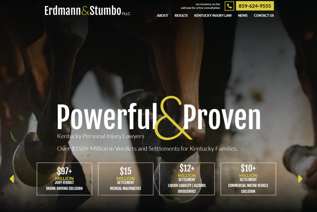
Strengths: Erdmann & Stumbo’s Richmond, Kentucky homepage opens with a full-bleed hero of horse hooves mid-gallop. It’s a bold, regionally specific choice. The black, yellow, white, and dark teal palette, paired with the direct headline “Powerful & Proven,” gives the site an energetic, kinetic feel that matches the motion in the background image. Here are some other aspects we like about it:
- A results ticker sits immediately below the hero and headline, running through more than two dozen figures across distinct sub-practice areas, truck accidents, medical malpractice, dram shop liability, nursing home neglect, dog attacks, topped by a $97+ million jury verdict in a drunk driving collision case, establishing scale before any other page content loads;
- The firm explicitly positions itself around complex, multi-party litigation, cases “involving multiple parties, complex industry regulations, lengthy trials, and multiple jurisdictions,” rather than the more routine single-vehicle claims many firms lead with; and
- A dedicated “Let’s Work Together” section speaks directly to other attorneys, inviting referrals and co-counsel partnerships, an audience most personal injury homepages don’t address at all.
Key Takeaway: A striking, unexpected hero image can do a lot of positioning work if it’s tied to something real about the firm’s market. Erdmann & Stumbo’s galloping horses are a great nod to Kentucky identity, similar in spirit to how Romanow Law Group borrowed Pittsburgh’s industrial visual language. If your firm’s location has a strong, recognizable identity, using it can make the site feel more personable.
12. Porter Simon Sierra Injury Lawyers
Company Website | Testimonials | LinkedIn | Contact Info
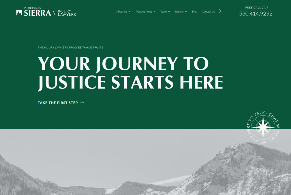
Strengths: Porter Simon Sierra Injury Lawyers, serving Truckee-Tahoe, builds its entire visual identity around orienteering and the outdoors rather than typical legal iconography. The forest green and white palette splits the hero into two horizontal bands, a full-bleed green panel with “Your Journey to Justice Starts Here” up top, and a photo of the Sierra landscape below, while an animated compass (“We Are Here to Talk. Chat With Us.”) spins as a functioning CTA between them. It’s a genuinely distinctive touch tying navigation metaphor to an actual site function. However, that’s not where the theming stops:
- The “journey” and “path” language carries through the entire page structure. A labeled 6-step process (See If You Have a Case, Build Your Case, Lawsuit Filed, Negotiations, Trial, Justice Prevails) reads like trail markers rather than a typical numbered list;
- The firm leans hard into hyperlocal identity: “We drive the roads you drive. We use the trails you use. We visit the businesses you visit,” and its practice areas list ski accidents and boat accidents alongside standard car and truck accidents, reflecting real Tahoe-specific risks; and
- Blog content mirrors the same local specificity, covering topics like fatal ski accidents at Tahoe resorts and a Lake Tahoe boat capsizing, giving the site genuine regional relevance.
Key Takeaway: A firm’s visual metaphor works best when it’s drawn from something true about the place and people it serves, not applied as a generic theme. Porter Simon’s orienteering and mountain imagery only lands because the firm’s actual practice areas (ski accidents, boat accidents on the lake) and their “we live here, we drive these roads” positioning back it up. If your firm serves a distinct region, look for an authentic visual metaphor rooted in local life, the way compasses and mountain trails work here, rather than importing scenery that isn’t tied to anything the firm specifically does.
13. Greenspan & Greenspan Injury Lawyers
Company Website | Testimonials | LinkedIn | Contact Info

Strengths: Designed by our team here at Juris Digital, Greenspan & Greenspan’s homepage follows the StoryBrand framework closely, with a bold navy blue, white, and electric green palette that reads confident. The hero uses a faded photo of the Gov. Mario M. Cuomo Bridge with “Tens of Millions Recovered” layered behind the headline “Your Fight is Our Fight,” pairing a recognizable regional landmark with the firm’s core promise. There is also an anniversary emblem that sits beside the heading, a genuinely rare tenure signal in an industry full of newer firms. Here are some important additions:
- Every office location (White Plains, New City, Yonkers, the Bronx) is listed at both the very top of the page above the navigation and again in the footer, a small, but practical touch that lets multi-location visitors self-identify their nearest office immediately without hunting for it;
- The page follows a clear StoryBrand arc: naming the client’s problem (“After an Injury, It Can Feel Like No One’s in Your Corner”), breaking the solution into three concrete outcomes (Get Medical Bills Paid, Get Lost Wages Paid, Get Expenses Reimbursed), and laying out a simple 3-step plan (“Your Battle Plan for Justice”: Share Your Story, Build Your Strategy, Fight for Justice); and
- Testimonials are attributed with first name and location (e.g., “Jean H. – New City, NY”), reinforcing the firm’s “we grew up here” positioning with proof tied to specific nearby towns rather than anonymous quotes.
Key Takeaway: When a firm has genuinely rare longevity, 67 years in this case, it’s worth designing a specific visual moment for it rather than folding it into body copy. Pairing that milestone with hyperlocal proof (a recognizable local landmark, town-tagged testimonials, every office address visible at a glance) makes “we grew up here” a claim visitors can actually verify at a glance.
14. Yellowstone Law
Company Website | Testimonials | Contact Info
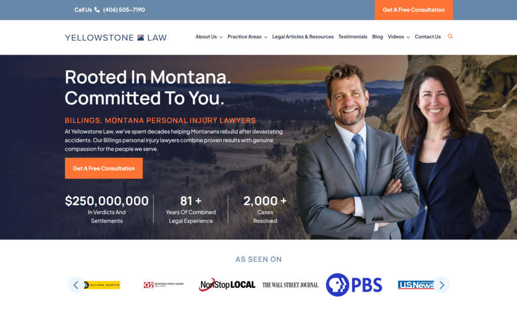
Strengths: Yellowstone Law’s Billings homepage pairs a photo of the surrounding Yellowstone landscape with headshots of attorneys Shane Colton and Tanis Holm directly in the hero. It serves as a straightforward but effective choice that puts real, named faces next to the firm’s regional identity. The blue-grey, faded navy, orange, and white palette feels grounded rather than flashy, matching the headline “Rooted in Montana. Committed to You.” Overall, it is a simple but effective design. Here are some other great design choices:
- Three concrete stats sit directly below the free consultation button: $250,000,000 in verdicts and settlements, 81+ years of combined legal experience, and 2,000+ cases resolved. This gives visitors quantified proof before they scroll past the fold;
- A media ticker beneath the hero runs an unusually broad set of outlets for a regional firm, not just local Montana press like the Billings Gazette and Great Falls Tribune, but national names like NPR, NBC News, PBS, U.S. News & World Report, and The New York Times; and
- The copy explicitly frames legal action as “stepping into an unfamiliar wilderness,” a regionally fitting metaphor for a Montana firm that reinforces the guide-like positioning without being heavy-handed about it.
Key Takeaway: Combining hyperlocal identity (a recognizable regional landscape, town-specific language) with genuinely broad, high-profile credibility signals (national media mentions alongside local ones) lets a firm feel both like a trusted neighbor and a serious operator at the same time. If your firm has real regional roots and real national recognition, don’t force visitors to choose between “local and personal” or “credible and proven”, show both, the way Yellowstone Law does with its landscape imagery next to a New York Times logo.
15. Paceline Law
Company Website | Contact Info

Strengths: Paceline Law is probably the simplest site on this list, and that’s exactly why it works. A generic blue and light grey palette gets out of the way entirely, letting the hero photo of attorney Kyle Smith with his own bike on a trail, paired with the headline “A Lawyer for Bike People,” communicate the entire value proposition in seconds. There’s no ambiguity about who this firm serves or why. That being said, the copy and information architecture of the site stand out as well:
- The section directly below the hero, “Let’s Go Further — Together and Stronger,” uses the actual cycling concept of a paceline as a metaphor for what hiring a lawyer should do for an injured cyclist. It’s genuinely clever copy that ties the firm’s name to a real, relevant idea;
- Practice areas are scoped entirely to cycling-specific scenarios like collisions, defective bike products and gear, and dangerous road conditions for cyclists; and
- Client reviews reference cycling specifics directly (Kyle helping a client get a new bike after an accident, being “an amazing person and a great attorney” and “pretty awesome musician too”), reinforcing that this is a lawyer embedded in the cycling community, not just a PI attorney who added bikes as a practice area.
Key Takeaway: When a firm’s niche is genuinely authentic, in this instance an attorney who’s also an avid local cyclist, the design doesn’t need to work hard to prove it. Paceline Law’s simplicity is a strength: strong, specific copy does more to build trust and rapport with the target client than a more visually elaborate site would. A tightly defined niche paired with genuinely knowledgeable, specific writing can outperform a flashier, more generic design.
How to Get a Great Personal Injury Law Firm Website
Personal injury trial lawyers need a website that speaks to potential clients with clarity and comfort during a time of great personal crisis. A well-designed website meets clients at their point of greatest need, provides answers, and gives multiple ways to contact your firm. Here are four things to consider when building a well-designed website for your personal injury law firm.
1. Make Your Website Design Work for Clients
Use images, colors, and headings that build a connection with your clients. An elegant website that makes good use of negative space, is skimmable, and puts the most important information front and center helps potential clients make an informed decision quickly.
2. Make Your Website Content Add Value
People dealing with injuries from accidents and negligence are often overwhelmed by the torrent of doctor’s visits, hospital and insurance paperwork, and mental anguish. Your website should make it easy for potential clients to understand their rights and how you will help them through the complex legal system. You can do this by creating blog posts, videos, and other content that is educational and easily shareable.
3. Highlight Client Reviews
Since potential clients are shopping around for the best personal injury firm in their area, they will rely heavily on client testimonials and Google or Yelp reviews. Post reviews prominently throughout your website. Google reviews also help boost your website’s local SEO, which helps clients find you when they search, for example, “car accident lawyer near me.”

4. Hire a Website Developer with Law Firm Expertise
Your personal injury website should not just present a professional and caring image for your firm; it should also have excellent SEO. Good search engine optimization is not just choosing the right keywords, though that’s a critical step. SEO also involves implementing the right code, metadata, and taxonomies behind the scenes, so to speak. Your site should communicate well with both humans and bots.
This isn’t something you want to leave to your internal marketing team. Talk with professionals who have deep experience building high-performance websites for personal injury law firms. Juris Digital has more than a decade of experience creating personal injury websites that drive ongoing client leads and rank well on Google for firms across the United States. Our digital marketing services also include SEO-optimized content creation composed by a team of writers with strong legal backgrounds. Check out the full range of website design and digital marketing services Juris Digital provides, and schedule your free consultation today.
Ready to Elevate Your Law Firm’s Marketing?
Let’s TalkLast updated: