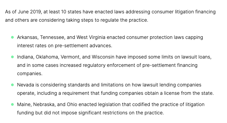
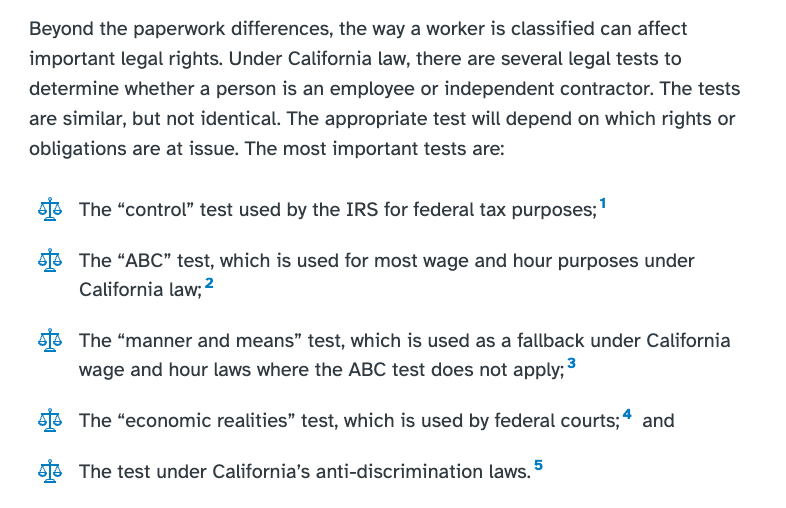
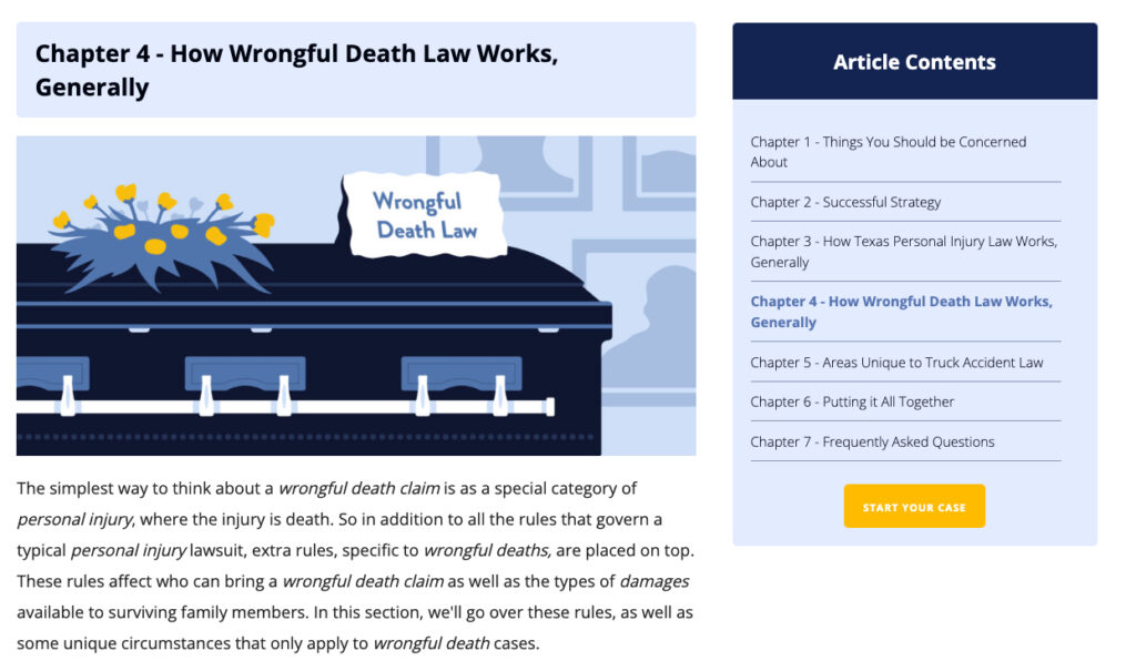
If you invest in content marketing and SEO it’s likely that blog posts constitute a huge percentage of your website’s total traffic. We often see blog posts making up 70% or more of our client’s total organic search traffic!
Yet law firms rarely create custom, intentional designs for their blog posts. Instead, the bulk of design resources is directed at places like the homepage, attorney bio pages, case results pages, etc. And while these pages are certainly important they generally don’t come close to blog posts in terms of total pageviews.
Because such an outsized percentage of law firm traffic goes to blog posts, we have an opportunity to drastically impact the website’s performance by improving the design of a single page – the blog post.
What follows is a comprehensive guide that will help you make your legal blog post design more effective. By using this guide to refine your blog post design you can achieve better SEO (higher rankings and more traffic) and deliver a better user experience (improved brand perception and ultimately, more conversions).
8 Examples of Creative Law Blog Designs
This post contains over 4k words that will help you create a more effective design for your law blog posts. But to be honest, exploring the links below is probably a more valuable way for you to learn what makes a great blog design than reading this guide word for word.
Check out these examples of really well-done law firm blog post designs:
- TexasNonCompeteLaw.com – Designed by Juris Digital
- WorkLawyers.com – Designer Unknown
- InjuryClaimCoach.com – Designer Unknown
- RaniaCombsLaw.com – Designed by New Media Campaigns
- Rosen.com – Designer Unknown
- BirthInjuryGuide.org – Designer Unknown
- InjuryRelief.com – Designed by Juris Digital
- HekmetFamilyLaw.com – Designer Unknown
Typography Will Make or Break Your Blog Design
The most essential design element of law firm blog posts is typography. If the goal of your blog posts is to help folks better comprehend their legal issue, the most fundamental way to achieve that is by presenting the information in a highly readable way. The quality of your typography will largely determine the readability and thus the usefulness of your content.
Choosing Your Typeface
Most likely your website already utilizes specific typefaces and so you aren’t going to choose an entirely different typeface for your blog posts. Typically, website developers (and some designers) advise using the fewest typefaces possible. The primary reason is that typefaces tend to be a heavy asset for browsers to render, and so fewer fonts generally mean a faster loading website.
My basic rules for typefaces for law firm blog posts are as follows:
- Use the fewest typefaces possible. I generally like to use two typefaces, one for paragraph text and one for headings. However, by utilizing different font weights, text decoration (italic, etc.), and colors, you can often achieve the variety you are after without using any more than a single typeface.
- Use widely available typefaces rather than niche, custom ones. At Juris Digital we use Google Fonts.
- Use a typeface that is easy to read. This can be a bit subjective but use your common sense. Which of these fonts is easier to read?
To my eye, the typeface used in the first example – Inter – is far easier to read than the second example, Josefin Sans. While Josefine Sans may be an interesting choice to use for headings or other highly styled text, it’s not a good choice for paragraph text.
Spacing is Critically Important to Readability
Regardless of how readable your typeface is, your blog content may lack readability if you don’t get the spacing right. When I think about typography spacing for law firm blogs I focus most on two elements: Line height and paragraph spacing.
Line-Height
Line height refers to the distance between lines of text. In school when you would double-space your Word documents to meet the minimum page requirement, what you were doing was increasing the line height.
The ideal line height for text is will vary slightly based on the size of the text. For instance, large text generally requires more line height, whereas smaller text doesn’t require as much spacing.
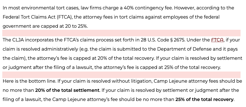
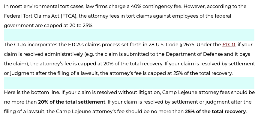
For paragraph text – which should normally be either 16 or 18px in size – I like to use a line height of between 180% and 200%. The screenshots below show paragraph text that is 18px in size. The first image shows the line height set at 120% and the second shows it at 200%. Which would you rather read?

In my personal opinion, it’s far preferable to go with too much line height than not enough. However, if you tend to prefer less line height, my suggestion for maintaining readability is that you go no lower than 160%.
Paragraph Spacing
Paragraph spacing refers to the distance between paragraphs. More specifically, it refers to the amount of margin that is added to the bottom of the paragraph, which creates space between the end of a paragraph and the following element. As with line height, you want to be sure that your paragraphs have adequate space so that the reader can easily distinguish one from the next, and so that eye is not subjected to a “wall of text”.
On the web, paragraph spacing is achieved by adding a bottom margin to paragraph elements. My preference is for the bottom margin of paragraphs to be set at 2 times the font size. So if your font is 16px, your paragraph spacing ought to be 32px.
The examples below display a few paragraphs of text from a law firm blog. The first has no additional margin added. The second has 32px of margin added. Which would you prefer to read?
As you can see, simply adding a small amount of margin to the bottom of your paragraphs can make a big difference to the readability of your blog’s content.
More on spacing: In addition to the proper spacing of your paragraphs you also want to make sure that your headings and your structured lists are spaced properly. For headings, this means having the same about of space between the heading and the following paragraph as between the preceding paragraph and the heading. For lists, this means having adequate space between list items and having the same spacing above and below the list.
Heading Style Best Practices – Creating “Scanability”
The purpose of headings is to organize your law blogs into subsections of a parent topic. Because headings are such an essential part of the information you are presenting, it’s crucial that they be styled in a way that is intuitive and allows the user to scan the post for the information most pertinent to them.
There are a few decisions that must be made with regard to the styling of heading tags:
- What typeface to use
- What color and size to make them
- How much margin to add to them
In general, the size of your headings should go in descending order, with your H1 being the largest:
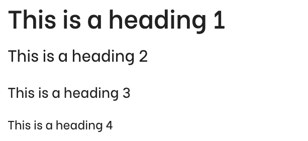
In the case of this blog, we made the decision to use a single typeface and color for each heading, with the only difference being the size. For each heading, we added 32px of margin to the bottom so that there is a nice bit of spacing between the heading had the following paragraph.
It is not at all uncommon to see headings styled with a different typeface, color, and font weight than the paragraph text. Just be sure to use common sense and style your headings in a way that keeps readability – and indeed “scanability” – as the primary goal.
Color Contrast and Font Weight are Crucial for Readability
One of the biggest mistakes you can make with your law blog’s typography is using a font color that fails to create adequate contrast with the background. In general, there is rarely a good reason to use anything but a white background for your blog posts. Against a white background, I generally use a dark grey color and a medium font weight.
The text you are reading right now is dark grey. The hex color code is #2f2f2f. The font weight is 600. I think this is probably a bit too much font-weight, but it’s better than the alternative…
The text you are now reading is a lighter grey – #b3b3b3 – and the font weight is 400. This is a bit more of a strain to read, eh?
Be intentional about the color that you choose for your primary paragraph text, and about the weight that you choose. Be sure that the color and weight you select contrast well with the background and make it easy to read your paragraph text.
Link Styling Best Practices
The general rule with link styling is that it should be obvious that links are links. It’s common to see links styled to be a different color from the rest of the text but without any other indicator that it’s a link. This is problematic for accessibility reasons because a not insignificant percentage of the population has some level of color blindness.
My best practices for link styling are as follows:
- Make links a different color from the surrounding text
- Make sure the color you choose contrasts adequately with the background
- Style links with an underline to make it clear that they are indeed links
- Make sure that links are styled to trigger the pointer cursor when the user hovers over it
Once again, common sense is king here. You want folks to know that a link is a link. Style them accordingly.
Wrapping Up Typography
This is by no means a comprehensive or even expert guide to typography for the web. However, by following these simple rules you can make sure that your law blog posts aren’t hindered by simple typography mistakes that render your content difficult to read and understand.
Here are additional resources that I have found immensely useful for better understanding effective typography:
- Readability and SEO (the most linked-to post of my SEO career)
- 26 Digital Typography Rules for Beginners
- 3 great ways to write helpful hyperlink text
Now that we understand the critical typographical elements of an effective law blog design, let’s look at some of the other important design elements that go beyond the aesthetic of the words on the screen.
Law Blog Design Elements that Convey Trustworthiness
For your legal blog posts to be effective – which is to say, to turn readers into prospective new clients – they must inspire a sense of trust in the reader. In other words, the reader must feel that the information in your blog post is authoritative and accurate.
Ultimately, the substance of your legal content is what matters most in earning the trust of your readers. But we can help instill this sense of trust with intentional design elements as well. Let’s have a look at blog elements that convey trustworthiness.
Author Information – Who Wrote This?
Legal information is generally of significant consequence. If you need to know what the statute of limitations is for medical malpractice claims in New Jersey you don’t want someone’s best approximation. You want an authoritative explanation from someone who understands the statute and the nuance around it.
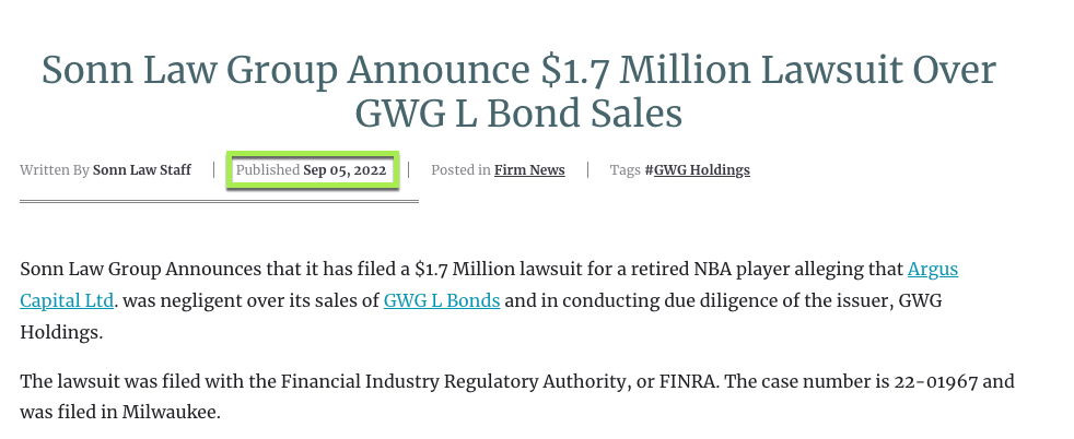
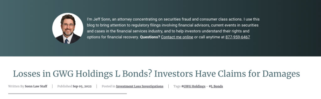
The first essential way to convey that the information in your blog posts can be trusted is to attribute an author. You can find an example of this at the top of this very blog post where you’ll see this:

It’s not hard to understand why readers will be more apt to trust the information on your blog when you attribute the name and face of a real human being to that blog post.
But what should you do when your blog content is largely written by folks who are outside of your law firm (like Juris Digital’s legal content team) and whose names and faces you aren’t able to display on your site? What we advise in these cases is to explain that honestly to readers with a callout like this:
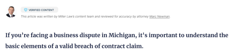
As you can see in this example the firm is being transparent with the reader by telling them that the article was written by the “legal content team”, while also explaining that the piece was “reviewed for accuracy” by an actual attorney at the firm. By being honest about who wrote the post the firm automatically gains credibility with the reader, and then by mentioning that an attorney at the firm reviewed the post, they have the opportunity to add the attorney’s name and photo which enhances the perception of trustworthiness.
Publish Date – When Was This Last Updated?
One of the things a discerning legal blog reader will look for is when the post was last updated. After all, laws change and folks who have questions about their legal issue want to be sure that your blog post contains up-to-date information. Including a publish date in the design of your blog posts helps instill trust in the reader that the information is current and can be relied upon.
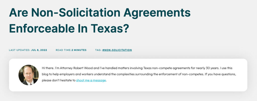
Last Updated vs. Publish Date
When the subject of your blog post content is an evergreen topic – eg. “are non-compete agreements enforceable?” – it makes a lot more sense to use the language “Last Updated” rather than “Date Published” in your blog design. With evergreen topics like this it doesn’t really matter when the post was first published; what matters is how recently it’s been updated. Here’s an example of what this might look like:

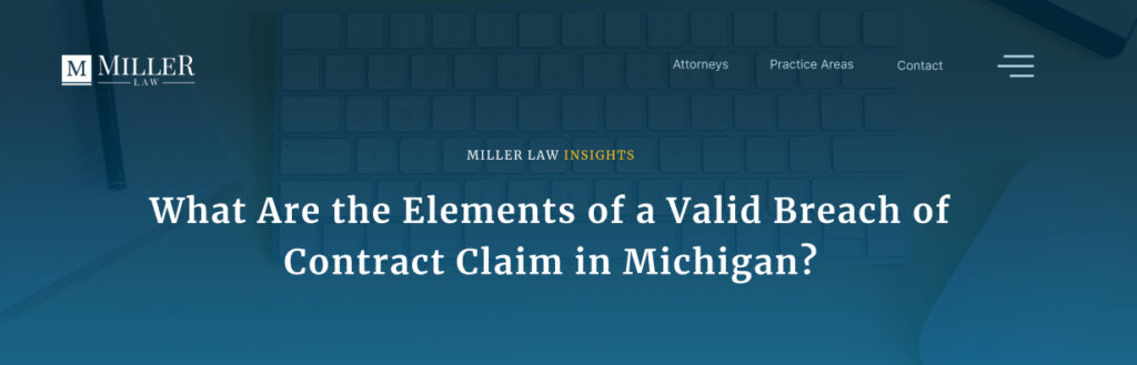
On the flip side, there are some topics where it makes a lot more sense to tell the reader when the post was originally published. For example, any blog topic that deals with a current event where the date of that event is relevant should include a publish date rather than a last updated date. Here’s an example of blog content where a publish date makes more sense:
Indicating to the user when your blog post was either originally published (in the case of content where the date is a relevant factor) or when it was last updated (in the case of evergreen content) is a great way to inspire trust in the reader.
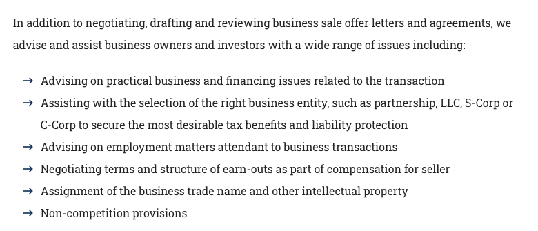
Calls-to-Action – Earning the Conversion
I am including calls-to-action (CTAs) in the section about making your blog content more trustworthy because bad CTAs can have the opposite effect; they can make your blog content seem less trustworthy.
In my experience there are a couple of keys to effective CTAs in blog content:
- The language used in the CTA should be relevant to the subject of the particular blog post.
- The language should tell the user what they can expect if they choose to reach out.
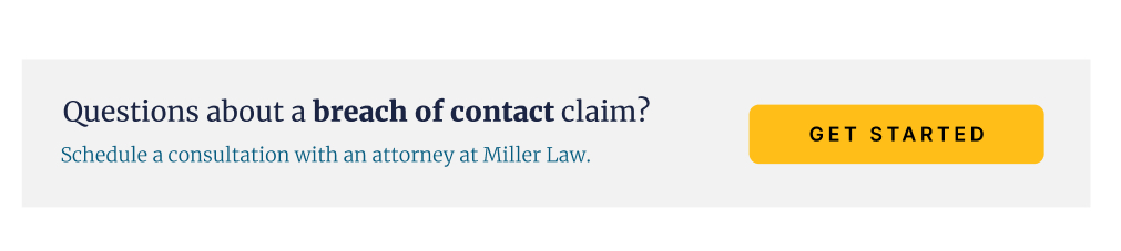
Here is an example. As you can see this CTA is both relevant to the topic of the blog post and it tells the user what they are signing up for by reaching out:
CTA Placement in Law Blog Posts – Value First, Then Pitch
I am a proponent of placing CTAs directly in the body of the blog post as opposed to exclusively in the sidebar or some other static element. I also like placing the CTA just after you have delivered valuable information to the reader, but not before.
In other words, you don’t want to shove the CTA into the top of the post before you’ve delivered any value to the reader. Here’s an example of delivering value first and then prompting the reader with a CTA:
By delivering value before you pitch the reader to reach out, you instill a sense of trust that you are the right firm to help them with their issue.
CTA Type – Button, Form, Phone Number, or Link?
The type of CTA you prompt your readers with should be guided by what you believe is the best way for people to contact your firm. Some of our clients believe that they can provide the best experience to potential clients over the phone, and so for those clients, we will prioritize phone numbers in our CTAs.
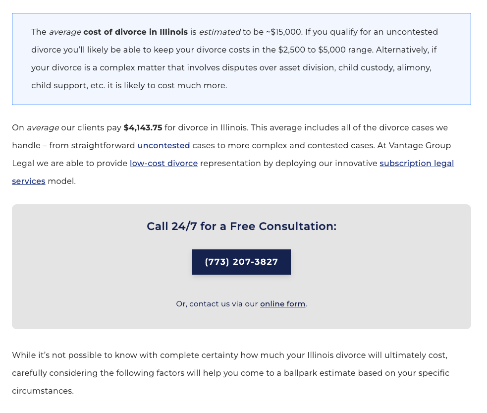
For other clients, form submission is a more ideal first touch point with the client, and so for those clients, we’ll either link to a form via a stylized button or we’ll include the full contact form right in the body of the post. Here’s an example of a firm that includes the full contact form right in the post body:
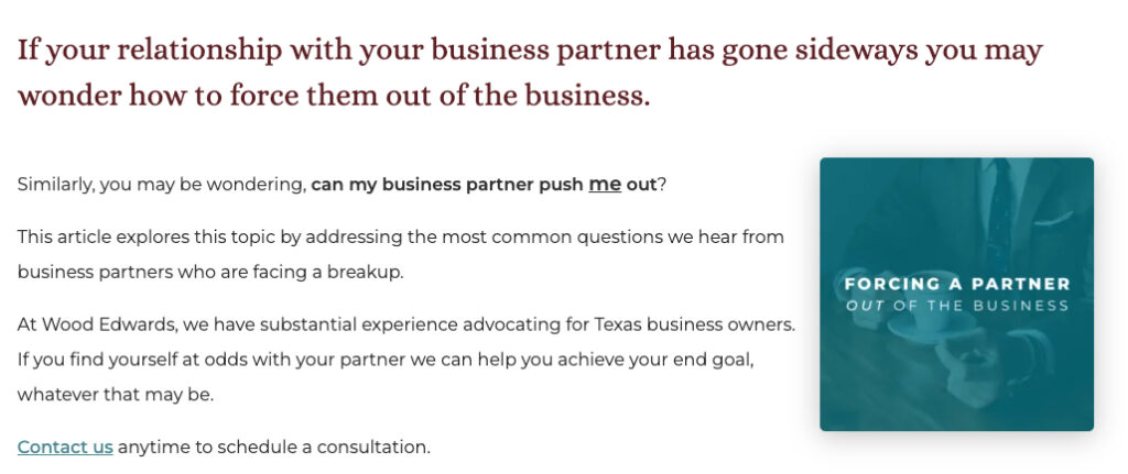
Another creative form of blog post-CTA that we’ve deployed for some of our clients is what I call an explainer CTA because we are explaining to the reader at the very top of the post why the law firm is blogging, what the law firm does, and how the reader can reach out if they have questions. Here are a few examples of explainer CTAs:
As you can see there are lots of options for including CTAs in your law blog post design. The CTA that will work best for any given law firm can really only be determined by experimenting and measuring the results.
More Law Blog Design Elements to Get Right
So far we have examined typography – which is really what will most determine the efficacy of your law blog design – and we’ve looked at three elements that can effectively build trust with the reader – author information, published/updated date, and calls-to-action. If you get both of these right, you are going to be well on your way to a highly effective blog design.
Now we’ll get a little less structured and look at a smattering of additional design elements to be intentional about when creating your law blog design.
Blog Post Title
The biggest mistakes you can make with the styling your blog post title are:
- Making it too small. Your title should be in the largest font on the page and be impossible to miss.
- Making it below the fold. The reader should not have to scroll to find the title of the post, whether on a desktop or mobile device.
- Making it hard to read. Your title should either be light on a dark background or dark on a light background. If your title is placed on top of an image banner the image needs to be treated so that it does not make the text difficult to read. Here’s an example:
In-Body Image Styling
It’s a general SEO best practice to include a custom image in each law blog post, and some blog topics (like the one you are currently reading) naturally require a large number of images to be valuable.
With that being the case it’s important to consider the styling of your in-body images. I personally like to ensure that in-body images are styled with:
- Proper spacing – Ensuring that there is adequate space between the image and the surrounding text elements.
- Depth or radius or both – Adding a drop shadow or a border radius to your images (or both, as with the images in this post) generally improves the aesthetic of the post. This is especially helpful in instances where you are using screenshot images to offset the image from the text on the page.
Here are two examples of images in law blog posts. Which do you think looks more appealing?

VERSUS:
Another Image Tip: Create custom images for your blog posts. This doesn’t mean you can’t use stock photos, but you should always make customizations to the stock photos that you use to make them custom to your law firm. The example above demonstrates the difference in aesthetics between using a plain stock photo and creating a customized image.
(Another) Another Image Tip: Make sure that the caption text for your images is styled intentionally. Generally, image caption text ought to be smaller than the default paragraph text. The image caption text on this blog post provides a good example.
List Styling
I generally find that it’s rare to write a legal blog post that doesn’t have bulleted and/or numbered lists. Lists are a great way to make your content more readable. As such, lists ought to be styled intentionally.
At a very minimum, your lists should inherit the best practices from your other typography. For example:
- They ought to match your standard paragraph font in terms of typeface, size, weight, and decoration.
- They ought to have adequate line height.
- They ought to have a bottom margin so that they are properly spaced.
- They ought to have a left margin so that they are offset from the surrounding paragraph text.
If you are so inclined you can also experiment with different styles for the actual bullet points. You can see that on this website we use dashes with a color gradient rather than traditional bullets. Here are some other examples of creative bullet styling:
As with so many of the elements discussed here, there is no single “best” way. What’s important is that you be intentional about designing and styling these elements and that you always keep readability and accessibility top of mind while doing so.
Blockquote Styling
It’s a good idea to intentionally style blockquotes. Here is what our blockquote styling looks like:
This is a blockquote. The styling is used to make it clear to the reader that this is a quote from someone. It can also be used simply to draw attention to particularly imporatnt information. Make sure you are intentional about styling your blockquote.
– Matt Green
Mobile Layout
I feel somewhat ashamed that I have not yet even mentioned mobile blog post design. As a general rule, we assume that around 50% of all of our client’s blog traffic is going to come from mobile devices (for some clients it’s higher, for others lower, but 50% is generally the medium).
For this reason, it’s essential to consider the mobile layout of your blog posts. Now, with most of the elements, we discuss here if you get them right on desktop you’ll get them right on mobile as well. But make sure to check. Review your blog posts carefully on mobile devices to ensure that your content is just as readable and accessible as it is on desktop resolutions.
Law Blog Post Bells-and-Whistles to Consider
Table of Contents Links
Especially if your blog posts tend to be on the longer side, baking a table of contents into your blog post design can be a great way to make your content easier for readers to digest.
If you scroll to the top of the blog post you are reading you can see an example of including a table of contents in the design. Here is an example of how we designed a table of contents into the blog post design for one of our clients:
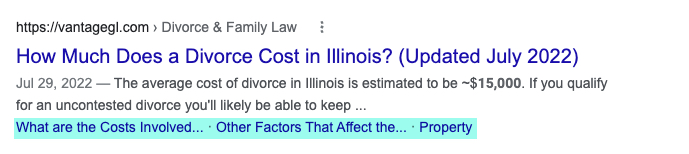
The primary reason to include a table of contents in your blog design is to help the user navigate long-form content. It has the added benefit of qualifying your posts for this search enhancement in Google’s results:
Sticky CTAs
A sticky CTA is a call to action that “sticks” with the user as they scroll the page. This very blog post has one (in the desktop version). Here are links to a couple more examples of blog post designs that utilize interesting sticky CTAs:
Author Bio Info
Earlier, we discussed the importance of attributing your blog posts to an author. Sometimes it makes sense to include a full author bio in your blog post design. For an example of this, see the bottom of this blog post.
Sticky Title and Progress Bar
I have seen this becoming increasingly popular on long-form content in particular. The idea is that there is a sticky header on your blog post that contains the title of the post and a progress bar so that folks know how close they are to the end.
Here’s an example from ZoomLegal:
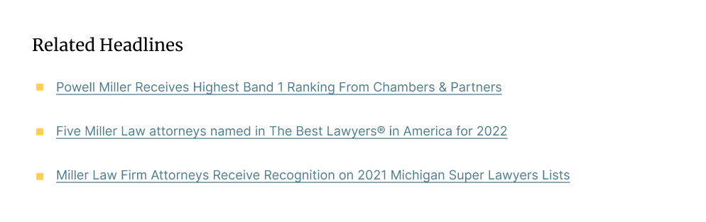
Related Posts Links
For sites that have lots of blog content, it might make sense to bake a “related articles” section into your blog post design. The key to an effective related articles section is to actually link to articles that are related and that might appeal to the reader of your blog post.
Here’s an example of what that might look like:
This is the End
I hope you found this guide useful and that you bookmark it to use as both a best-practice reference and as inspiration when you’re tackling the challenge of creating a compelling and effective blog post design for your law firm.