In today’s digital-first world, having a user-friendly and engaging website for your law firm isn’t an option—it’s a necessity. That goes double in the highly competitive legal field, where potential clients make snap decisions about your firm’s credibility, often based primarily on their initial impressions of your website.
Everyone in your firm likely has an opinion on your website. Who’s right and who’s wrong? Let’s talk about it! Welcome to your comprehensive guide on the 5 best website designs for employment law firms. We’ve curated this list with a meticulous eye, years of industry experience, and a broad array of empirical usability data. Steering clear of subjective opinions, we’re delving into the core factors that yield a high-performing law firm website.
Why Is Quality Website Design Important for Your Law Firm?
In the fiercely competitive landscape of the legal sector, a sophisticated and user-friendly website is your law firm’s digital flagship. A multitude of credible studies underscore this fact. For instance, according to Magnetize, approximately 75% of users judge a company’s credibility based on its website’s design.
Moreover, enhancing your site’s user-friendly design can significantly grow trust in your brand. Improving the user experience (UX) design can raise customer conversion rates by up to 400%, as recent findings from Forrester Research suggest. That includes optimizing your site for mobile users. While a majority of users search online for law firms using desktop computers, mobile traffic will soon outpace desktops if trends continue.
The evidence is clear to those of us who have been doing this for a long time: Law firms seeking competitive advantage and high client engagement must prioritize robust, professional, and appealing website design. Starting with these research-backed findings can guide you toward creating a website that effectively delivers your unique offerings and bolsters your firm’s digital footprint.
Why Should You Trust This List?
At Juris Digital, we’ve honed our legal marketing expertise for over a decade. In that time, we’ve built a portfolio of high-impact digital content that drives more than just online visibility for law firms.
This list isn’t simply an arbitrary collection of “best employment law firm websites” or a list of websites that Juris Digital designed. Our selection process is deeply rooted in comprehensive research, industry scrutiny, and repeatable results achieved. We aren’t here to toot our own horn, and we had nothing to do with the design of these websites. We chose them out of our steadfast commitment to assisting employment law firms like yours in identifying an exceptional web presence, no matter who designs the site.
Keep reading to explore our top 5 selections for employment law firms with the most compelling website designs!
1. Littler Mendelson P.C.
Website | LinkedIn | Contact Information
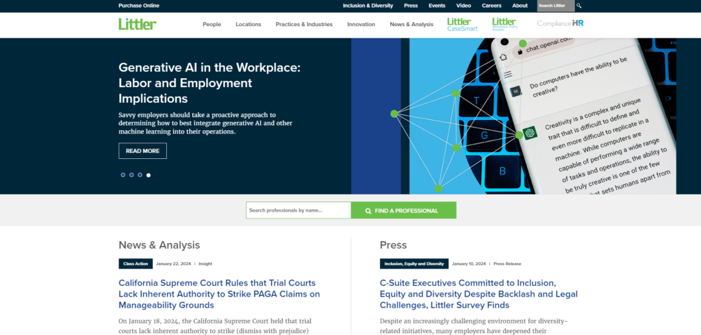
Littler brings together various design elements that are visually compelling and well-aligned with user expectations. The law firm is wise not to try to cram too much onto the homepage; instead, it includes two separate tiers of navigation tabs at the top of the page to make finding what you’re looking for easy to do without scrolling. A site with smaller pages also loads faster, which helps reduce its bounce rate.
Strengths: Littler’s site differentiates itself with its clean design and bold color choices. Here are five reasons why it made our list:
- Professional design. The Littler website portrays a clean, professional look aligning with its brand image.
- Ease of navigation. This site is user-friendly with a straightforward navigation menu.
- Comprehensive information. The website is informative, providing extensive content about the firm’s services, leaders, and updates.
- Responsive web design. It adapts well to various devices and screen sizes, indicating a responsive design.
- Multiple language support. Given the international span of the firm’s operations, the website supports multiple languages, improving accessibility for users of different linguistic backgrounds.
The site’s professional-looking visuals and persuasive content align with a website design study’s findings that system design significantly impacts usability. As applied on Littler’s site, a clean design and bold color choices make the site stand out and pop for instant brand differentiation. For these reasons, we had to include it on this list.
2. Ogletree Deakins
Website | LinkedIn | Contact Information
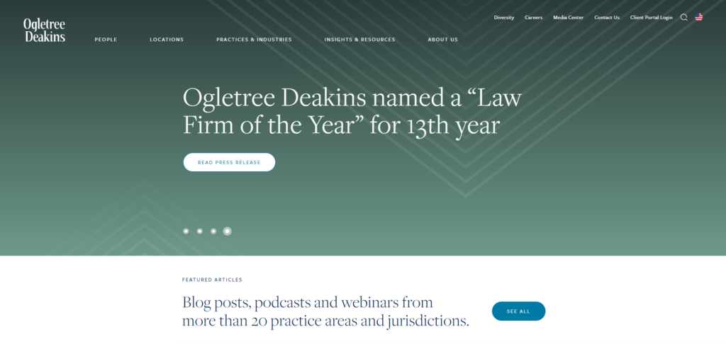
Ogletree Deakins’s website is another site with a solid, professional-looking design that somehow makes navigating hundreds of pages worth of information intuitive and simple. This site embodies critical attributes commonly identified for website evaluation, including user experience and usability. Ogletree presents information concisely and offers fluid navigation, ensuring a productive user experience.
Strengths: Ogletree’s website has a number of factors going for it!
- Award-winning creativity and excellence. The website’s design has proven its merit by winning a W3 award, an honor recognizing creative excellence on the web.
- User-friendly and efficient navigation. The website was redesigned following a comprehensive content audit and re-organization process. The site uses an agile user experience design method, ensuring the website is easy to navigate and leading to an enriching user experience.
- Effective information delivery. The redesign immediately increased organic traffic and time spent on the website’s thought leadership content.
- Advanced technical infrastructure. The firm has embraced key technological advancements for its website. It has implemented new features such as a cloud-based intranet, AI-augmented enterprise search, and a natural language chatbot with multilingual support.
- Innovative design approach. The web design process involved upwards of 50 wireframes for new pages and introduced a new look and feel.
Ogletree invested in a quality website because the effectiveness and success of a web design are not merely a product of aesthetic appeal but hinge significantly on the site’s usability, the relevance of content, and the degree of alignment with the organization’s overall digital strategy. This one’s got all three.
3. Jackson Lewis P.C.
Website | LinkedIn | Contact Information
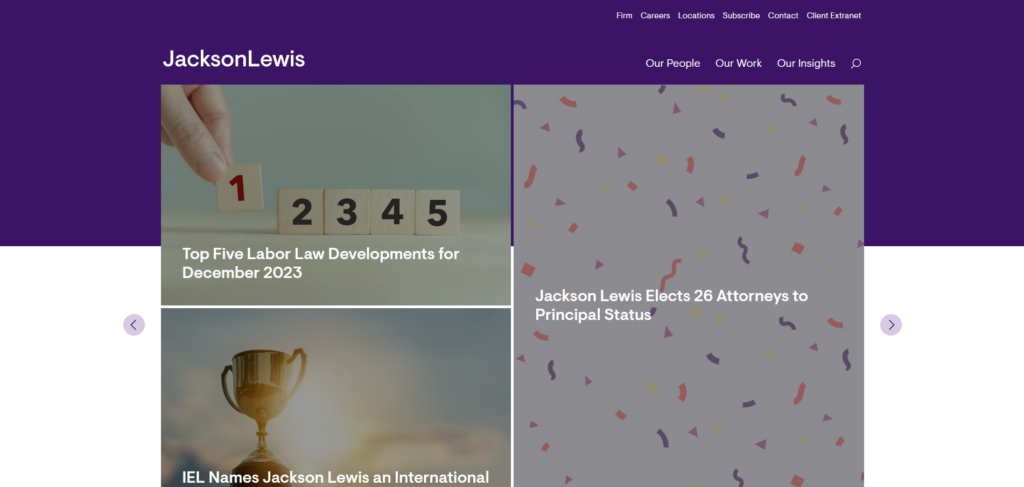
Jackson Lewis’s website greets visitors with a bold shade of purple, making it stand out from the pack of law firms draped in shades of navy blue. The site emphasizes educational content—a critical factor in building trust with new users and keeping them coming back for more expertise. The simple navigation bars make it easy for visitors to narrow their search focus and quickly find the info they want.
Strengths: Jackson Lewis follows many of the same design principles that our other picks have used to much success.
- Professional design. The Jackson Lewis P.C. web page exhibits a professional aesthetic, with a simple color palette and a clean design.
- Ease of navigation. The site navigation is neatly structured with a well-organized menu that allows users to readily access the sections they’re interested in.
- Focus on content. The website contains a wealth of resources and publications, suggesting a dedication to providing clients and visitors with valuable legal information.
- Responsive web design. The website performs well on various screens and devices. This is crucial in the current digital environment, where users access web resources on multiple devices.
- Website compliance assessment feature. Jackson Lewis P.C. offers a cutting-edge website compliance assessment tool, a clear reflection of its commitment to advanced web-relevant legal tools.
Overall, Jackson Lewis P.C. conforms to usability guidelines by making critical information and contact channels easily visible. The straightforward and practical design improves the overall user experience.
RELATED: What Makes a Good Law Firm Website?
4. Fisher Phillips
Website | LinkedIn | Contact Information
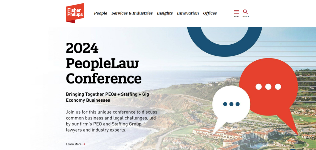
Fisher Phillips favors a bold splash of red in its homepage design, again using a bright color to set itself apart from the pack. It scores high marks for its mobile-friendliness due to looking great on screens of all shapes and sizes. The site keeps navigation simple by hiding less popular pages in its dropdown menu and highlighting its top pages up top in the navigation bar.
Strengths: Fisher couples some of the essential attributes we’ve discussed with other designs on this list with some tech features others lack.
- Professional design. The website reflects a professional image, featuring a clean, sorted design and straightforward representation of the law firm’s brand.
- Clear navigation. The user-friendly website layout prominently features navigational elements. The main sections are easily accessible, enhancing the user experience.
- Comprehensive resources. The website highlights an impressive array of resources, such as blog articles and publications on diverse labor and employment law topics, offering extensive information to visitors.
- Responsive design. From the user interface, the website has a responsive web design that adjusts to the user’s device, offering a seamless browsing experience on varying screen sizes.
- Interactive features. The website provides interactive features like live chat and search options, which can enhance user engagement and satisfaction.
By presenting a bold, contemporary design, Fisher Phillips offers users an experience that captures attention and guides them effectively through the firm’s many service offerings and expertise—an approach that aligns with modern digital expectations and user-centric design principles.
5. Seyfarth Shaw LLP
Website | LinkedIn | Contact Information
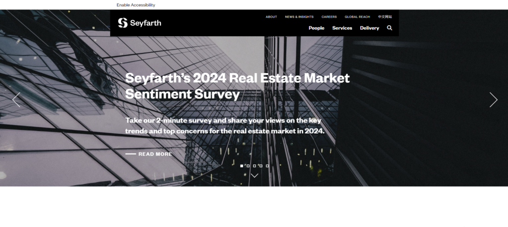
Seyfarth Shaw sets its website apart by loudly touting the firm’s accomplishments right up top, where you can’t miss them. This is another sleek and professional design that scrolls smoothly and makes “Browse Our Services” its primary call to action.
Strengths: Following a review of the Seyfarth Shaw LLP website, users can identify several notable aspects of its web design.
- Substance-focused design. The website’s design prioritizes content, focusing on providing robust, relevant, and timely information to its visitors. The scrape results indicate a wide range of legal topics being covered, from “PAGA Claims in California” to “Corporate Transparency Act” and “Pay Equity.”
- User-friendly navigation. The structure of the site’s content suggests an emphasis on easy navigation. This is a crucial component of good web design, as it directs users to the information they’re seeking quickly and efficiently.
- Mobile responsiveness. As we’ve covered, mobile responsiveness is often an essential attribute of professionally designed websites like Seyfarth.com. Responsiveness ensures that the website displays well on various devices and screen sizes, and Seyfarth’s sleek design looks great on mobile browsers.
- Professional aesthetics. The website’s professional look and feel reflect the firm’s image, instilling a sense of trust and reliability.
- Fresh and current content. The website regularly offers fresh content, staying up to date on pertinent legal topics. This engages visitors and encourages them to return for fresh insights.
Relying on visually engaging blocks of content dovetailed with compelling written content, Seyfarth Shaw offers its visitors an appealing, multi-faceted exploration of the firm’s services. The firm’s commitment to a mobile-friendly design perfectly aligns with studies linking website usability to user engagement and satisfaction.
Things to Consider When Creating Your Law Firm’s Website
A poorly designed and constructed website can really hinder a law firm’s growth. Most new users on your site simply will not have the patience for an ugly, hard-to-use website that makes them scroll or search endlessly. Often, they will leave your site immediately if it does not meet or exceed their expectations for a successful firm.
As you consider working on your website’s design or engaging a digital agency to revamp it, here are some critical points to contemplate:
- First impressions matter. How your site appears at first glance can significantly influence how visitors perceive your brand. It needs to be professionally designed and visually appealing.
- Emphasis on usability. The best law firm websites are intuitive, easy to navigate, and well-structured, resulting in an excellent user experience on all devices.
- Incorporation of engaging content. From case study highlights to widely acclaimed verdicts, engaging content in formats such as videos or infographics can offer viewers a vivid picture of your practice.
Remember, a well-constructed website should be the front porch of your law firm—your face to the digital world that helps potential clients choose your law firm over others. Consider these designs for inspiration and guidance as you build or upgrade your own digital presence.
