The best divorce lawyer websites are visually pleasing and easy to navigate. Your law firm’s website should also clearly explain what services you offer, as well as any other details potential clients need to know.
And the very best divorce attorney websites use a Storybrand framework. But more on that later…
Looking for a little inspiration? We’ve compiled a list of our favorite divorce lawyer websites. They feature gorgeous designs, user-friendly layouts, high-quality content, and more. Keep reading to discover our top 15 website designs for divorce attorneys. Along the way, we’ll discuss pro tips for getting the most out of your website.
Want a site like one of these built for your firm? We build custom, conversion-focused websites for divorce attorneys.
Top 15 Divorce Lawyer Website Designs
Now that you know what factors to consider when creating your website or hiring a web design agency, you can start perusing other lawyer websites to get some creative ideas.
Here are fifteen of our favorite divorce lawyer websites.
| Firm | Standout feature | Palette/mood | Key takeaway |
|---|---|---|---|
| 1. Vantage Group Legal Services (Juris Digital design) | Full StoryBrand-framework homepage | Navy blue & beige, lighthouse mark | Clarity beats cleverness |
| 2. The Lincoln Law Firm, PLLC | Rotating symbolic imagery (apple, compass, puzzle pieces) | Memorable, metaphor-driven | Help clients, don’t brag |
| 3. Kraayeveld Family Law Attorneys | #2 Google ranking, AI chatbot | Dynamic, concern-driven copy | SEO is non-negotiable |
| 4. Jones Divorce and Family Law | 3 funnel-stage CTAs, resource library | Autumnal, forest imagery, serene | User-focused design boosts SEO |
| 5. Riddle & Hanna, PLC | Bilingual site, local SEO on practice pages | Bold single-image simplicity | Local SEO works even with broad practice areas |
| 6. Randal Lowry & Associates | Charging rhino hero image, FAQ schema | Bold color, callout text | FAQs help both users and SEO |
| 7. Haid & Teich, LLP | Niche SEO targeting women, shareable infographic | Search-first, resourceful | Reviews drive conversions |
| 8. Levine Family Law Group | Gated downloadable resources | Calming, white space, simple icons | Gated content builds a warm-lead list |
| 9. Rosen Law Firm | DIY divorce tool, calculators, eCourse | Reader-centric, tool-rich | Answer every question a visitor has |
| 10. M & Company Family Law | Three Practice Group structure, in-house CPAs | Black, white & blue, boardroom aesthetic | Niching down is a design choice too |
| 11. Fresh Legal | Mediator/lawyer path split, resource links | Yellow, orange, white & blue, playful | Tone is a design decision |
| 12. The Dadvocates | 4 trust signals above the fold, outcome-driven testimonials | Grey, black & white, minimalist | Tighter focus, faster self-identification |
| 13. Lishman Law | Board certification & network badges in hero | Scarlet, grey & beige, founder-centered | Surface rare credentials up front |
| 14. Yarborough Law Group | Affirm payment plan ticker, tribal affiliation badges | Tan, brown & dark blue, organized | Address affordability before it’s asked |
| 15. Nevada Family Law Group | Free Divorce Guide opt-in, state-shaped logo | Blue, white & tan, emotionally direct | Clarity over visual flash |
TL;DR — Top 5 Divorce Lawyer Website Designs
- Vantage Group Legal Services: a textbook example of the StoryBrand framework applied to a law firm homepage.
- The Lincoln Law Firm, PLLC: one-of-a-kind rotating imagery (an apple, a compass, puzzle pieces) tied to real client pain points.
- Kraayeveld Family Law Attorneys: an SEO powerhouse, ranking #2 for “Grand Rapids divorce lawyers,” backed by a 24/7 AI chatbot.
- Jones Divorce and Family Law: serene autumnal imagery and copy built around a client-centric marketing funnel.
- Riddle & Hanna, PLC: a single bold image that communicates a multi-practice-area firm without overwhelming visitors.
1. Vantage Group Legal Services (A Juris Digital Site)
Company Website | Testimonials | LinkedIn | Contact Info
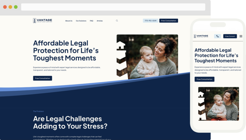
Strengths: Vantage Group Legal Services is a Juris Digital design that doubles as a textbook example of the StoryBrand framework in action. Every section of the homepage follows the “problem, guide, plan” structure rather than just listing services. The navy blue and beige palette, paired with a lighthouse mark in the logo, reinforces the site’s core message: Vantage is a steady guide during a stressful legal situation, not just another law firm. Here are some highlights:
- The hero pairs a clear, benefit-driven H1, “Affordable Legal Protection for Life’s Toughest Moments,” with an image of a woman holding her child, immediately putting a real person (the client) at the center of the story rather than the firm;
- The page moves through a textbook StoryBrand arc: naming the client’s problem (family disputes, foreclosure, probate, evictions), positioning Vantage as the guide with a simple 3-step plan (Reach Out, Meet Your Attorney, Focus on Your Life), and backing it up with client testimonials as proof; and
- “Free Consultation” appears as a repeated CTA after nearly every section, so a visitor never has to scroll far to find the next step, regardless of which problem brought them to the page.
Key Takeaway: Clarity beats cleverness. The most effective legal websites tell a story where the client is the hero, the firm is the guide, and the path forward is dead simple. If a visitor can’t tell within seconds what problem you solve and what to do next, the design is working against you, no matter how polished it looks.

2. The Lincoln Law Firm, PLLC
Company Website | Testimonials | LinkedIn | Contact Info

Strengths: The Lincoln Law Firm website’s one-of-a-kind imagery makes it memorable. Here’s what else stands out:
- The main image rotates between an apple, a compass, and puzzle pieces and uses corresponding headlines that speak to common pain points of divorce;
- The language on the home page and throughout the site answers clients’ questions and concerns; and
- Practice area pages feature testimonials and topic-related blog posts that build trust for potential clients.
Key Takeaway: A great divorce lawyer website will emphasize helping clients over serving as a law firm brag sheet. Meeting clients’ needs in a unique way makes your website memorable.
3. Kraayeveld Family Law Attorneys
Company Website | Testimonials | LinkedIn | Contact Info
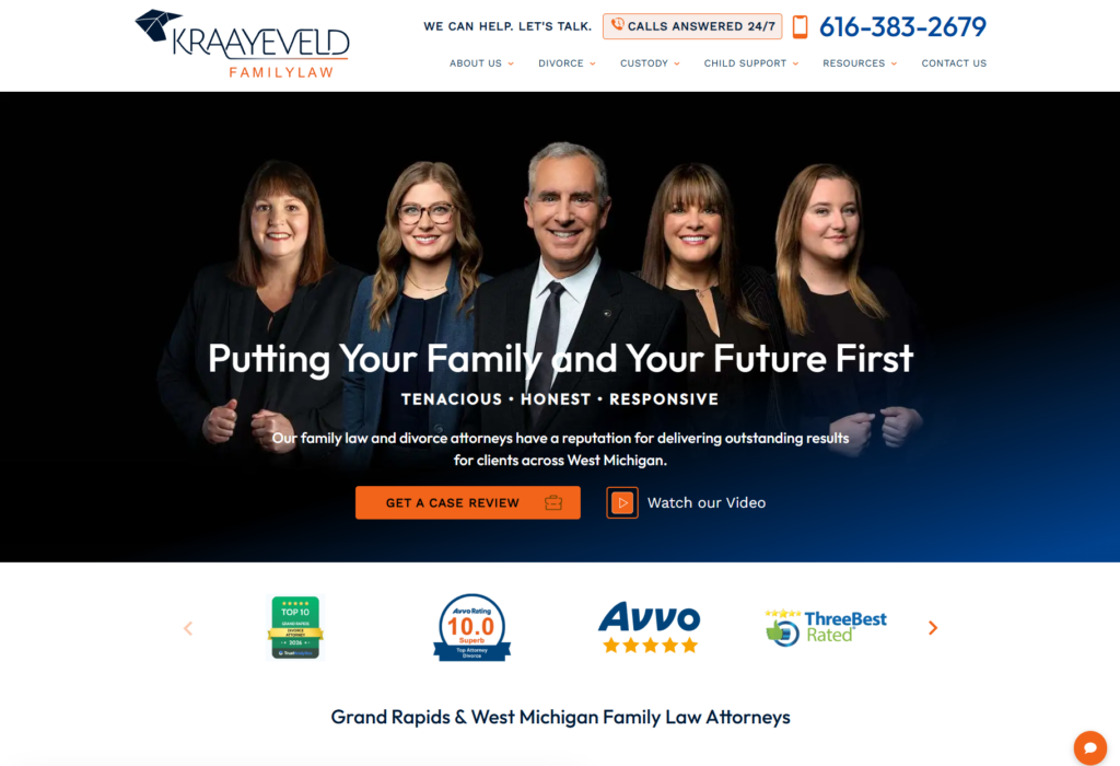
Strengths: The Kraayeveld Family Law Attorneys website nails SEO. It uses meta titles, meta descriptions, and on-page language that help its site achieve the second position on Google for the highly searched phrase “Grand Rapids divorce lawyers.” More standout features include:
- The homepage images and wording are dynamic, and they all speak to common concerns clients have when facing a divorce;
- An AI-powered chatbot allows the firm to capture important information from potential clients 24/7; and
- Multiple calls to action (CTAs) on each page make it easy for potential clients to contact the firm wherever they are on the website.
Key Takeaway: An SEO-optimized website is crucial for getting new clients. Use targeted keywords for your practice areas and your physical location. This will help you rank on page 1 of organic search. Remember: if your website is on page 2 of search, it may as well not exist.
4. Jones Divorce and Family Law
Company Website | Testimonials | LinkedIn | Contact Info
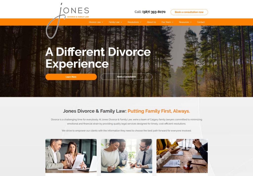
Strengths: The autumnal colors, peaceful forest imagery, and stylized “J” on the home page evoke a serene experience. This mood contrasts with what most people imagine when it comes to divorce—a possible contentious legal fight. Here are other eye-catching features:
- Three CTAs on the home page header accommodate potential clients at the three points of the marketing funnel—learn more (awareness), book a consultation (consideration), and get started (conversion);
- The language throughout the site speaks to individuals who may have a complex divorce situation; and
- A resource library includes downloadables and content related to divorce procedures and healing after a divorce.
Key Takeaway: This site is the most client-centric of the top 7 divorce lawyer websites listed here. Designing a website that is user-focused can help boost its SEO performance. Google prioritizes websites that provide helpful and unique information, and this site achieves that goal.
5. Riddle & Hanna, PLC
Company Website | Testimonials | Facebook | Contact Info

Strengths: Is divorce law one of your firm’s many practice areas? A diverse set of legal offerings can complicate your website’s design. Riddle & Hanna, PLC manages to communicate its many strengths in a single bold image. When it comes to connecting to potential clients, a few items stand out:
- The page for family law and divorce goes all-in on local SEO, using location-based keywords on the page and in meta descriptions;
- Each page includes a prominent phone number and contact form, making it easy for potential clients to reach out; and
- The website gives users the option to read the site’s content in Spanish or English.
Key Takeaway: Even if your firm covers a wide range of practice areas, be sure to optimize your pages for local SEO. Your divorce attorney web page can still rank high on Google search with the right combination of targeted keywords and helpful information.
Related: How Much Should a Law Firm Website Cost?
6. Randal Lowry & Associates
Company Website | Testimonials | LinkedIn | Contact Info

Strengths: The homepage image is as striking as it is clever. Potential clients are sure to remember the charging rhino and the creative corresponding headline. But that’s not the only thing that makes this website great. Here are a few other points:
- A bold color scheme paired with large, succinct headings keeps the user’s eyes moving through key content;
- Callout text in a different color and font from the rest helps potential clients see important information at a glance; and
- An FAQ page answers common client questions and can boost the site’s search rank.
Key Takeaway: FAQs are useful for website SEO in several ways. First, they provide helpful information, which Google prioritizes above other content. Second, an FAQ section with the proper schema data encoded on it makes it easier for Google to highlight the page as featured content on the first search results page.
7. Haid & Teich, LLP
Company Website | Testimonials | LinkedIn | Contact Info

Strengths: This family law firm takes every step to ensure that women in the Chicago area who need a divorce attorney will find its website. The website URL, page headings, and metadata are all targeted to show up on page 1 when women search for a Chicagoland divorce attorney for women. Other items that set this divorce attorney website apart:
- A search bar at the top of the home page makes it easy for users to find the exact content they’re looking for;
- A “divorce roadmap” infographic on the home page is easily shareable on social media; and
- A review button on the sidebar of each page helps current and former clients give feedback that can be used in various ways for marketing the firm.
Key Takeaway: Garnering positive reviews is vital for divorce law firms. This is especially true given that 93% of consumers say online reviews influence their buying decisions. Make it easy for clients to leave reviews through an online form. And be sure to ask clients to review your firm on Google to boost your local search rank. Be careful to follow Google’s best practices for soliciting reviews.
8. Levine Family Law Group
Company Website | Testimonials | LinkedIn | Contact Info

Strengths: A simple design with calming colors, plenty of white space, and straightforward icons makes navigating this divorce law firm website a breeze. Other features that make this website unique:
- Four-star Google and Yelp reviews on the home page build trust with potential clients;
- Quotes from satisfied former clients stand out on the bottom of each web page; and
- A resources page provides downloadable content that is helpful for potential clients and allows the firm to capture client lead contact information.
Key Takeaway: Build a robust email list of potential clients by providing downloadable white papers and guides on your website. By gating this content (requiring a user to give their email address and name before accessing the downloads), you can create a stream of warm leads that will remember your firm if they find themselves or their loved ones needing a divorce lawyer.
9. Rosen Law Firm
Company Website | Client Stories | LinkedIn | Contact Info
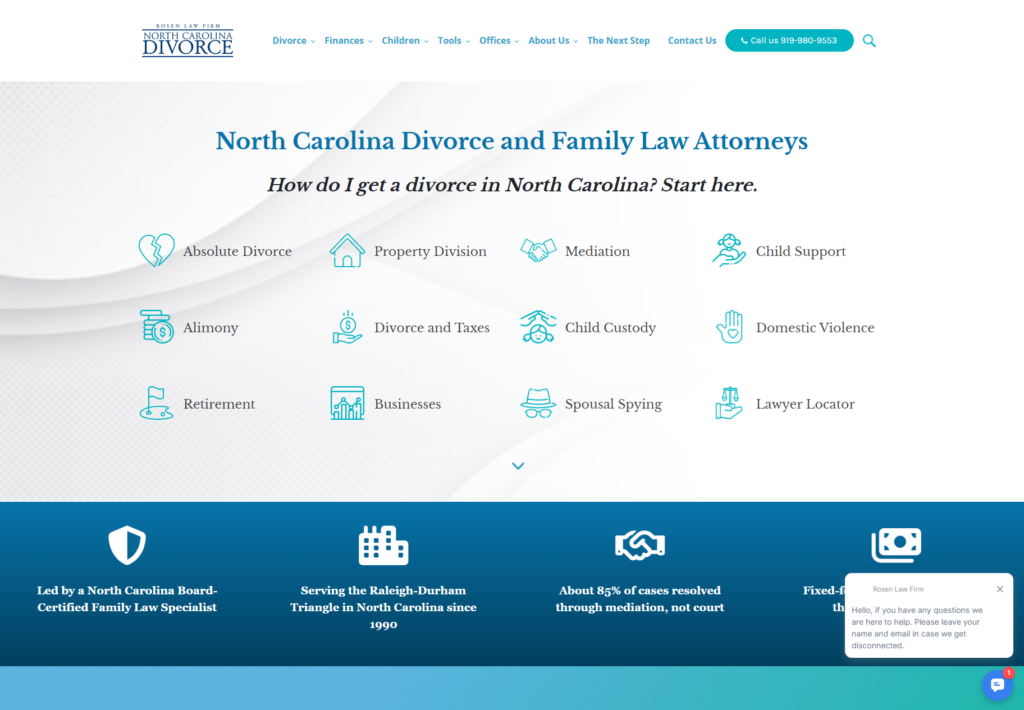
Strengths: When it comes to providing user-friendly content and answering readers’ questions, few websites do it better than North Carolina divorce lawyer practice, Rosen Law Firm. At the top of the website’s home page, you’ll find clickable links with information on how to navigate every facet of getting a divorce in North Carolina. Scroll down to discover tools such as a child support calculator. Just a few of the highlights of Rosen Law Firm’s website include:
- Easy-to-find, useful information on absolute divorce, alimony, property division, child custody, divorce and taxes, and much more;
- Rosen Online, which enables you to get a DIY divorce online (with unlimited attorney access, separation agreement templates, and a form builder);
- Child support and alimony calculator tools; and
- A divorce eCourse and eBooks.
Key Takeaway: Rosen Law Firm publishes reader-centric content that addresses website visitors’ needs, wants, and pain points while fully answering their questions. By doing so, this firm ensures readers will remember them when the time comes to hire a divorce lawyer.
10. M & Company Family Law
Company Website | LinkedIn | Contact Info
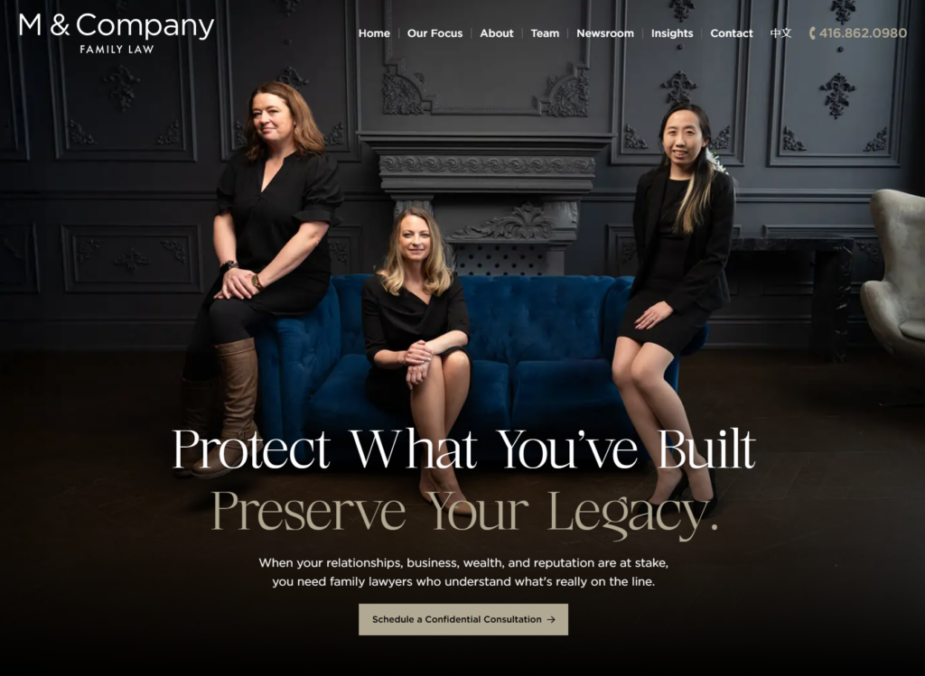
Strengths: M & Company positions itself as “corporate family lawyers” for high-net-worth clients, and the site’s visual language backs that claim before a visitor reads a word. The hero photo, the attorney team in black, standing in an upscale room with crown molding, wainscoting, and a single blue couch as the only pop of color, reads more like a private wealth management firm than a typical family law practice, reinforced by a black, white, and blue palette throughout. More standout features include:
- The messaging speaks directly to a narrow, high-value audience (“high-net-worth professionals, business owners, and executives”) rather than trying to appeal to every possible divorce client, positioning the firm around protecting wealth and business interests specifically;
- A “Three Practice Group” structure (Written Advocacy, Financial Advocacy, Litigation) is explained in detail on the homepage, giving visitors a clear picture of how their case would actually be staffed and billed, down to the promise that “you will never see multiple lawyers billing for the same task”; and
- An in-house Financial Advocacy group staffed by former Big Four accounting partners is called out as a genuine differentiator, not just an add-on service, with real detail on how it affects financial disclosure, tax strategy, and settlement outcomes.
Key Takeaway: Niching down can be a design strategy, not just a marketing one. When a firm commits to serving a specific, well-defined client (here, high-net-worth individuals with complex assets), the visual identity and copy can commit right alongside it, rather than defaulting to the generic warmth most divorce sites reach for. A boardroom aesthetic and confident, credential-heavy copy will repel the wrong client and attract exactly the right one, which is the point.
11. Fresh Legal
Company Website | LinkedIn | Contact Info

Strengths: Fresh Legal, an Ottawa-based family law firm, breaks from the somber tone most divorce sites default to, and the design commits to it fully. The hero image, all the firm’s attorneys holding oranges in front of their faces, playing off the firm’s citrus branding, paired with a yellow, orange, white, and blue palette, signals a deliberately un-litigious, human tone before a visitor reads a single headline. Additionally:
- The homepage immediately splits visitors into two paths, “Talk to a Mediator” or “Talk to a Lawyer,” acknowledging upfront that not every family law client needs (or wants) a courtroom fight;
- The messaging leans hard into a non-confrontational positioning (“Divorce Doesn’t Have to Be a Battle,” “less conflict and more control”), directly naming what most people fear about divorce and offering a contrasting path in the same breath; and
- A “Helpful Resources for Separations” section links out to practical, specific content (safety planning, flat-fee divorce info, the legal consequences of getting married), giving visitors something useful to act on even before they book a call.
Key Takeaway: Tone is a design decision, not just a copywriting one. If your firm’s actual approach to divorce is genuinely different (mediation-first, lower-conflict, whatever the differentiator is) the visuals should say so before the text does. A playful motif like an orange slice only works because it’s backed by real substance underneath: clear service paths, honest acknowledgment of the client’s fear, and resources that deliver on the promise of a calmer process.
12. The Dadvocates
Company Website | Contact Info
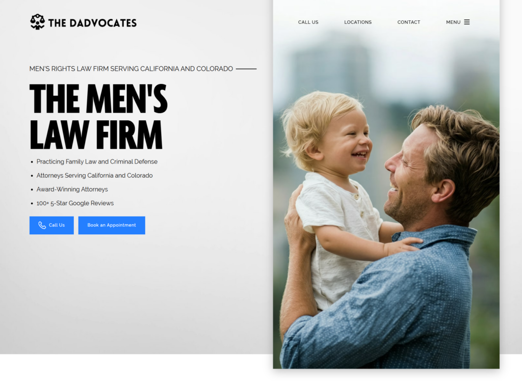
Strengths: The Dadvocates commits fully to a narrow, clearly stated audience: men and fathers navigating family law and criminal defense. A minimalist grey, black, and white palette with touches of blue keeps the design restrained, while the hero photo of a father with his child, paired with the direct headline “The Men’s Law Firm,” leaves no ambiguity about who the site is for. Here are some good features that they effectively use before the user ever has to scroll down:
- Four quick trust signals sit directly below the headline: practice areas served, states served (California and Colorado), award recognition, and “100+ 5-Star Google Reviews”, giving visitors everything they need to qualify the firm before scrolling further;
- “Call Us” and “Book an Appointment” appear as the first two actions on the page, ahead of any explanatory copy, prioritizing speed to contact over persuasion for a visitor who’s likely already decided they want this kind of firm; and
- Client testimonials throughout the site are specific and outcome-focused (“I saw my kids the very next day for the first time in 112 days”), reinforcing the firm’s core promise with real results.
Key Takeaway: A minimalist design doesn’t always translate to a lack of information. The Dadvocates strips away anything that doesn’t serve its specific audience and puts the highest-value information (who we serve, where, and how good we are) right at the top, above the fold. If your firm serves a defined niche, resist the urge to broaden the homepage to appeal to everyone. The tighter the focus, the faster the right client self-identifies.
13. Lishman Law
Company Website | LinkedIn | Contact Info
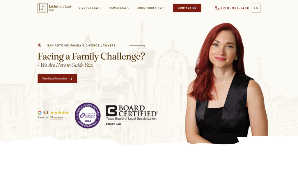
Strengths: Lishman Law’s San Antonio homepage centers founding attorney Sarah Lishman herself in the hero amid a scarlet, grey, and beige palette. Whether it’s intentional or not, it echoes her red hair and black dress in her photo, which is a nice touch. Additionally, the headline, “Facing a Family Challenge? We Are Here to Guide You,” is direct without being cold, setting a reassuring tone before a single practice area is mentioned. Here are some other great features:
- Three authority signals sit right in the hero: a Google rating, an Amicable Divorce Network membership badge, and Sarah Lishman’s Board Certification in Family Law from the Texas Board of Legal Specialization;
- A “Free Case Evaluation” CTA appears in the hero, the mid-page callout, and the closing contact form, giving a visitor multiple low-commitment entry points without ever feeling pushy; and
- The site includes a Spanish-language toggle (“Es”) in the header, extending the firm’s reach to Spanish-speaking clients in the San Antonio area, and its “Why Choose Us” section explicitly calls out plain-language communication as a differentiator.
Key Takeaway: When a founder’s credentials are genuinely rare (board certification in family law is held by a small percentage of Texas attorneys) don’t bury that fact in an about page. Lishman Law surfaces it in the hero alongside softer trust signals like reviews and network memberships, giving visitors both an emotional reason to trust the firm and a hard, verifiable credential to back it up.
14. Yarborough Law Group
Company Website | Contact Info
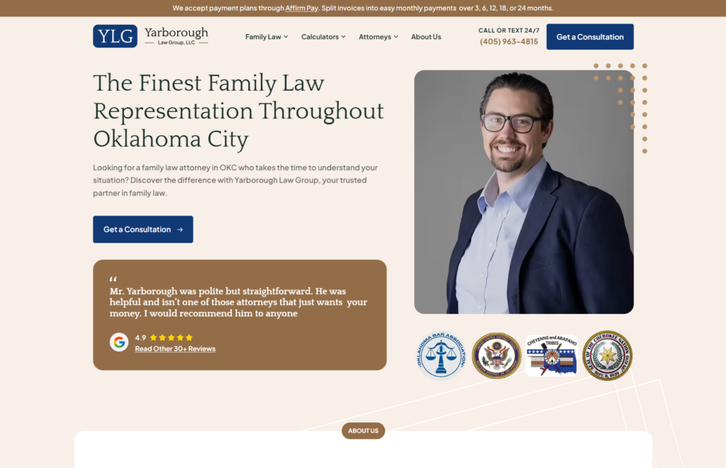
Strengths: Yarborough Law Group’s Oklahoma homepage packs in a lot of trust-building information without feeling cluttered, largely thanks to a restrained tan, brown, and dark blue palette that keeps everything organized visually. The hero pairs a photo of attorney Cole Yarborough with a direct headline, “The Finest Family Law Representation Throughout Oklahoma City,” a consultation link, and a review snippet, giving visitors the pitch, the proof, and the next step all in one glance. More standout features include:
- A row of tribal affiliation badges sits directly beneath Cole’s photo, including the Choctaw Nation, Cherokee Nation, Cheyenne and Arapaho Tribes, and Muscogee Nation, a meaningful signal in Oklahoma given the firm’s stated licensure in all Federal, State, and Tribal Courts of Oklahoma;
- A ticker at the very top of the page announces Affirm payment plans (3, 6, 12, 18, or 24 months), addressing a real affordability concern before a visitor even reaches the headline, a detail rarely seen on family law sites; and
- Concrete proof points appear just below the fold: 32 years of combined legal experience, a 90% case settlement rate, and a 4.9 rating across 30+ Google reviews, giving visitors specific numbers rather than vague reassurances.
Key Takeaway: Affordability objections are often the real reason a qualified lead doesn’t convert, and most firms never address it directly. By putting a payment-plan option front and center, before pricing even comes up in conversation, Yarborough Law Group removes a common hesitation early. If cost is a barrier for your ideal client, don’t wait for them to ask; put the solution where they’ll see it first.
15. Nevada Family Law Group
Company Website | Facebook | Contact Info

Strengths: Nevada Family Law Group leans on emotional clarity rather than visual flash. A standard palette with a hero image of a father playing with two children may seem too simple at first. However, the single, benefit-driven headline, “Nothing is more important than what we do for families,” leaves zero ambiguity about who the firm serves and why. The firm’s logo doubling as an outline of the state of Nevada is a small, but effective touch that reinforces geography without needing to spell it out. Here are some other good features:
- Only two CTAs sit in the hero, “Schedule a Free Consultation” and “Call Now,” giving visitors a clear choice without decision fatigue;
- A “Free Divorce Guide” email opt-in offers real value (education on asset division, custody, and the divorce process) before asking for a consultation, capturing leads who aren’t ready to talk to an attorney yet; and
- The firm backs its emotional framing with substance further down the page: award badges from Expertise.com across multiple categories (divorce, child custody, family law), and specific, detailed client testimonials naming individual attorneys.
Key Takeaway: A homepage doesn’t need a distinctive visual identity to be effective. Instead, it needs total clarity about who it’s for and what to do next. Nevada Family Law Group proves that a simple, emotionally resonant headline paired with exactly two clear actions can outperform a more elaborate design, especially when it’s backed by real trust signals.
How to Build a Great Divorce Attorney Website
First, you need to start with the message.
At Juris Digital, we’ve seen it time and time again: A successful business owner faces a high-stakes divorce. Their life’s work, built over decades, hangs in the balance. Overwhelmed and anxious, they turn to Google, searching for a lifeline – a divorce attorney who can protect what they’ve worked so hard to build.
Will they find your Divorce Firm?
Your website isn’t just an online brochure. It’s the frontline of your practice, the first impression that can make or break a potential client’s decision to reach out.
But here’s the hard truth: Most divorce attorney websites are a labyrinth of legal jargon, generic stock photos, and vague promises (yawn). They trumpet the attorney’s credentials instead of addressing the client’s urgent needs. In short, they fail to connect when it matters most.
Your potential clients aren’t looking for just any lawyer. They’re searching for a guide – someone who understands their fears and can lead them to a secure future. Your website should be that beacon of hope in their moment of crisis.
So, how do you transform your website from a mere placeholder into a powerful client-attraction tool? How do you cut through the noise and speak directly to the hearts and minds of those who need you most?
That’s where Juris Digital comes in.
We specialize in helping divorce attorneys like you build websites that work as hard as you do. Our approach combines the storytelling power of StoryBrand with cutting-edge digital marketing strategies to create a website that:
- Crafts a compelling message that resonates with your ideal clients
- Designs a user experience that builds trust and encourages action
- Showcases your expertise without drowning visitors in legalese
- Implements SEO strategies to ensure you’re found when it matters most
- Creates content that educates, comforts, and motivates potential clients
Whether you’re launching your first website or overhauling an existing one, Juris Digital will give you the tools to create a digital home that not only attracts more clients but the right clients – those you’re best equipped to serve.
Ready to turn your website into your most powerful marketing asset?
Let’s partner together and start building a website that doesn’t just tell your story, but becomes an integral part of your clients’ journey to a better future.
For more than a decade, Juris Digital has created distinguished websites for leading law firms across the United States. Law firm website design and digital marketing are our firm’s sole focus areas. Juris also produces SEO-optimized content from writers with strong legal experience.
Check out the full range of website design and digital marketing services Juris Digital provides, and schedule a free consultation today.
Ready to Elevate Your Law Firm’s Marketing?
Let’s TalkLast updated: