3 Astonishing Traits of Personal Injury Websites That Transform Them Into Lead Generating Machines
STOP: Got a Hot Pocket in your mouth and about to make a mad dash to the local courthouse? ↓ Click here ↓ to be shuttled to our exclusive list of the top, most kick-ass personal injury websites ever to shade a pixel!
[ RELATED: How to Create the Best Website for Your Law Firm ]
What is a Personal Injury Lawyer Website?

Before we begin, we must identify what a personal injury lawyer website is.
A personal injury lawyer site is a digital asset operated by a law firm, promoted for the purpose of informing visitors about its services and converting those visitors into nurtured leads. The best personal injury websites accomplish the task of educating their visitors and acquiring their business more efficiently than competing websites.
Was the above paragraph written for Googlebot? Yassss, of course, it was! What do you think we do here at Juris Digital?
OK, for those of you who walk vertically and have a genuine interest in this stuff, don’t worry: we’ll keep it real for ya from here on out. In fact, we’ll even break down that sacred 4th wall and expose some industry secrets about how you too can make your personal injury law firm website the best it can be!
Website Core Values
Core values. Listen, guys, we’ve analyzed thousands of PI sites over the years. Even though that intro paragraph was written for Google to get our page to rank, what we said holds true. An injury site for lawyers must adhere to these principles to be graded among the best:
- Answer the query (keyword) each page is optimized for from an SEO perspective
- Sufficiently inform the visitor
- Capture the visitors information for lead follow-up
That’s it.
Performance First
You may be scratching that overly-intelligent head, wondering, “Well, hells bells, what about how the website looks?”
First things first.
And, the first thing is performance. It doesn’t matter how attractive that late model Mercedes Benz S550 AMG is if the carburetor is on its last leg. By contrast, a personal injury design ripping and roaring with images drenched in high resolution will bring your load times to a screeching halt.
Your organic rankings may wind up doing a stretch on Google’s page 2 with the rest of the repeat offenders.
3 Distinct Traits of Successful Personal Injury Site Designs
The fact is in 2021, building out the best personal injury websites is just like doing personal injury SEO: it’s sometimes what you don’t see that moves the needle. Here we will delve into three crucial components necessary to build the proper foundation required for success. If you’ve ever wondered why you haven’t been able to “get it right,” maybe this list will give you an alleyoop.
#1. An Exceptional Technical Foundation
This is an extension of what our core values are: leveraging enhanced performance. It all comes down to speed, amigo. There are two fundamentals to satisfy: Google and your visitors.
Mobile visitors should now make up the majority of your traffic, so improving their experience with blazing fast load times would be appreciated.
Got a law firm website that loads wicked fast? Google will reward you.
Strap on your kicks. Here’s how you level up in the speed department.
- Get an insanely good website host. Clean code is cool, but you need a sturdy ship to carry your precious cargo. We’ve seen multi-million dollar, multi-location firms hosted on budget shared hosting. #MindBlown Think of it this way. Your website hosting is your “building” that houses your offices on the internet. Downtimes, backups being lost (or not at all), hackers, slow load times, bad neighborhoods–the list goes on. The following is our recommended list of web hosts for law firms. Choose wisely.
- I feel the need, the need for Page Speed. We obsess over page speed here at Juris Digital. There are a bevy of reasons for this. Optimal keyword rankings, superior conversions rates, and better user experience. Improving your website’s speed is one of the most sound investments your firm can make, hands down. Page speed is not for the faint at heart as far as developers go. Ergo, optimizing for page speed separates the men from the boys in the law firm website design industry. Wanna test your site’s page speed? Click here to test your firm’s site on Google — it’s free!
- Own WordPress. What’s not to say about WordPress? Nearly half a billion sites use this free Content Management System. At Juris Digital, we use it on all our personal injury clients. Also, make sure you own your instance of WordPress, so if you leave your agency for whatever reason, you can take your assets with you (4th wall: down).
- Do SEO. Law firm search engine optimization (SEO) does more than just rank stuff super high in Google. SEO makes sure documents are accessible and indexable by search engines. If Googlebot and other spiders aren’t able to crawl around your site at night, it’ll be no wonder why you don’t have any traffic. The cool part about WordPress is it’s well-suited for optimization. Heaps of plugins and an interface that’s a perfect fit for an SEO pro.
#2. Unlearn Your Biases & Prioritize Your Users
If there’s one thing I know from working with hundreds of lawyers it’s that lawyers know everything.
Even web design.
OK, OK. You guys do know a lot. I’ll give you that. But, you probably know as much about web design as I do.
I can say this with 100% confidence: what works on TV and billboards doesn’t always translate to Google search. Television, billboards, Facebook Ads, and the like are forms of “interruption marketing”. Google is different. Users are actively seeking your services. Depending on the keyword, they may badly need your help.
Flashy law firm designs with over-the-top, engorging themes are often associated with personal injury lawyers, but that’s not what we prescribe at Juris Digital. Rather, we stress simplicity. Elegance. Taste. These elements aren’t a matter of preference, either. They are more conducive to prioritizing the user’s needs over any others. Set your ego aside, and make way for a custom website design suitable for your firm. The sacrifice will pay dividends.
#3. Compose Compelling, Informative Content
It’s likely those who need to retain a personal injury attorney have never done so before. Pressing questions about your process may need to be addressed. Some example questions include:
- How much does a personal injury lawyer cost?
- How long does a personal injury lawsuit take to resolve?
- What are the first steps in filing a personal injury claim?
- Will a law firm help me pay my medical bills?
- What should I say to the insurance company after an accident?
- What is the average settlement for a car accident?
The best personal injury law firms harness the power of their websites to clearly and accurately address those questions. By doing so, they earn the trust of their potential clients and are able to help guide them through their injury case.
We know and respect that when clients hire a personal injury lawyer, it can be a critical or potentially life-threatening decision. Because of the serious nature involved, prospective clients will research your firm to ensure they are among the best.
It’s crucial to captivate your audience to successfully answer their questions in your website copy. You must speak to them in their language, too. Compose your site copy in a manner that is relatable to your audience.
At Juris Digital, our Director of Content interviews all our clients to help build their client avatar prior to having our team of JD’s write their legal content. A client avatar is a persona of sorts that helps us understand the exact needs of their client base.
- Demographic information (age, sex, location, income)
- Background (family, occupation, experience)
- Etc
Don’t stop there.
Aside from identifying your target audience, hone in on your USP: unique selling proposition. Google Maps and the organic top 10 SERPs are filled with savvy competition.
Here are some interesting questions to ask of yourself:
- What do previous clients say about the firm?
- Why should someone hire you instead of a top competitor?
- How were you able to achieve a positive injury case result for a client?
- What are your areas of speciality?
While entirely individual, we’ve found injury lawyers to have solid traction when they remove the “stiffness” (read: intimidation) associated with the legal profession, and weave their content in a way that connects with the readers so they can have a true, heartfelt bond with them.
Content is your connection to clients. It’s more than a vehicle to get clicks. Use content as a way to provide value and let your clients know you are the right fit for them. With 13 law firms available in the SERPS, why should they pick you?
It’s not business. It’s personal. Give them a reason.
Follow the steps outlined and you’ll be well on your way.
[ RELATED ] 8 Website Design Mistakes Your Law Firm Should Avoid Now
Our Top 3 Favorite Personal Injury Websites
With our common traits established, let’s gander at our top 3 personal injury websites of 2021!
WAIT! You may be wondering, what criteria are judging our top 3 injury sites by? Great question! On a scale of 1-10, with 10 being “magnum virtuosity” and 1 being “My site is injured; get me a medic!”, here is what we look for among the best of the best:
- Website design quality
- Pagespeed
- Content
- Navigation (UX)
- Good Vibes
Start the countdown!
3. Anapol Weiss
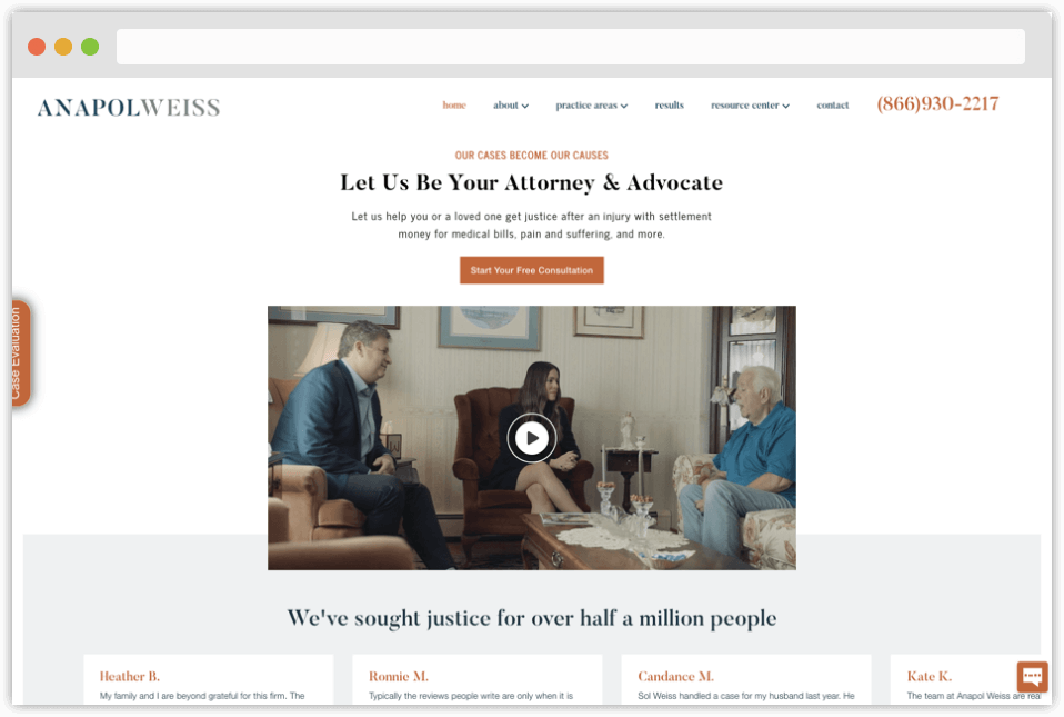
Design: 3
- The designer here prioritized a straight-forward, sparse design, which is fine in and of itself, but glossed over elements that’d improve lead flow. On their next site overhaul, I’d suggest working in sidebar and footer lead capture forms where the “Get a Free Case Evaluation” area is now. Still, I think the design from a graphical standpoint could use a refresh to stay competitive. First impressions matter.
Pagespeed: 5
- Desktop pagespeed smokes, but mobile–clocking it at 44/100–could use a layup.
Content: 8
- Strong value propositions. Anapol & Weiss expeditiously informs their visitors they are the firm of choice by showcasing featured client testimonials and case results. Having all that and awards badges above the fold would be preferred, though.
- Content is well-written and performs great from an SEO standpoint. Their content distribution is a little on the slow side. Last update was made in May 2021 and prior entries were a taste sparse. I’d like to see more content. They could be making much wider MoM traffic gains provided their keyword research stays on point.
Navigation: 9
- Navigation is solid. All the elements we look for are just about covered in their main menu, which makes for an intuitive and pleasant user experience.
Good Vibes: 10
- Lawyers are local, just like any other business. But, attorneys can be an intimidating bunch. Disarming your target audience with a smile and a positive gesture in the local community goes a long way. That’s why we look for law firms who are active with causes close to their hearts.
- Anapol & Weiss is not just active, but took it a step further: They have their own foundation funded by a portion of fees collected from successful cases. Nice. Their generosity falls inline with their credo of, Our Cases Become Our Causes.
2. Silva Injury Law
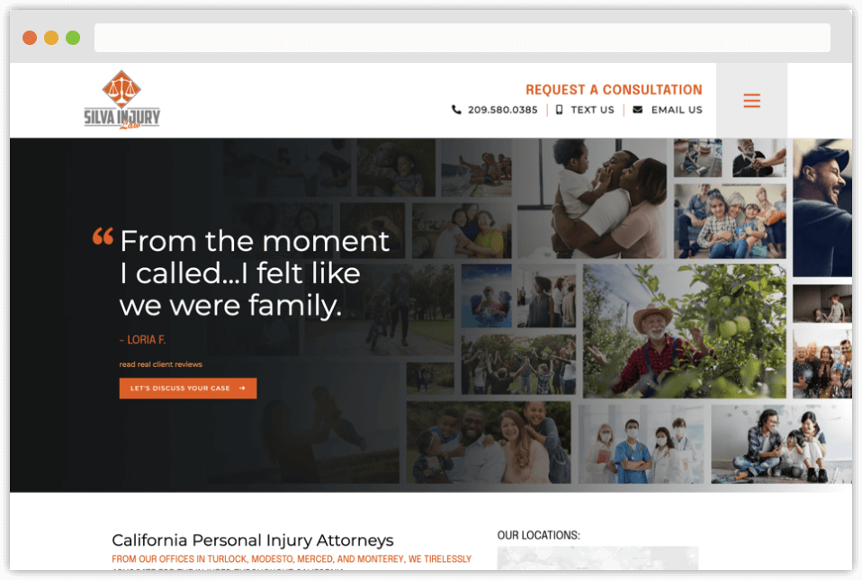
Disclosure: Silva Injury Law is a Juris Digital client
Design: 6
- Graphically speaking, there are a few things to be desired on Silva Injury Law, such as the logo. I’m not sure how I feel about the hamburger flyout menu, but many parts of the site were very well planned.
- For instance, take the attorney bio pages having trust badges above-the-fold and massive personalized testimonials. Or, dropping in real client reviews at the top of the practice area page and interspersed with calls to action throughout. Good stuff. It’s a time intensive task and the design team went the extra mile here.
Pagespeed: 6
- Desktop is at warpspeed but mobile needs some work (51/100).
Content: 9
- Homepage ad copy was written in a very laid back manner just about anyone could digest.
- Heaps of informational content at the ready, linked prominently from the Injury Law Articles top-level navigation.
Navigation: 10
- UX is really good as far as menus go. It’s just tucked away in a hamburger (see those three “slices” stacked on top of each other in the top right of the screen? That’s a hamburger.). Opening it requires an extra click. My only gripe.
Good Vibes: 2
- Silva Injury Law does not have any community outreach listed on their site. We do encourage it in some form, even if it is just donating your time to a worthwhile local cause. Silva does have a philosophy page that does give good vibes, though. They state their practice promotes healing through compassionate advocacy. I think that’s a good start, but would like to see their vibes score increase, as they’re really cool people.
1. Arnold & Itkin
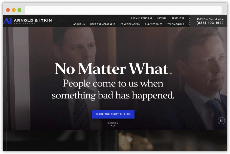
Design: 10
- One word: Wow! Visually impressive to say the least. Holy s–t this is one helluva design. Great job, guys!
- The interesting part to me is the design isn’t there just for flash. It compliments the components and inner workings of the entire PI website.
Pagespeed: 10
- Blew the doors off. Considering all the graphics and working parts going on here, achieving a near-perfect score was no easy feat.
Content: 10
- Arnold & Itkin’s content is compelling and easy to consume; almost ad copy-like. Quite the departure from traditional long-form legal content seen in most law firms. Rich with interest segments to break up the flow that contain CTAs, trust badges, testimonials, and FAQs, their distribution is top notch.
Navigation: 9
- Everything is in place here, except their phone number is not tap-to-call. I’d advise repairing this ASAP to maximize inbound calls from mobile traffic.
Good Vibes: 10
- Arnold & Itkin’s Community Involvement page is a perfect lesson in how just about any firm can engage in local outreach without investing tons of money. Here are a couple examples:
- Canned food drive
- Packed school lunches
- Volunteering at the local food bank
- Good vibes indeed!
Honorable Mentions
Kelley Uustal
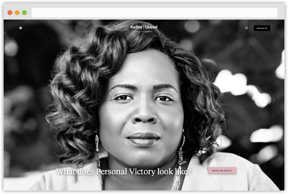
What I love about this site:
- Fiercely Unique Design. Upon viewing Kelley Uustal’s homepage, I’m immediately drawn into their story. The story of their clients. Their mission. Brilliant. Why? It’s honest. It’s about the people, and the people are made prominent; not the attorneys.
Things I’d try to improve:
- Navigation. The main menu items are a bit unorthodox vis-à-vis other competing personal injury websites. I’d consider testing a traditional navigation using Google Analytics and a heatmap tool like CrazyEgg or Hotjar, and seeing if engagement improves.
- Content. Their ad copy is fantastic and powerful, but the practice area page content may benefit from added depth if their goal is to rank in Google (it may not be).
- Pagespeed. Needs work on both mobile and desktop–mobile itself scored 39/100.
- SEO. Site does not appear to have the basics of optimization in place.
Fob James Law Firm
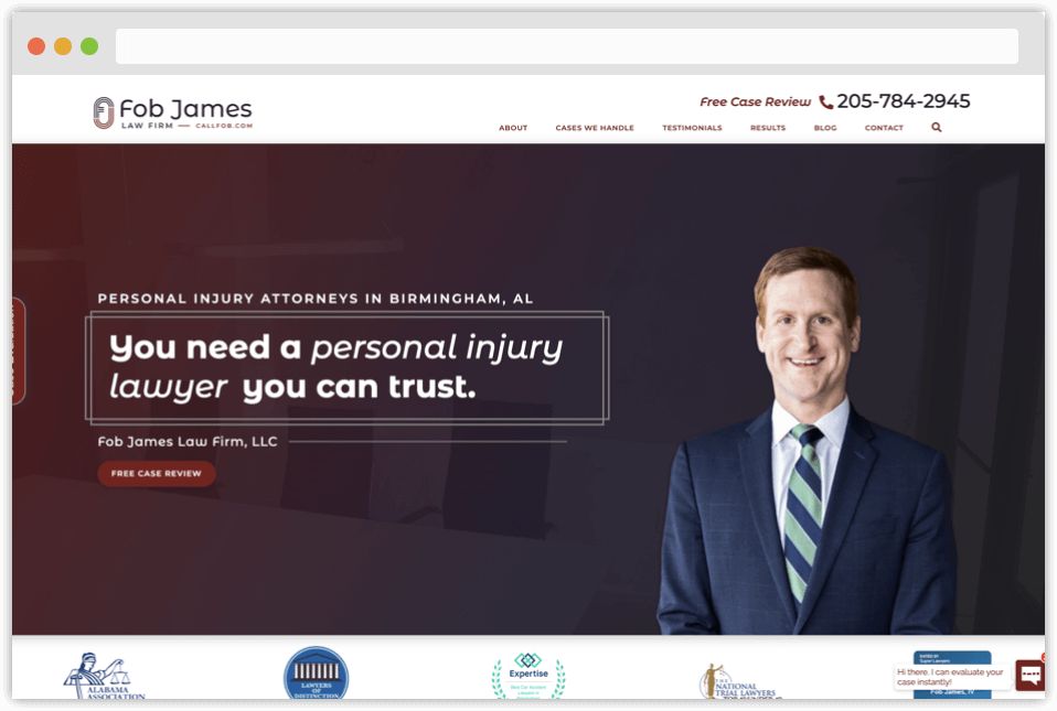
Disclosure: Fob James Law Firm is a Juris Digital client
What I love about this site:
- Design. Very clean, high functioning, elegant layout. Perfection in many ways. This is another well-planned site project with no stone left unturned.
- Calls to action. The CTAs throughout the homepage and inner pages make it easy for visitors to reach the firm.
- Content. Gobs upon gobs of high quality, long-form content. Perfect for educating their base and for feeding Googlebot until it’s rotund and ranking.
- SEO. Fob James is locked and LOADED for optimization. If you are looking for an example of how a personal injury site design should look in the context of SEO, this is one of them.
Things I’d try to improve:
- Pagespeed. Mobile speed could use a lift.
Conclusion: Is Your Law Firm Next?
I’ll be the first to admit, compiling this list was a very difficult task to complete. There are so many fantastic personal injury websites surfing the web. Should your firm’s site be considered for our next round-up?
Let us know in the comments below!
