Let’s be honest. Personal injury law isn’t exactly light reading for your average consumer.
Legal concepts like negligence, liability, statutes of limitations, and comparative fault can seem daunting, especially for someone who’s already stressed after an accident.
The problem? If your content is too dense or hard to follow, most potential clients won’t stick around long enough to understand how you can help them.
That’s where infographics for personal injury law come in. Done right, they simplify complex information, engage your audience visually, and give your firm a serious edge when it comes to turning website visitors into qualified leads.
Why Visual Content Matters in Personal Injury Marketing
Think about the people you’re trying to reach. They’re not legal scholars. They’re everyday folks dealing with medical bills, insurance headaches, and uncertainty about their rights. They don’t have time (or the emotional bandwidth) to parse a 3,000-word blog post explaining the nuances of liability in a multi-vehicle accident.
Visual content bridges that gap. It gives your audience information in a format they can process quickly and remember. When you use infographics for personal injury law, you’re not just making your content look nice—you’re making it useful.
Related: How to Craft Video Marketing Content for Legal Audiences
How Infographics Help Simplify Complex Legal Concepts
Most personal injury law content falls into one of two traps: it’s either too simplistic to be helpful or so complicated that it loses the reader entirely.
Infographics allow you to hit the sweet spot between those extremes. They help you:
- Break down legal processes into clear, digestible steps;
- Compare key concepts side-by-side;
- Visualize timelines; and
- Summarize statistics.
By making legal information easier to understand, these visuals help prospective clients feel more confident about reaching out to your firm—which is exactly what good marketing should do.
Infographic Ideas for Personal Injury Lawyer Content (with Examples)
When people visit your website after an accident or injury, they’re looking for answers to very specific questions:
- “Do I even have a case?”
- “How long will this process take?”
- “What kind of compensation could I be entitled to?”
The problem? Most law firm websites answer these questions with long blocks of text that many visitors won’t read or fully understand, especially when they’re already feeling overwhelmed.
This is where infographics for personal injury law shine. The right infographic doesn’t just decorate your content; it clarifies key information and helps move readers toward the next step.
Here are some high-impact infographic ideas you can use, along with examples of how they might look on your site.
1. Claim Process Roadmaps
The legal process feels like a black box to most people. A visual timeline showing the key steps involved in a personal injury claim is a simple and effective way to let potential clients know what the process is like, especially if they’ve never been in an accident. Breaking it down into clear, sequential stages helps demystify the process and makes hiring a lawyer feel less intimidating. Here’s an example from one of our clients.

A simple flowchart titled, “What Happens After You File a Personal Injury Claim?” could be helpful if it includes each stage of the process, like:
- The initial consultation;
- Investigating and gathering evidence;
- Sending a demand letter to the insurance company;
- Conducting negotiations;
- Settling or filing a lawsuit; and
- Going to trial if necessary.
Each step should include a short, one-sentence explanation. This kind of roadmap reassures potential clients that there is a plan and that you’re the guide who can lead them through it.
2. This vs. That
Many personal injury concepts involve comparisons that can be difficult for non-lawyers to understand. Clients often confuse key ideas like economic and non-economic damages, or they may not fully grasp the difference between settling a case and going to trial. A side-by-side or “this vs. that” comparison makes these distinctions clear at a glance.
For example, a graphic titled Economic vs. Non-Economic Damages could break down the two types of compensation with a simple two-column layout that includes:
- Medical bills, lost wages, future medical expenses, and property damage on the economic side;
- Pain and suffering, emotional distress, loss of enjoyment of life, and loss of consortium on the non-economic side; and
- Brief, one-sentence explanations for each category to keep the information clear and readable.
Other helpful “this vs. that” infographic topics might include settlements vs. lawsuits, negligence vs. gross negligence, or compensatory damages vs. punitive damages. It could look as simple as the example below.

The key to these infographics is simplicity and clarity. Too much detail can make the graphic feel like another wall of text. Keeping the comparison focused on the most important differences helps clients quickly understand the basic concepts and feel more prepared to move forward.
3. Local or State Accident Statistics
The average person has no idea how common serious accidents are in their own city or state. Sharing clear, local statistics helps potential clients understand the scope of the problem and recognize that what happened to them happens to others, too. A data-focused infographic is an effective way to present this kind of information without overwhelming the reader with numbers or long paragraphs.
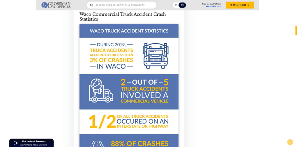
A graphic titled How Common Are Crashes With Injuries in Texas? could highlight key statewide and local statistics, such as:
- The total number of crashes reported statewide over the last year;
- The percentage of those crashes that involved serious injuries or fatalities;
- The most common causes of those crashes, like distracted driving, speeding, or drunk driving; and
- The number of crashes reported specifically in the firm’s city, county, or metro area.
Every data point should be clearly sourced from credible authorities like the state department of transportation or local law enforcement agencies. The infographic should also connect the data to the reader’s next step. In short, this type of visual helps people see that their situation is serious and common—and that your firm is prepared to help.
Why These Infographics Convert Better Than Walls of Text
Each of these personal injury lawyer content ideas does more than just make your website look good. They help potential clients quickly understand whether they have a case, how the process works, and why they should trust your firm to help.
The key is to meet people where they are: stressed, uncertain, and often unfamiliar with legal jargon. Infographics break down those barriers by making complex legal topics accessible, and that builds the confidence people need to take the next step.
Where to Use Infographics for Personal Injury Law
Infographics shouldn’t live in isolation. The most effective infographics for personal injury law support your larger content strategy. We recommend that you:
- Add them to your blog posts to improve time on page and readability;
- Share them on social media to increase engagement;
- Use them in email newsletters to keep your audience informed; and
- Include them on your practice area pages to make complex topics easier to digest.
Generally, visual content works best when it’s integrated across your marketing channels.
Don’t Underestimate the Usefulness of Visual Content
If your goal is to make your content more engaging, trustworthy, and conversion-friendly, infographics for personal injury law are one of the smartest tools you can use. They help break down complicated topics, educate your audience, and guide potential clients toward the next step, whether that’s picking up the phone or filling out your contact form.
Want help developing personal injury lawyer content ideas that go beyond generic blog posts? At Juris Digital, we help law firms create content that educates, engages, and converts. Reach out to get a quote and learn how we can help your firm leverage visual content that gets real results.