Our Mission
To provide the most effective inbound marketing services for law firms, ensuring that our clients recommend us to their colleagues, employees are proud of our work, and Juris Digital becomes the most respected digital marketing brand for law firms.
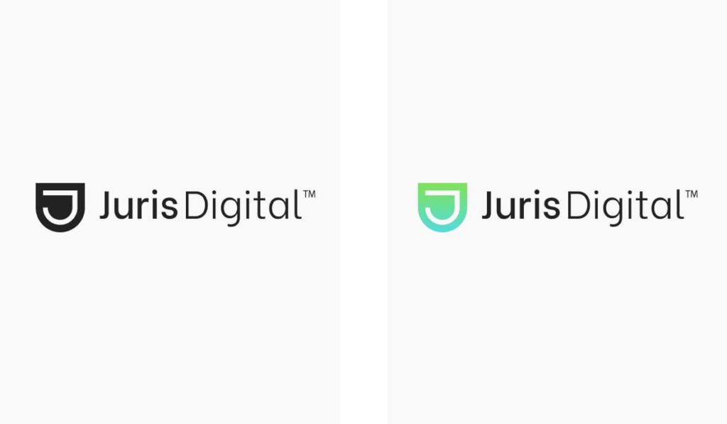
Logo Design
The Juris Digital Logo Design combines two elements, the logo symbol and logo type. The logo symbol is a powerful monogram evoking the feeling of prestigious services.
Logo Design Colors
The logotype should always contrast with the background. There are 4 versions of the logotype to ensure legibility and optimum reproduction quality in all printing processes and digital needs.
Full color:
The full color – positive logotype is considered the main version, and should be used whenever possible.
Monochrome:
When there are a limited number of colors available for reproduction, or the quality of colors is questionable, choose the monochrome version. No other colors besides black or white should be used.
Logo Design Spacing
The logo design should be surrounded with clear space to ensure its visibility and impact. No graphic elements of any kind should invade this zone.
The clear space around the logotype on all sides should be equal to the height of the logo symbol for maximum legibility and impact.
Typography
Lexend:
Juris Digital primary font is Lexend and should be used whenever it is available.
Be Vietnam:
Juris Digital’s logo font is Be Vietnam.
Colors
Juris Digital color palette consists of black, blue and green. As well as a branded gradient blend of the green and blue colors.