![]() I think most designers and business owners out there would agree that a logo is the most important part of any brand. Logos shouldn’t be difficult, hard to understand, pointless or create puzzles for the audience to decode. They should tell a story in a blink of an eye.
I think most designers and business owners out there would agree that a logo is the most important part of any brand. Logos shouldn’t be difficult, hard to understand, pointless or create puzzles for the audience to decode. They should tell a story in a blink of an eye.
We can all probably name a handful of logos that we recognize, but what we don’t know is the time behind creating a logo. From idea, execution, to redesign, there are a lot of components that create a brand’s story.
Many believe that redesigning their logo is a quick and easy way to upgrade or freshen up their brand. In reality, it can be a risky proposition. Lets take the clothing store Gap for example.
In 2010 Gap released “a more contemporary, modern expression” of their logo said the store’s VP Bill Chandler. The logo release sent many loyal Gap customers into a Twitter and Facebook comment frenzy. The result was an immediate take down the new logo.
The famous redesign mistake:
![]()
![]()
Logo redesigns should not be taken lightly. If major corporations like the Gap can mess it up, so can you.
To avoid a logo redesign disaster, here are a few tips that will help you get it right.
Tip #1: Start By Asking Yourself These Five Questions:
- Who is my audience?
- What are your current typefaces and colors?
- What would I like to change about it?
- What are the key points about your business that you want to convey that are not conveyed already?
- What is your budget?
These questions will help organize your thoughts going into a meeting with a designer OR they will help you understand when and why you need to redesign your logo.
Tip #2: Isolate Your Old Logo’s Best Assets
![]()
![]()
It’s critical that you take the time to understand what, if anything, are the good traits of your current logo. There might be something within that logo that works. This will make the process easier and create a smoother transition to the new logo.
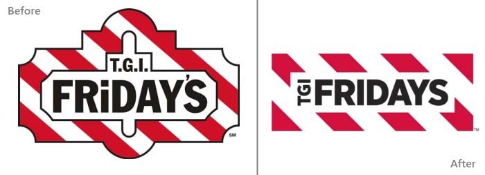
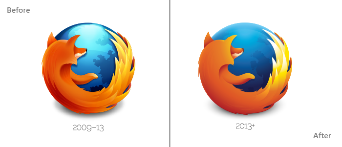
Tip #3: Aim For Simplicity
You never want your logo to be complex. Remember, it has to make an impression in a blink of an eye. Overall, simplification in the logo makes it clearer and quicker to grasp your brand’s message.
For Example:
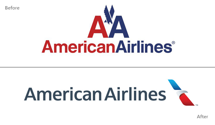
Tip #4: Focus On Most Important Colors
The colors are not what define your logo’s story or identity, but rather, the overall look and feel. Colors play a huge roll in the psychology of how the viewer feels towards your logo, and too many colors can add confusion, or bring the audience’s attention away from point you want to make.
For Example:
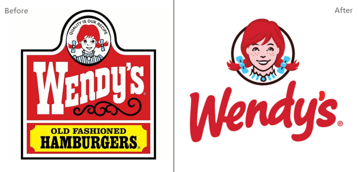
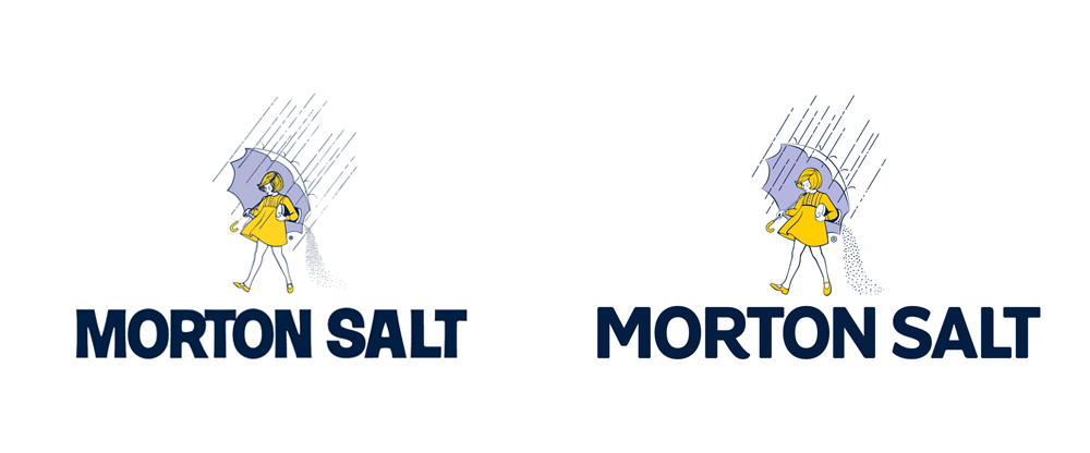
Tip #5: Embrace New Trends, But Don’t Forget Classic Traditions
Sometimes you have elements or icons that have been so ingrained within your brand that you don’t want to part from them. So, no fear! The redesigned logo should respect those traditions. However, there is nothing wrong with modifying the colors, brush stroke, or icon to make it more modern or cleaner.
Take a look at these examples below:
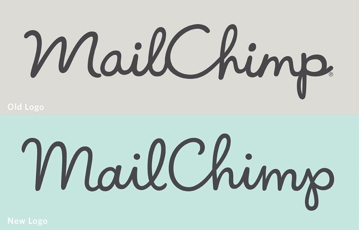
Tip #6: Optimize Readability
The variety of available typefaces is almost endless. Sometimes with certain typefaces cause your message to get lost because they are difficult to read, which will cause viewers to disengage. Look for a way to minimize the complexity of your font to make it fully legible. In doing so, you find the balance between keeping the brand and showing your personality.
For Example:
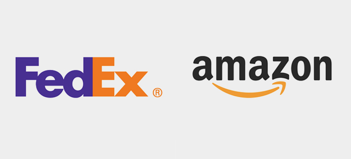
Tip #7: Think Outside the Box With Hidden Meanings
This is the fun one in my opinion. Below are two examples of corporate logos, Fedex and Amazon. Fedex (if you haven’t noticed before) uses their negative space between the E and X to create a arrow. The arrow represents speed or movement.
The other example, Amazon, uses a “smile” to point to the A and Z representing that they deliver anything from a – z and their products will bring a smile to your face.
Incorporating messages like this reinforces a brand’s story and value propositions.
For Example:
Tip #8: Make Sure You Have Vector Image
What is a vector? According to Wikipedia: “Vector graphics files store the lines, shapes and colors that make up an image as mathematical formulae.” (a.k.a. EPS files)
What’s the purpose? Your logo has to be compatible online, offline, and everywhere in between. A vector image can be resized for all mediums including stationery, t-shirts, banners, and all other promotional materials.
Done With Branding and Need Website Help?