There was once a day when the most common introduction between a law firm and a potential client was a solid handshake.
Today, of course, that first impression is much more likely to be formed by the colors, layout, and overall design of the firm’s website. In an era where introductions are forged online, law firms like yours now face the unique challenge of conveying professionalism, reliability, and trustworthiness through screens.
Making a good first impression online consistently is not a simple feat; it requires an intricate blend of art, science, and psychology—particularly color psychology.
What Is Color Psychology?
Color psychology is the study of hues as a determinant of human behavior. Perhaps surprisingly, colors can significantly impact how prospective clients perceive a law firm. For example, did you know that nearly one-third of the Vault 100 firms use blue as their primary brand color? While this certainly doesn’t mean that you have to use blue as well, it shows that other firms are taking color psychology into consideration.
Whether your firm needs to stand out or blend in with that crowd may drastically affect the colors a seasoned web designer will use for your website. That’s because the right color palette can differentiate a law firm from its competitors. It can also instill a sense of confidence in visitors that they’ve come to the right place for their legal needs. While lesser agencies often prioritize the structural aesthetics of web design, the psychological impact of color selection is pivotal in shaping user experience and, ultimately, conversion rates.
Understanding and harnessing the power of color psychology in law firm web design is not an endeavor to be taken lightly. Each color carries its own associations and emotional responses, which can vary culturally and individually. Effective use of color requires a deep dive into these nuances, ensuring that the selected hues resonate with the firm’s intended audience and reinforce the firm’s branding message.
The Science Behind Color Psychology
To appreciate the role of color in law firm web design, we must first glance at the science fueling it. Colors have the power to evoke emotional responses and influence human behavior. This concept isn’t new. Its roots stretch back to ancient cultures, and numerous psychological studies have substantiated it.
While the emotional impact of color can be subjective and influenced by personal experiences and cultural differences, certain generalities provide a foundation for using colors in marketing. For example, blue is broadly perceived as stable and reliable—qualities highly sought after in legal representation.
Leveraging Color Psychology Marketing
In marketing, color ideally connects a brand and its intended audience. This connection is particularly significant for law firms, as the choice of colors can subconsciously influence a potential client’s perception of the firm’s reliability, expertise, and temperament. For instance, a firm specializing in family law might lean towards warmer colors like soft blues and greens, which evoke calmness and trust, creating a welcoming atmosphere for prospective clients dealing with sensitive issues.
However, applying color psychology extends beyond selecting an appealing palette. It requires a mindful approach that aligns with the firm’s brand image, target audience, and the emotional journey your website visitors intend to take.
Crafting a Palette with the Color Psychology Chart
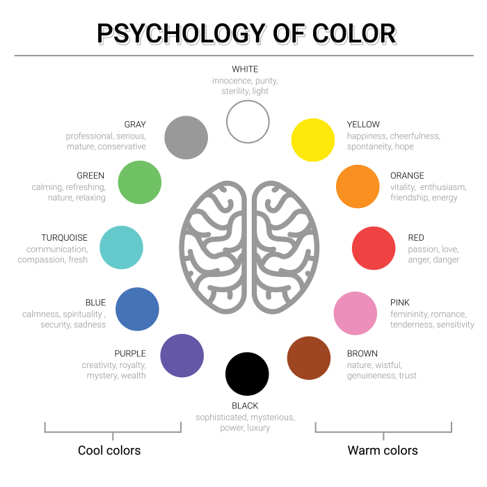
A color psychology chart offers insights into how various hues influence emotions and behaviors. When crafting a color palette for a law firm’s website, considering the chart’s insights ensures that the chosen colors align with the desired emotional impact. Let’s take a look at some of the most popular colors for attorney websites.
Blue
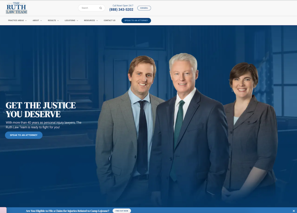
The color blue represents trust, security, and professionalism. It is ideal for law firms seeking to establish a trustworthy and dependable image. You can see all that here on the Ruth Law Team’s homepage.
Green
Green symbolizes growth, renewal, harmony, and stability. Suitable for practices emphasizing family or environmental law or aiming to convey a balanced and fair approach. You can see how it’s used subtly as an accent on this page.

Gray
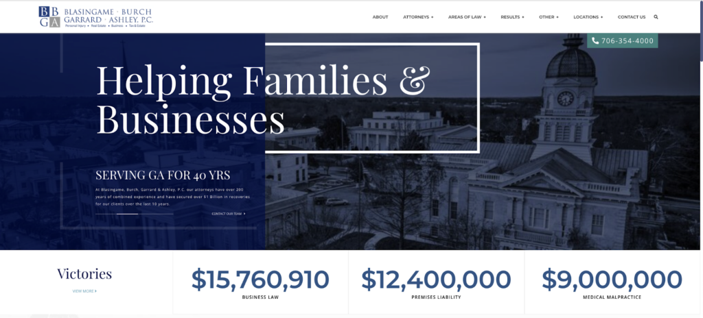
Gray conveys neutrality, sophistication, and timelessness. It is a good choice for firms aiming for an elegant and professional aesthetic. Look at its use in combination with blue on this homepage.
Red
Red is associated with energy, passion, and action. Used sparingly, it can effectively highlight calls to action or urgent information. See how this firm’s site uses a deep red to highlight important info.
Black
Black embodies power and sophistication, and used judiciously, it can offer an elegant, authoritative presence on a website. It is used nicely to this effect above the fold on Ramos Law Group, PLLC’s website.

Effectively integrating these colors requires balance—it’s about blending trustworthiness with approachability and professionalism with personality. This balance guarantees that your law firm website communicates the right message to the right audience, prompting a positive response.
Color Constancy Psychology Definition
The concept of color constancy plays a crucial role in maintaining brand consistency across different mediums. This psychological phenomenon, where the perceived color of objects remains constant under varying lighting conditions, underlines the importance of choosing an adaptable and versatile color palette. Ensuring that your chosen colors display consistently across various digital devices is crucial for your law firm’s brand recognition and trust-building.
Moreover, understanding the technical aspects of displaying colors correctly on different platforms is as crucial as the psychological aspects. It involves technical considerations in web design, such as color profiling and calibration. The objective of profiling and calibrating is to ensure that the chosen colors remain true to the firm’s brand identity, regardless of the device or browser used to access the website.
Integrating Color Psychology with Web Design Elements
The application of color psychology in web design goes beyond background colors and text. It extends to every element on your website, including buttons, navigational aids, and calls to action (CTAs). For example:
- CTAs—Orange, often used to signify energy and enthusiasm, can be an effective color for CTAs, encouraging quicker decisions and actions from website visitors;
- Navigation—Using calming colors like blue for navigation elements can improve usability by making visitors feel more at ease while exploring your site; and
- Imagery—The colors in your website’s imagery should complement your overall color scheme, reinforcing the desired emotional tone and enhancing the visual appeal.
As you can imagine, there is art in website creation, and your firm deserves a well-thought-out and strategic design.
A Whole Spectrum of Possibilities
In sum, the effect of color psychology on law firm web design extends far beyond aesthetic considerations. When used wisely, it is a potent tool that can significantly enhance brand perception, user experience, and, ultimately, the success of your online legal presence. By carefully selecting a color palette that resonates with your firm’s identity and target audience, you can create a website that communicates trust, professionalism, and approachability.
When looking into the possibilities offered by color palettes, law firms have the unique opportunity to differentiate themselves in a crowded online space. By aligning color choices with marketing objectives and the emotional needs of prospective clients, your firm can forge stronger connections and greater brand impact.
Remember, in law firm web design, colors do more than fill space—they tell your firm’s story, embody your values, and, most importantly, connect with the hearts and minds of those seeking your knowledge and experience. The strategic application of color psychology can help transform your website from a mere online business card into a powerful tool for client engagement and conversion.
