
Ever wonder why you prefer one law firm website design over another?
The answer: Simplicity. Or, in other words, “less visually complex”.
Simplicity in a law firm website doesn’t mean your homepage has to be nothing but white with black text, or extremely minimalistic in the aesthetic.
Rather, simplicity refers to a design which facilitates seamless communication between the eyes and the brain, allowing us to process information quickly and effectively. This 2013 Harvard study taught us that humans generally make a decision on a website design within 1/50th to 1/20th of a second based on the “visual complexity” of the design.
Below is a perfect example of how use of white space and typography can completely alter the emotion that a word evokes:

Despite being the same word, our minds react differently to the version on the left than the one on the right.
5 advantages of simpler design:
1. White space helps your website “Breathe”.
Again, this doesn’t mean that your website’s homepage must be nothing but a white background with black text. Rather, I’m suggesting that you simplify the “clutter” (which evokes feelings of anxiety and stress), using enough space to help the user gather what is being communicated within the content and aesthetic of the page.
The whole idea of “web experience” is not to make the viewer feel “trapped” or “run away” but to feel comfortable enough to read your content and find out what your law firm is about. The attorney-client relationships require a certain level of trust and comfort, and you want to evoke those feeling with your website’s design. White space can help achieve just that.
2. White space keeps the focus on content.
If you invest in content marketing (articles, blog posts, videos, infographics, etc.) it is likely that the majority of your site’s visitors are interested in learning something. That’s why at Juris Digital we prefer simple design places our best content at the forefront of our client’s websites.
When a design is stuffed with decorative, flashy, blinking, moving, bright colored icons or elements, it’s can be easy for the user to become distracted from the task of navigating the site to find what they are looking for.
3. Simplicity is good for conversion rate.
Who doesn’t want more conversions, right?! At Juris Digital we have simplified the structure of a law firm homepage into four parts:
- Call-to-action (CTA)
- Logo + navigation links
- Who you are + critical firm information
- Footer + contact form
Web design and conversion optimization go hand in hand. A user is expecting to do something on your website, to take some sort of action. It’s our job to create a simple flow to help the user accomplish that goal.
We generally suggest that a law firm website’s primary navigation include no more than six parent links. This should include Home and Contact links. You don’t need excessive links to complicate or clutter a navigation system. How is this done?
- Create consistent navigation through the site
- Use only one menu
- Minimize number of dropdown items
- Take extra care to properly categorize and silo content
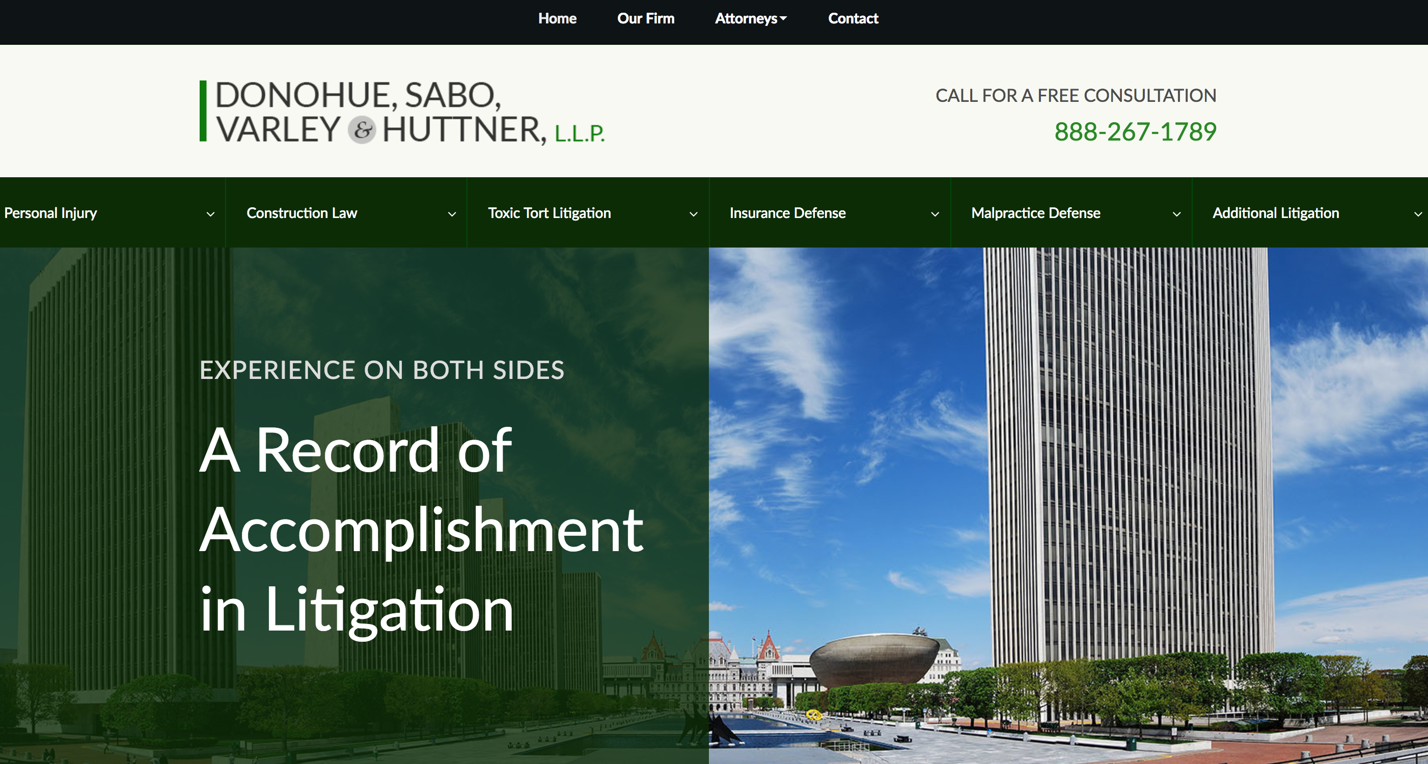
Simple Navigation:

Overly Complex Navigation:
5. Fast. Faster. Fastest.
We loooove fast load times. Simplistic design normally correlates with page speed, and page speed normally correlates with websites that people love. Elements such as image borders, drop shadows, extra illustrative images, big images, image calls, video embeds, social share buttons, parallax scrolling, giant background images, all increase page load times. Most web design companies add this “flare”, which commonly accomplishes nothing but slowing down the site’s page load times.
Just remember your homepage is often your law firm’s first impression. Strive for simple, elegant design which evokes the emotions you want your clients to feel.
Whether you’re using WordPress, HubSpot or Webflow it may be time to seriously consider how your site is designed to attract ideal clients.